
2021 Portland (Happy Valley) Street of Dreams
I’m excited to be able to write another blog about the NW Natural Street of Dreams! My last blog about this preeminent (usually) yearly show was from 2019. (Check it out for lots of pics and design commentary.)

Me riding the Cheese to the show.
Unfortunately, a little virus known as COVID-19 derailed last year’s show. The 2020 SoD was supposed to take place in the new(ish) South Hillsboro neighborhood. Fortunately, there’s already been an SoD there so maybe we didn’t miss out on much. And, hey look, I have a blog from 2018 about it! Check it out and just pretend it was from last year :)
I attend the Street of Dreams every year. There are a lot of reasons I go but, mainly, as a Realtor licensed in Oregon, I like to stay on top of design trends. This is important because my clients often ask for advice when they want a Realtor’s perspective on remodeling, whether they happen to be flippers or homeowners considering selling in the not-too-distant future.
Also, it’s fun. Yes, I’m a Houzz and Architecture Illustrated addict. Speaking of which, if you are considering buying or selling a home, or need some real estate advice, please contact me and let’s chat!
Now it’s time to talk about the 2021 SoD! There were some… interesting design choices this year and I’ll talk allllll about them below.
What’s Different This Year

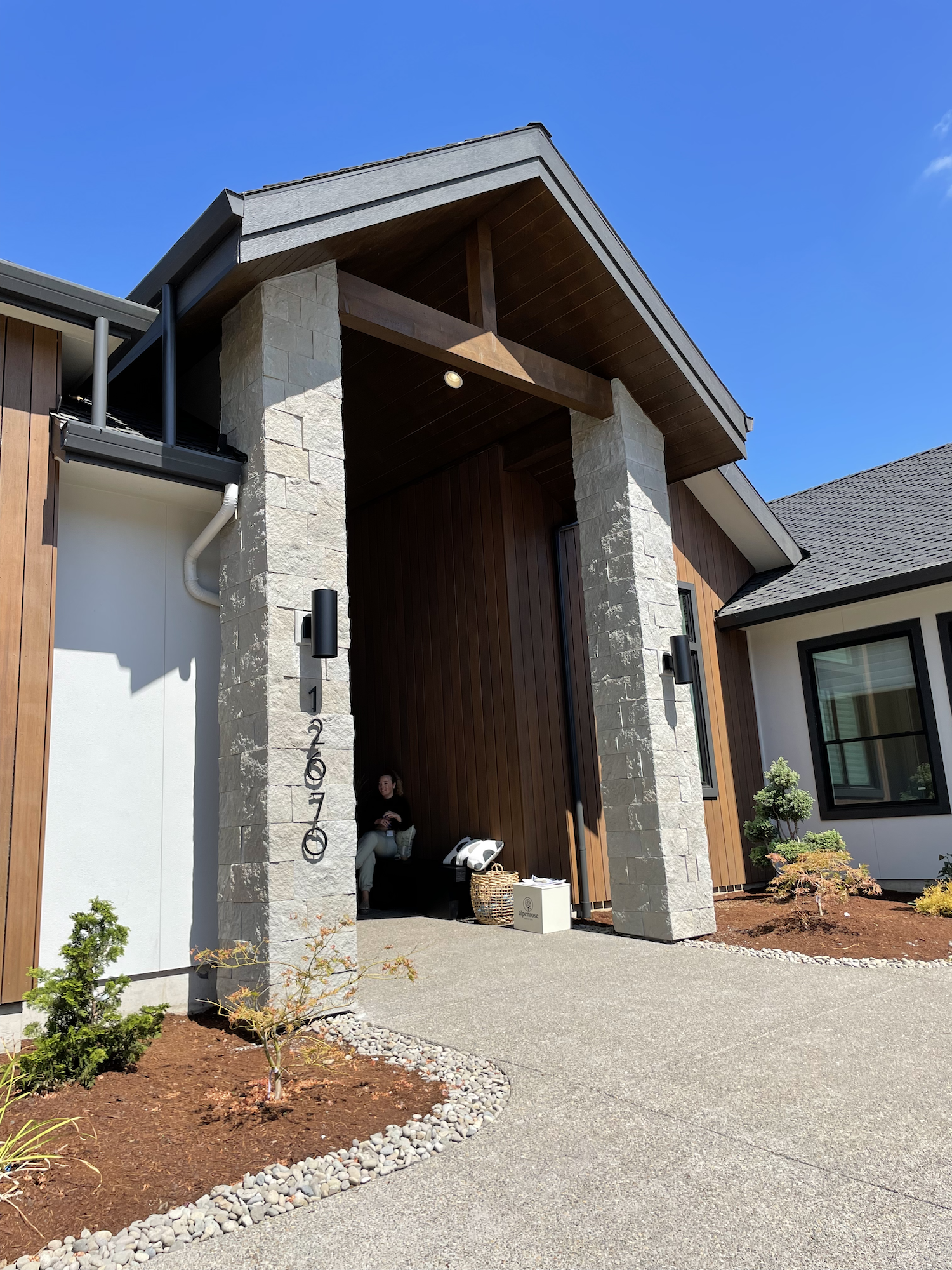
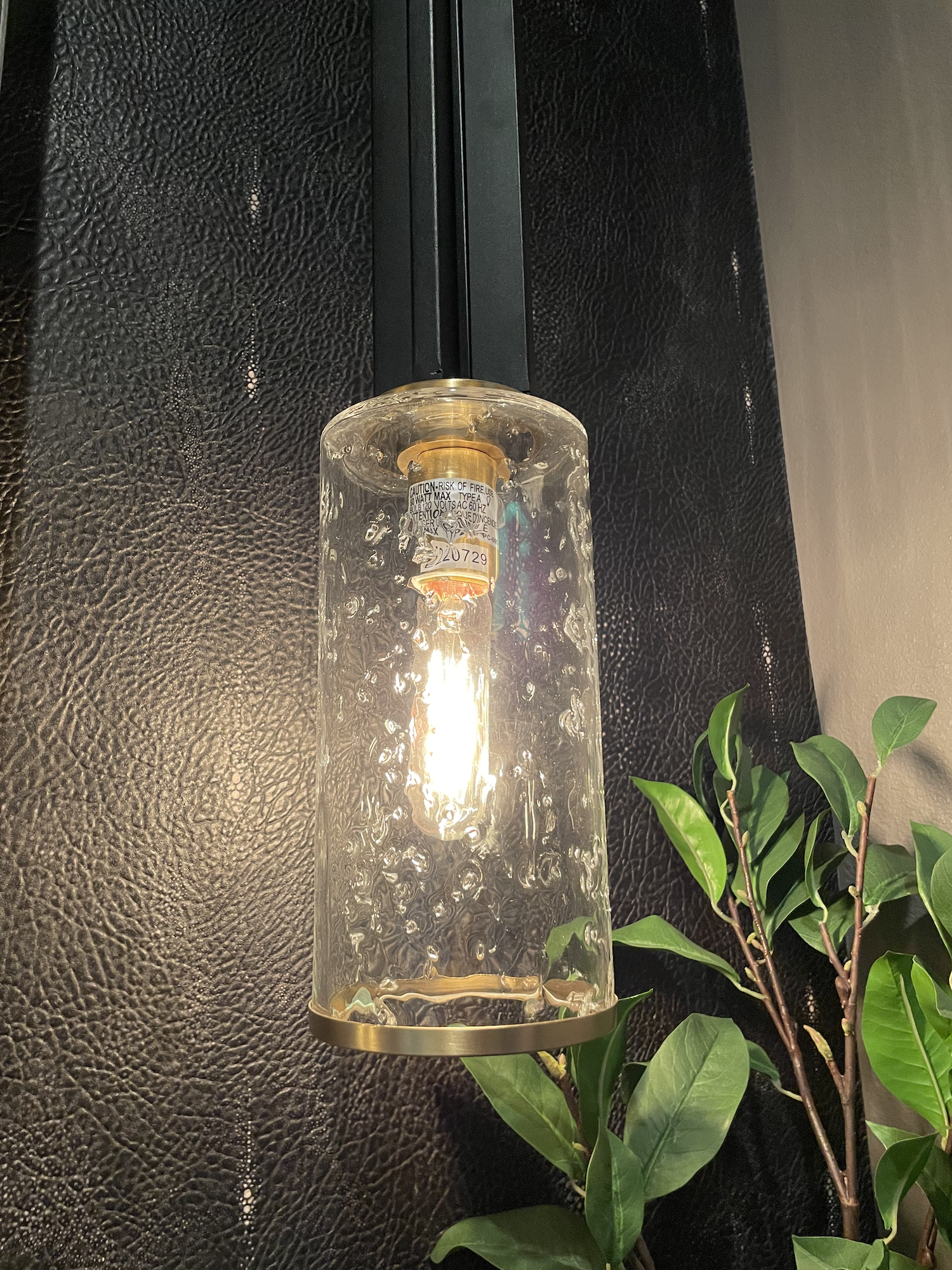
Show entrance, after a shuttle bus ride on the Cheese.
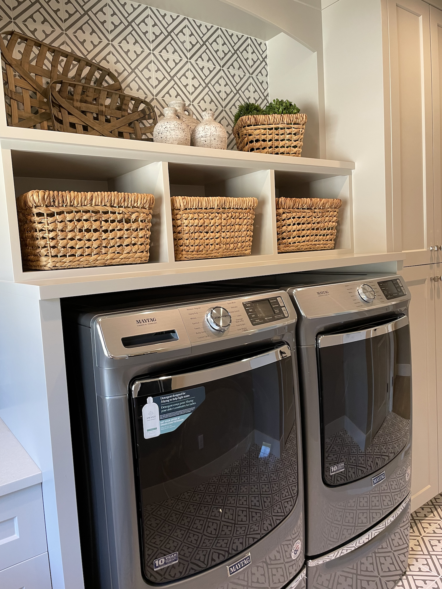
For those not familiar with the Street of Dreams (SoD), it usually consists of ~5 new construction homes by local builders. Sometimes, they are custom construction where the homeowner chooses their layout and materials. Other times they are built on spec (the builder constructs the home speculating that they can find a buyer for it).
SoD homes are luxury builds and, generally, the prices range from around 1.5M - 5M+. Some of the past show guides are available to view.
However, the Street of Dreams makes changes to adjust to unusual times. For instance, during the recession, the 2009 show focused solely on condos around the Pearl District. Ticket prices were reduced but the condo prices weren’t… Even in 2009 they ranged from 1.3M - 3M. It was… different.

“The Cheese” - shuttle to the show.
COVID-19 isn’t the only wacky thing we’ve been dealing with over the past year. Housing prices have shot through the roof and don’t seem to be wanting to hit a ceiling. Housing affordability is definitely in the spotlight.
In response, the 2021 Street of Dreams has decided that everyone’s “dream” looks different.
The show this year consists of 3 custom homes (all pre-sold and designed for the specific owners) + a small container home + a 3 unit sleeping pod.
House 3 at Pleasant Valley Villages. Stay tuned for Part 2 of this blog for more pics and info.
The custom homes are in a 9 unit development in Happy Valley called “Heritage Crest”. Open lots are still available for sale, so if you’re considering building custom, contact me and we can talk about this neighborhood and plenty of other options.
The SoD also teamed up with a major national builder: Holt Homes. Attendees were encouraged to check out their new development “Pleasant Valley Villages” located 3 miles away. Which, of course, I did.
I’ll cover Pleasant Valley Villages, the container home, and the 3 unit sleeping pod in Part 2 of this blog.
Now, let’s get to it!
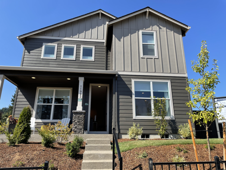
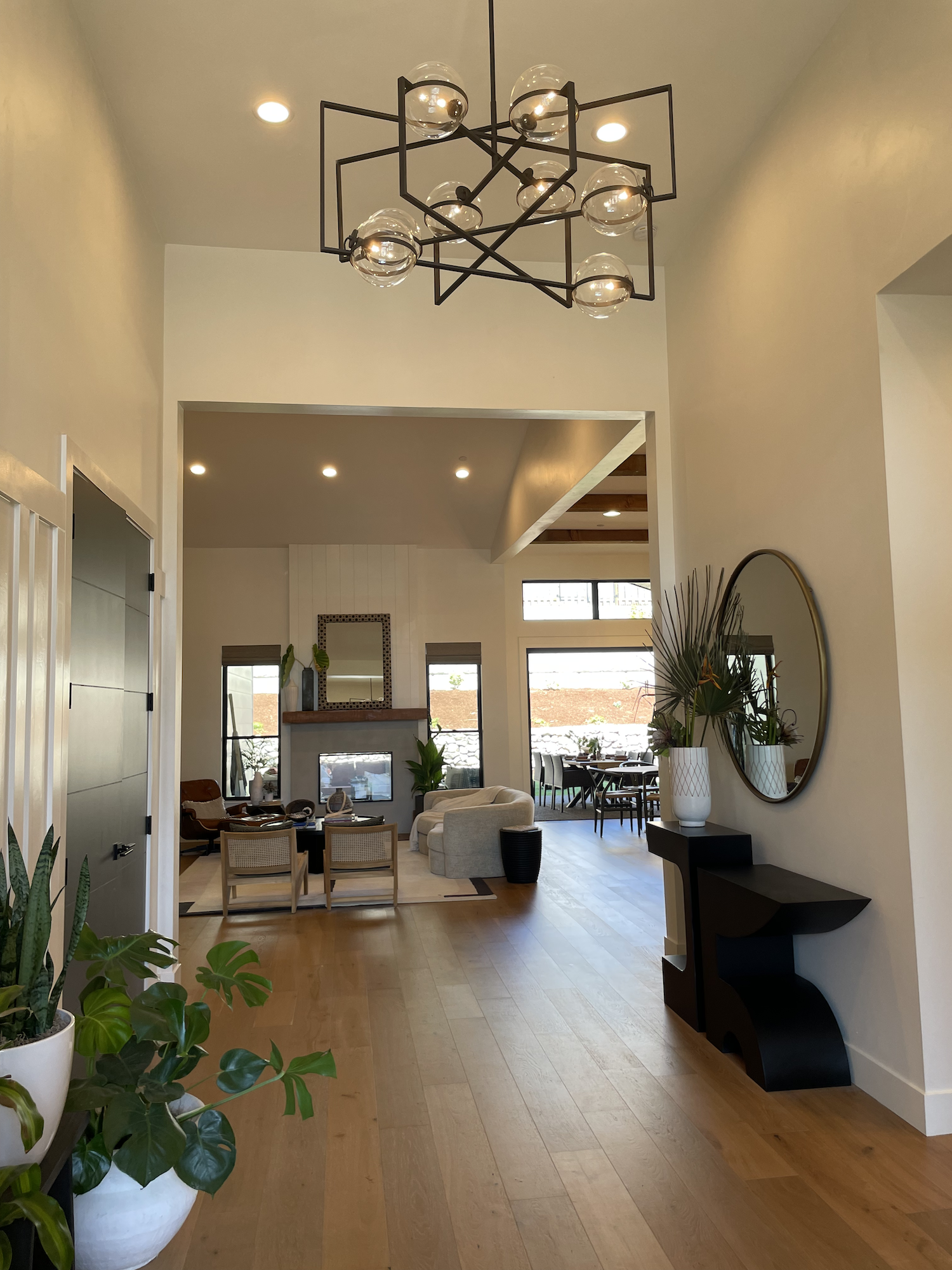
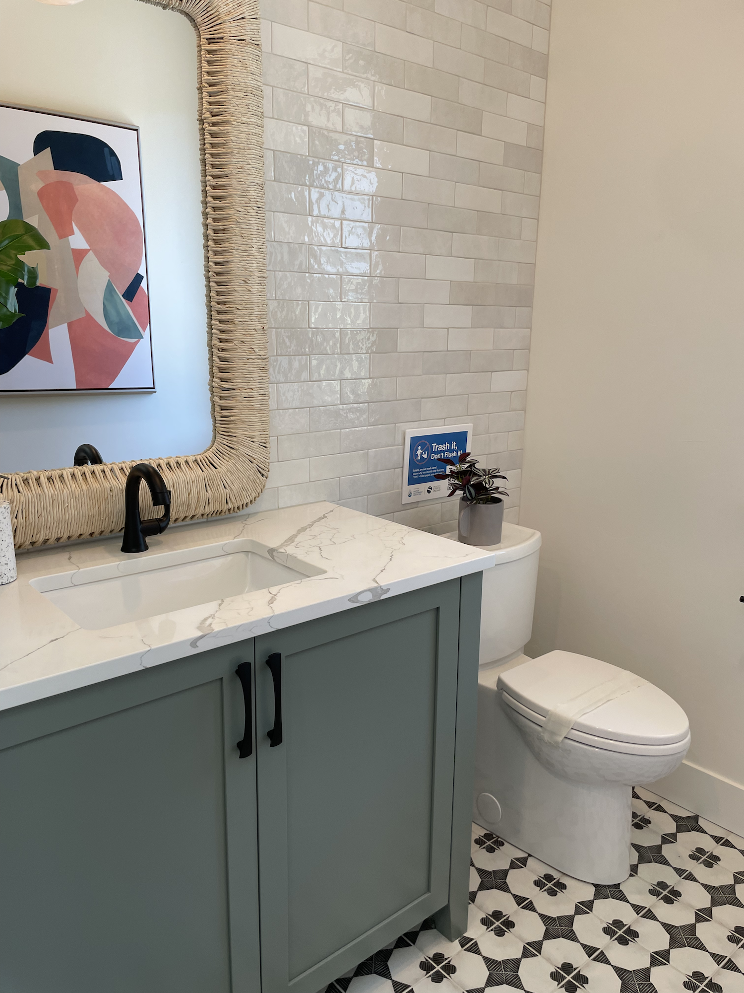
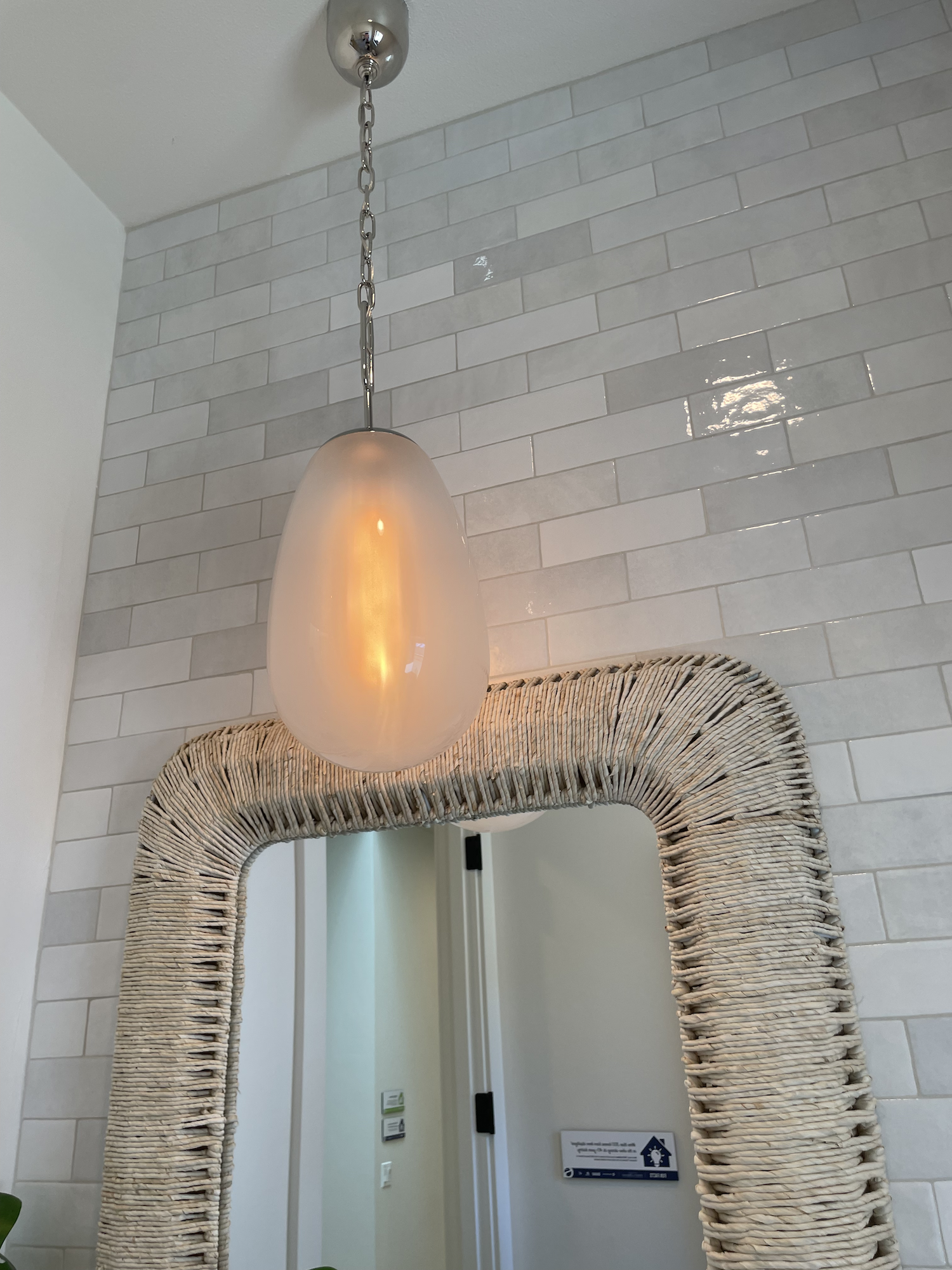
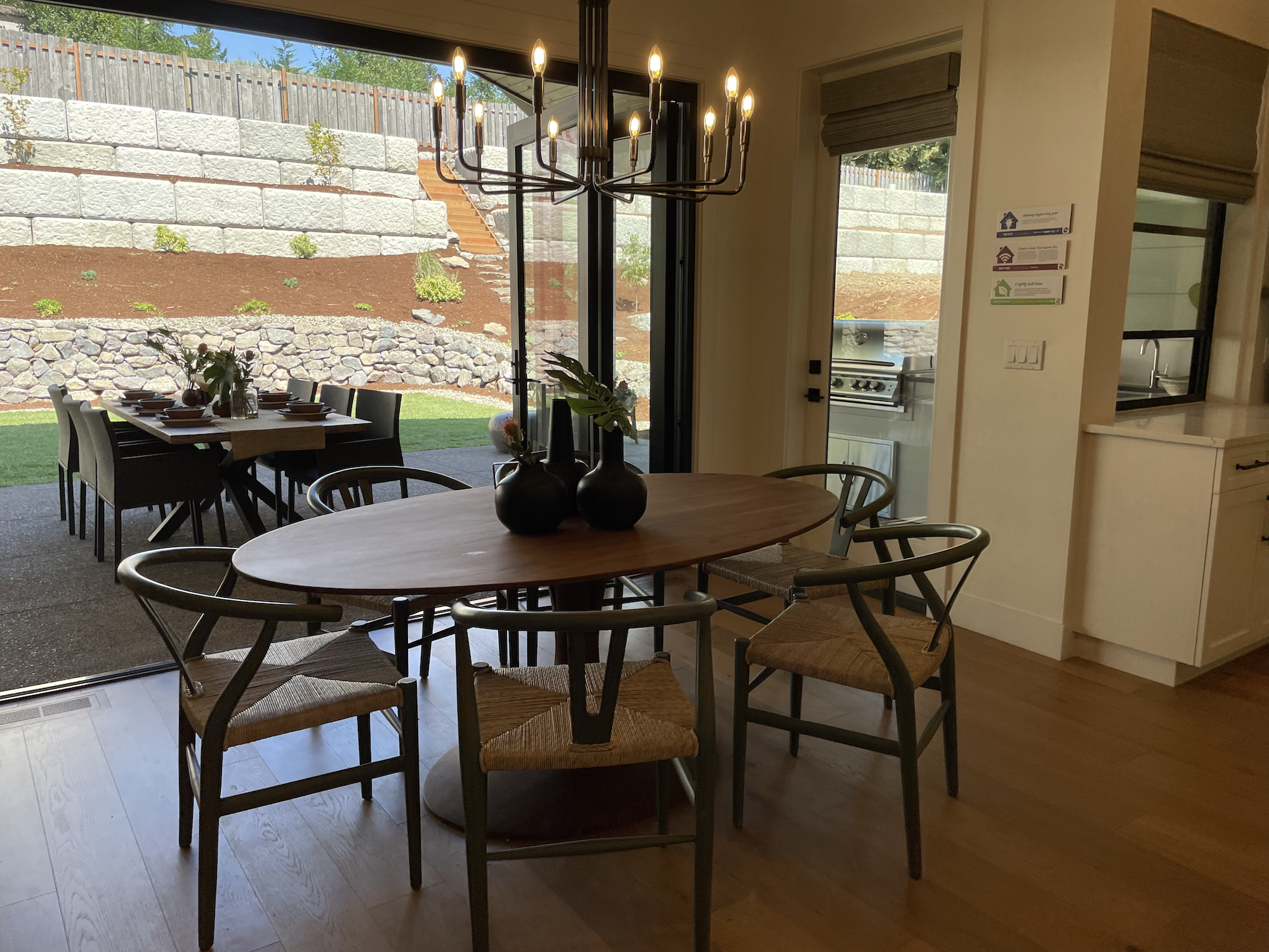
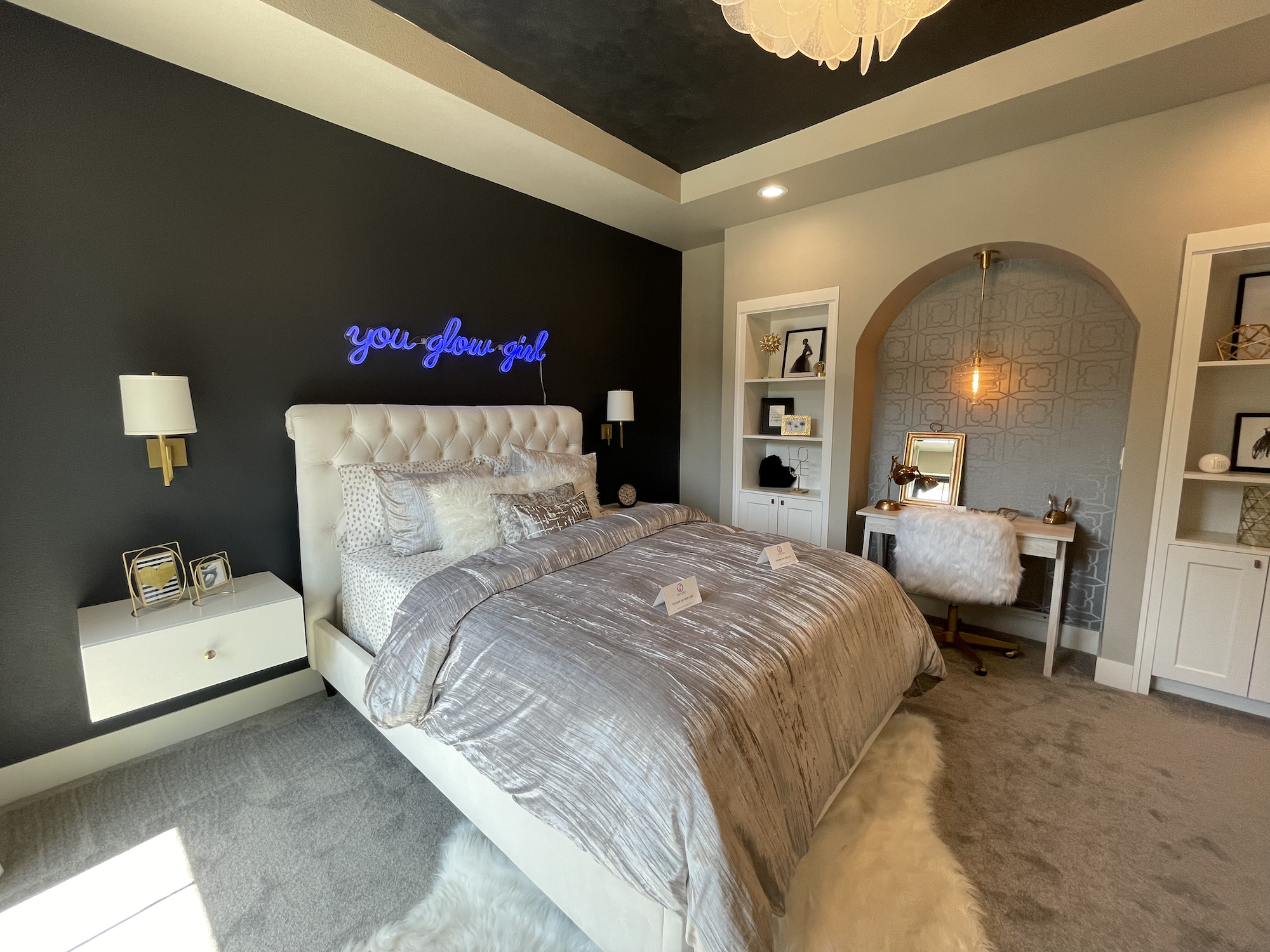
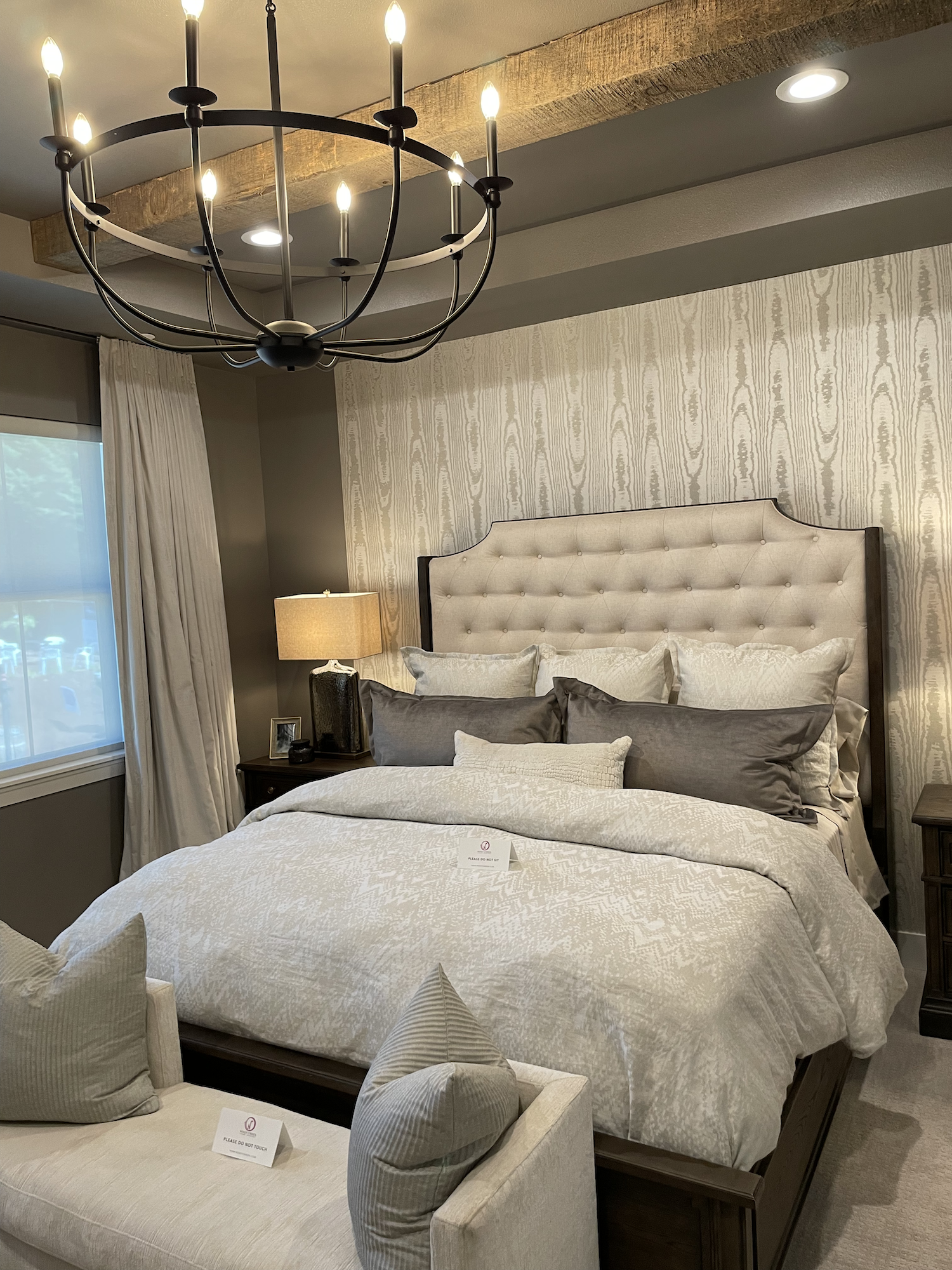
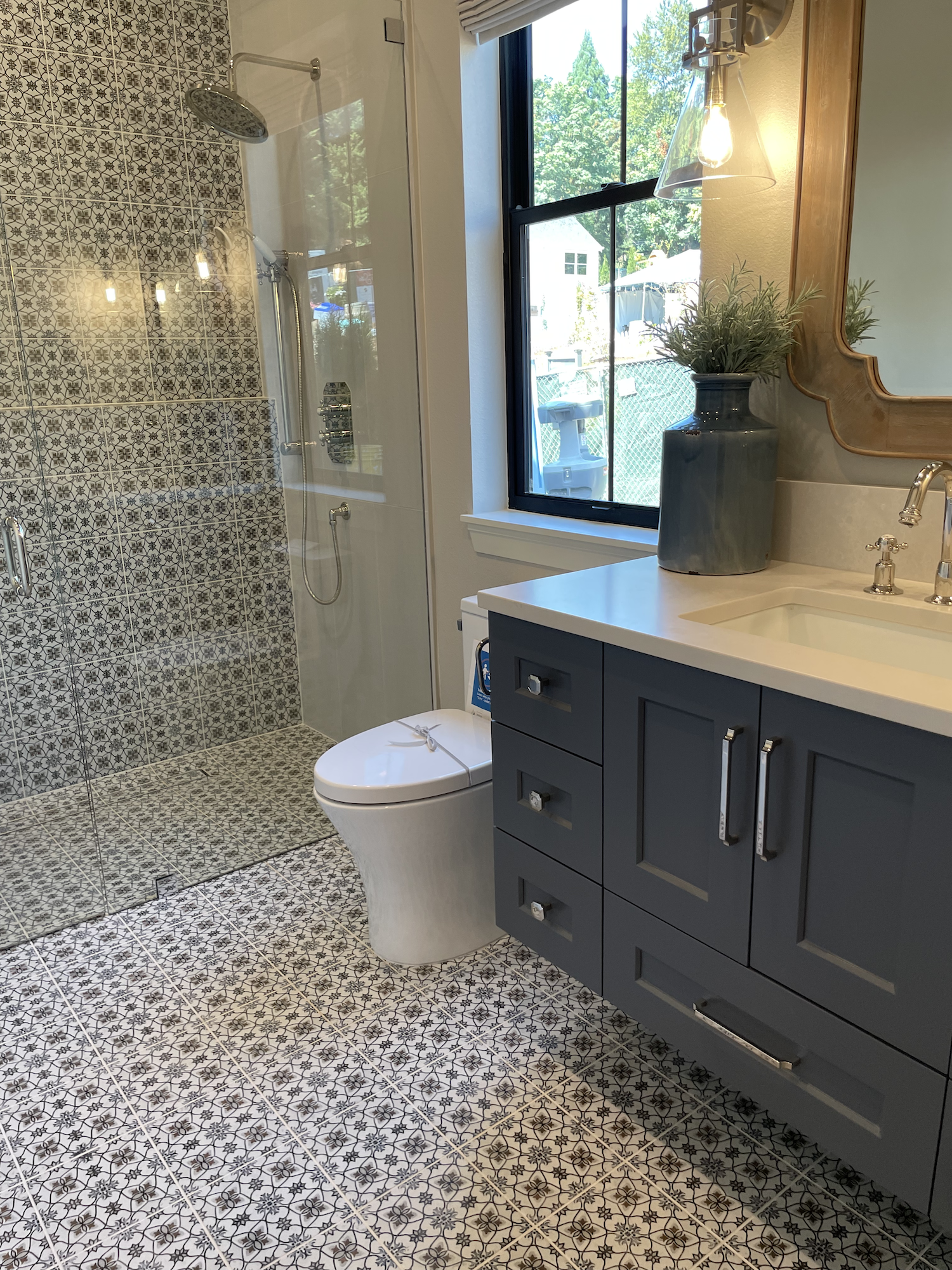
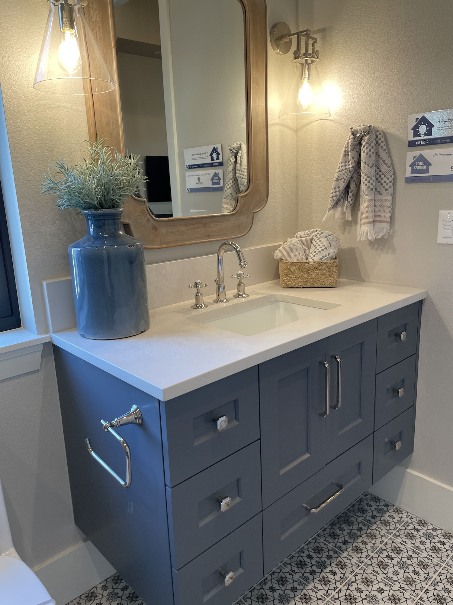
Home 1 - Hygge
Yes, all 3 homes have cute names. It’s a thing. Kinda like how some people name their cars. It’s totally normal. For instance, I named the very first car I owned “Nova” which loosely means “doesn’t go”. Since the name became quite prophetic, I decided against naming objects after that.
Anyhow…
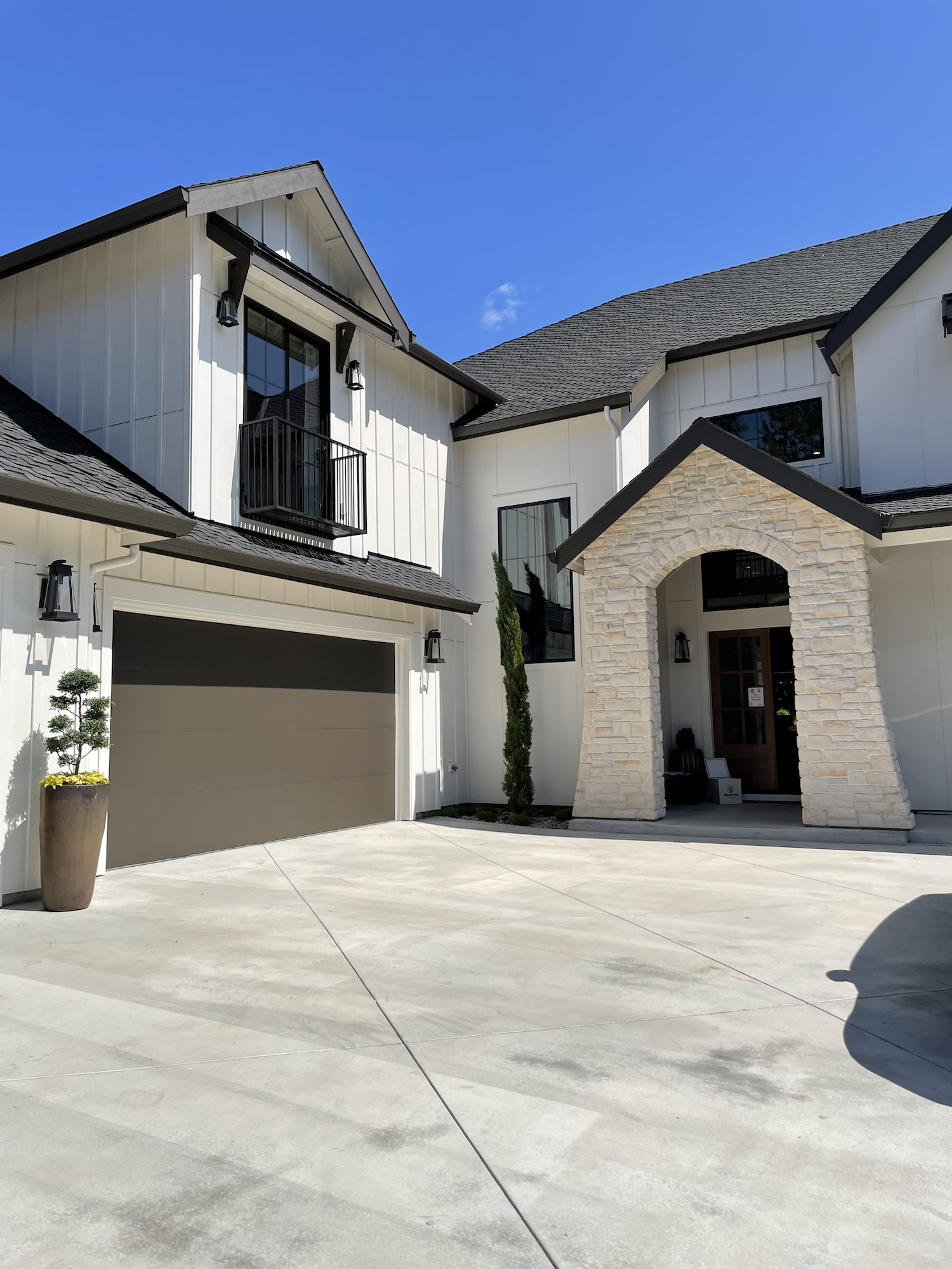
Built by Anlon Custom Homes for a family of four, the design idea is a combination of modern farmhouse meets Scandinavian decor.

Square Feet: 5,132
Bedrooms: 4
Bathrooms: 4 Full, 1 Half
The modern farmhouse style has been raging for several years now thanks to “Fixer Upper Fever” (I’m pretty sure this is an acknowledged medical condition). But, it’s currently on the downslide as people get tired of shiplap, barn doors (just… no, please, never on a bathroom!), and white EVERYTHING.
Downslide doesn’t mean gone, though, as this year’s SoD proves!
I’m always interested in style-fusion (Portland housing is famous for it) so let’s talk about these two styles: Modern Farmhouse and Scandinavian
A modern farmhouse is supposed to be rustic, cozy, warm, and simple, but I’ve noticed them trending more towards stark black/white color palettes that I’m hard-put to call “warm”, especially with new construction.

Guest Suite. Scandinavian doesn’t need to mean boring, though.
Scandinavian style isn’t dissimilar, just without all the shiplap and barn doors. Clean, minimalist, with lots of white or monochrome color palettes and open spaces. Some people describe it as “stripped”. I’ve seen Scandinavian homes where the interior spaces are completely filled with raw plywood. It’s a look…
These two styles aren’t terribly different other than Scandinavian usually isn’t “rustic”. So, how did they mix together in this home?
The answer is… they didn’t because there’s not much Scandinavian or Farmhouse about the home. Excepting the exterior, I would have labeled it maybe Modern Mediterranean. Check out the pictures and see what you think!
Click a picture to enlarge and scroll through. Click here to see the floor plan. Info about various sub-contractors is available on the show guide.
My commentary is below!


What Was Great!
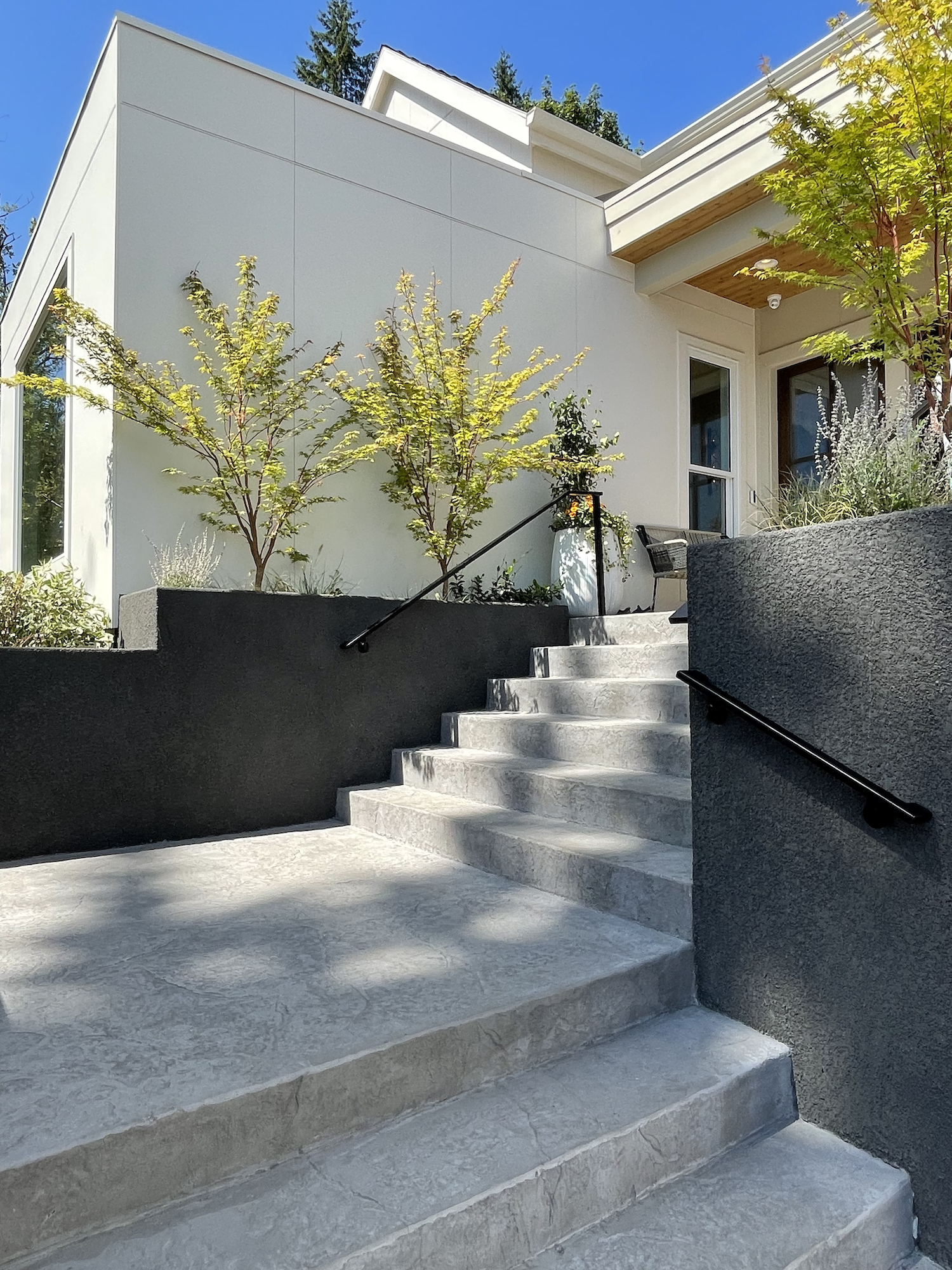
I thought the front exterior entry stairs and planters were very well done. The mixture of materials, colors, and textures they used for the concrete work were superb.
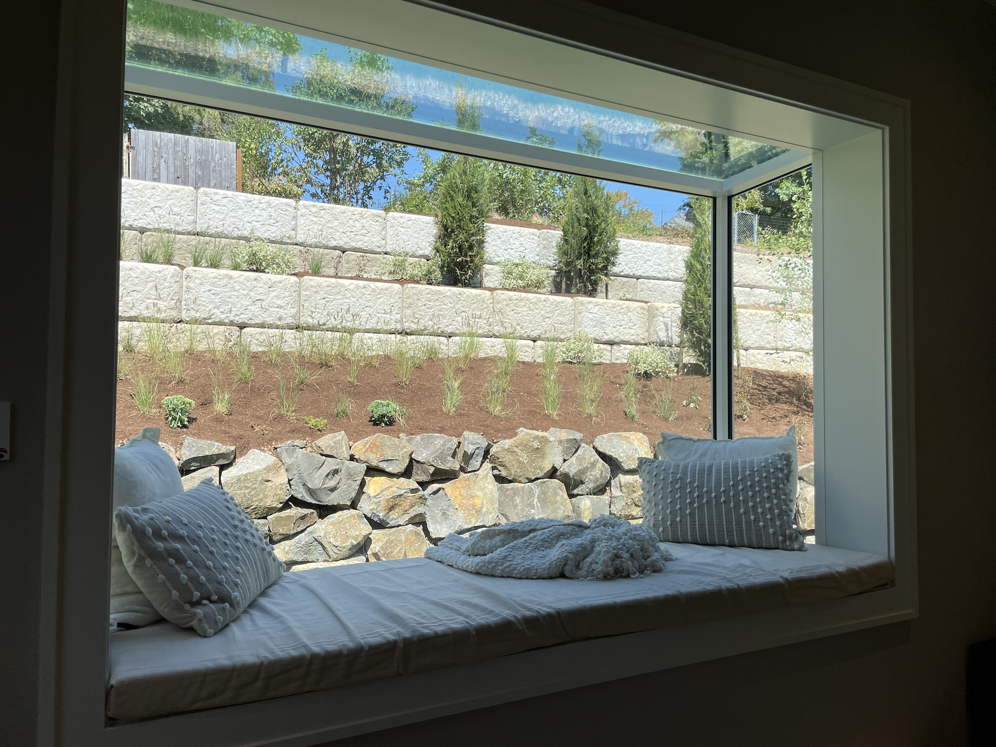
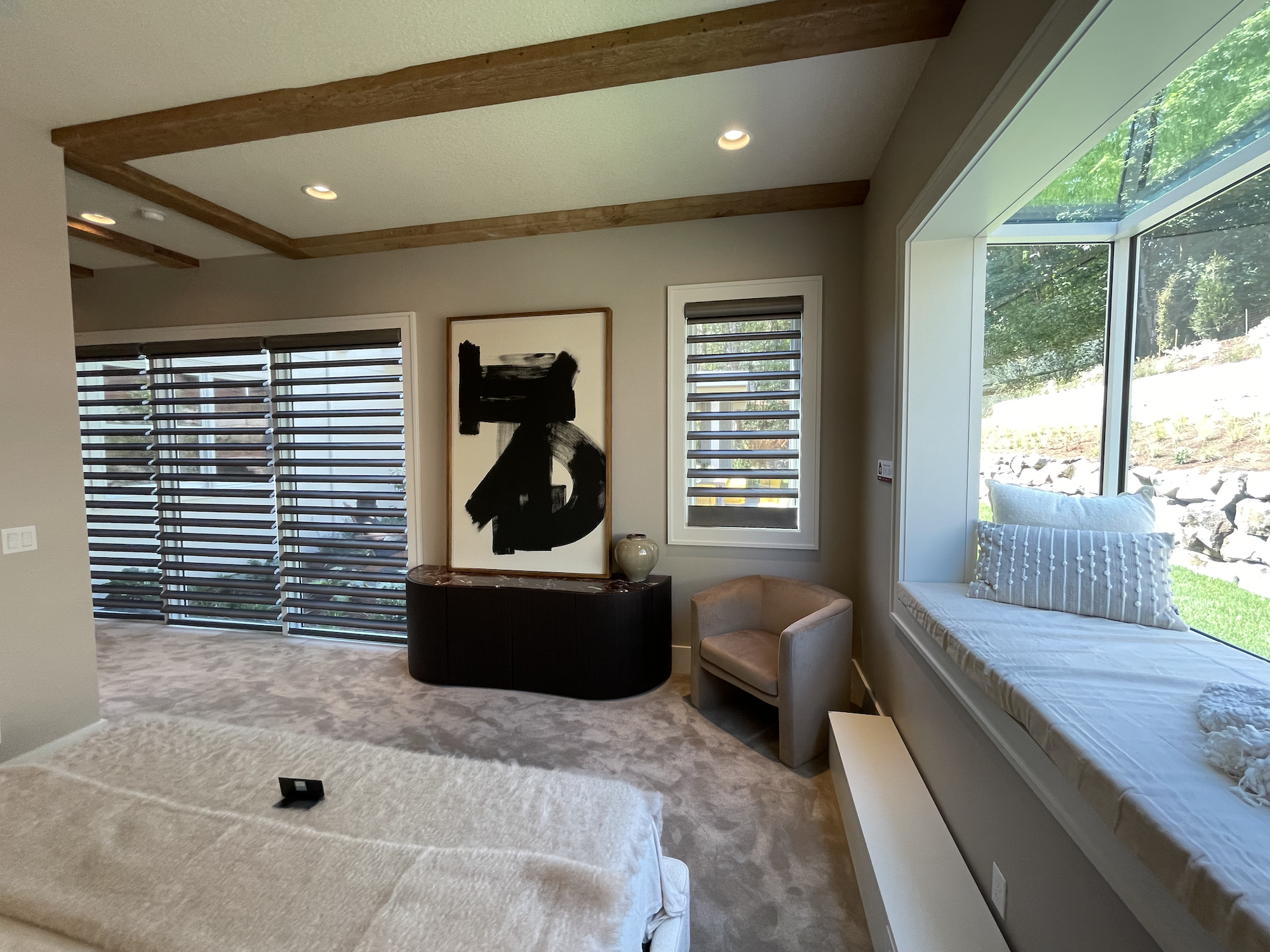
I’m 100% a sucker for a window seat so even though just about everything else about the primary suite was not what I would choose… I absolutely loved this one feature.
The kitchen featured Dacor appliances and I’m a fan of the brand.
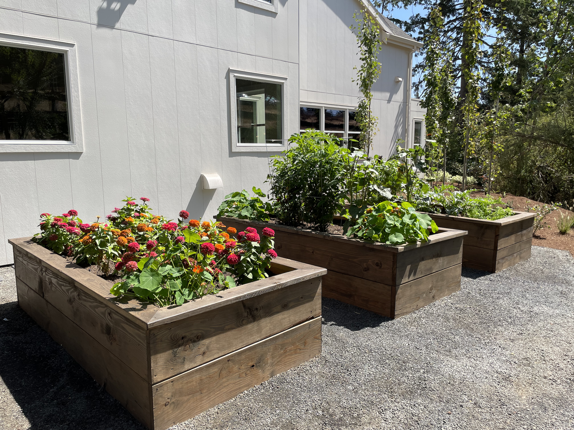
The raised garden beds made good use of what would otherwise have been wasted space.
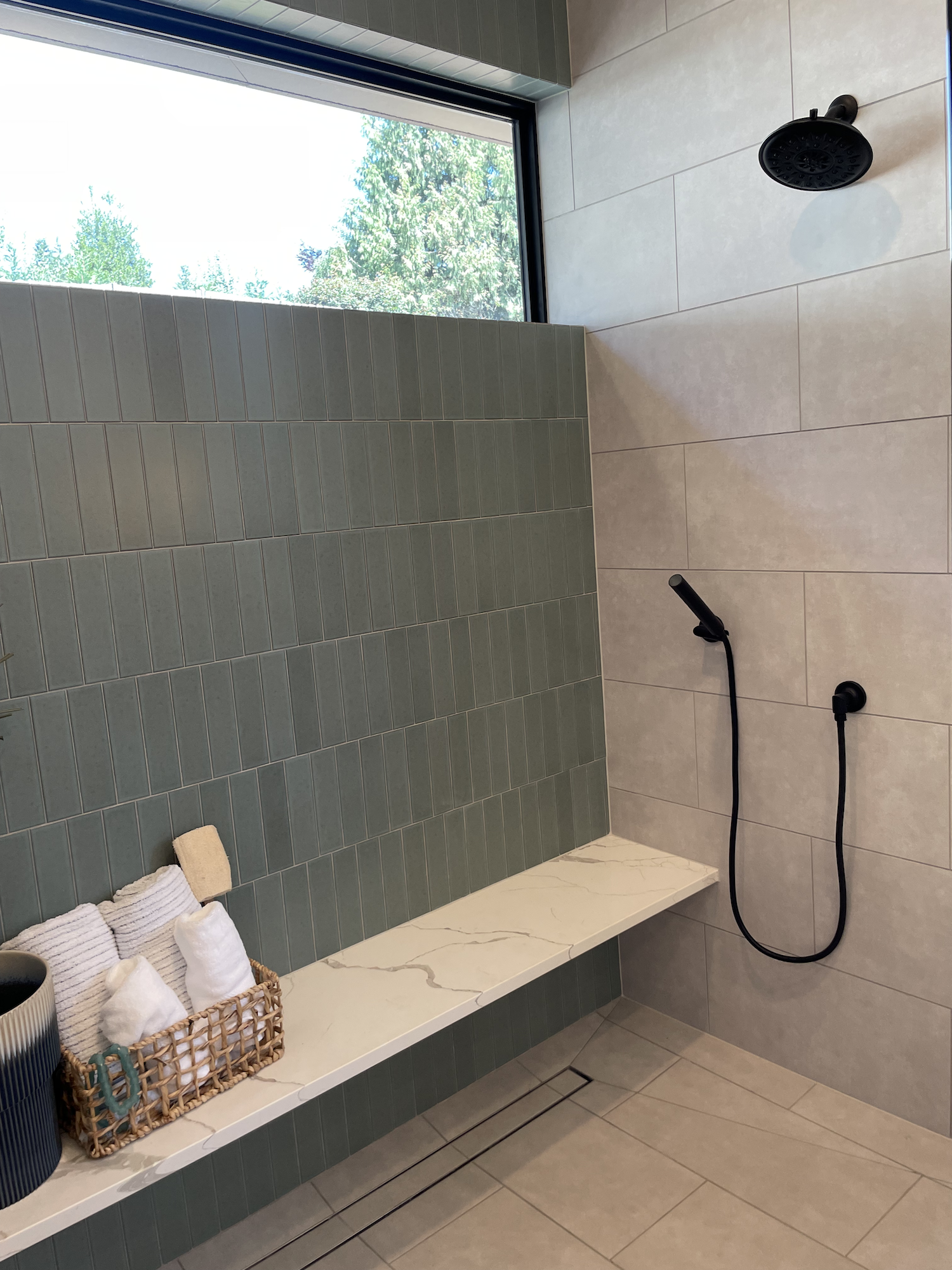
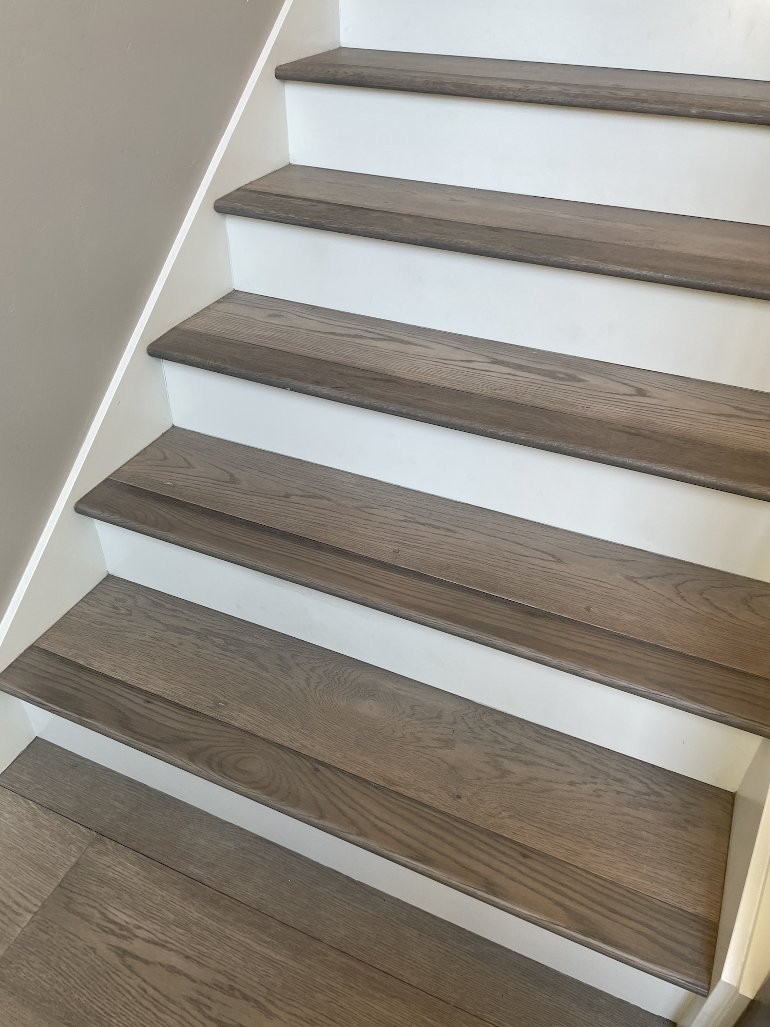
One thing that is just a big pet peeve of mine is stair treads. Oftentimes flooring companies just do a poor job with the stairs, using transition pieces instead of proper treads or using end pieces that don’t match the rest of the flooring (see Home 3 below). This happens with homes of any price point!
In this case, the interior stair treads were beautifully done (I wouldn’t have used the white risers, but that’s just me). Also, the width of each tread and spacing was perfect, regardless of your shoe size. Well constructed!
What… I Didn’t Understand
Let’s start with the fact that everyone has different taste. A custom designed home should be close to everything you want in floor plan, space, materials, etc. There are always compromises… but this really should be a dream home! So, I’m very happy for this family if this is the result they were looking for!

But, this wouldn’t be much of a blog if I gushed about everything :) Let’s start with… I don’t know how anyone could call this home Scandinavian influenced.
In the Street of Dreams literature they alternatively refer to it as Swedish, Danish, and Norwegian. They never use the word Scandinavian but I’m going to for the sake of simplicity.
Check out this article for a quick explanation of the differences.
View fullsize
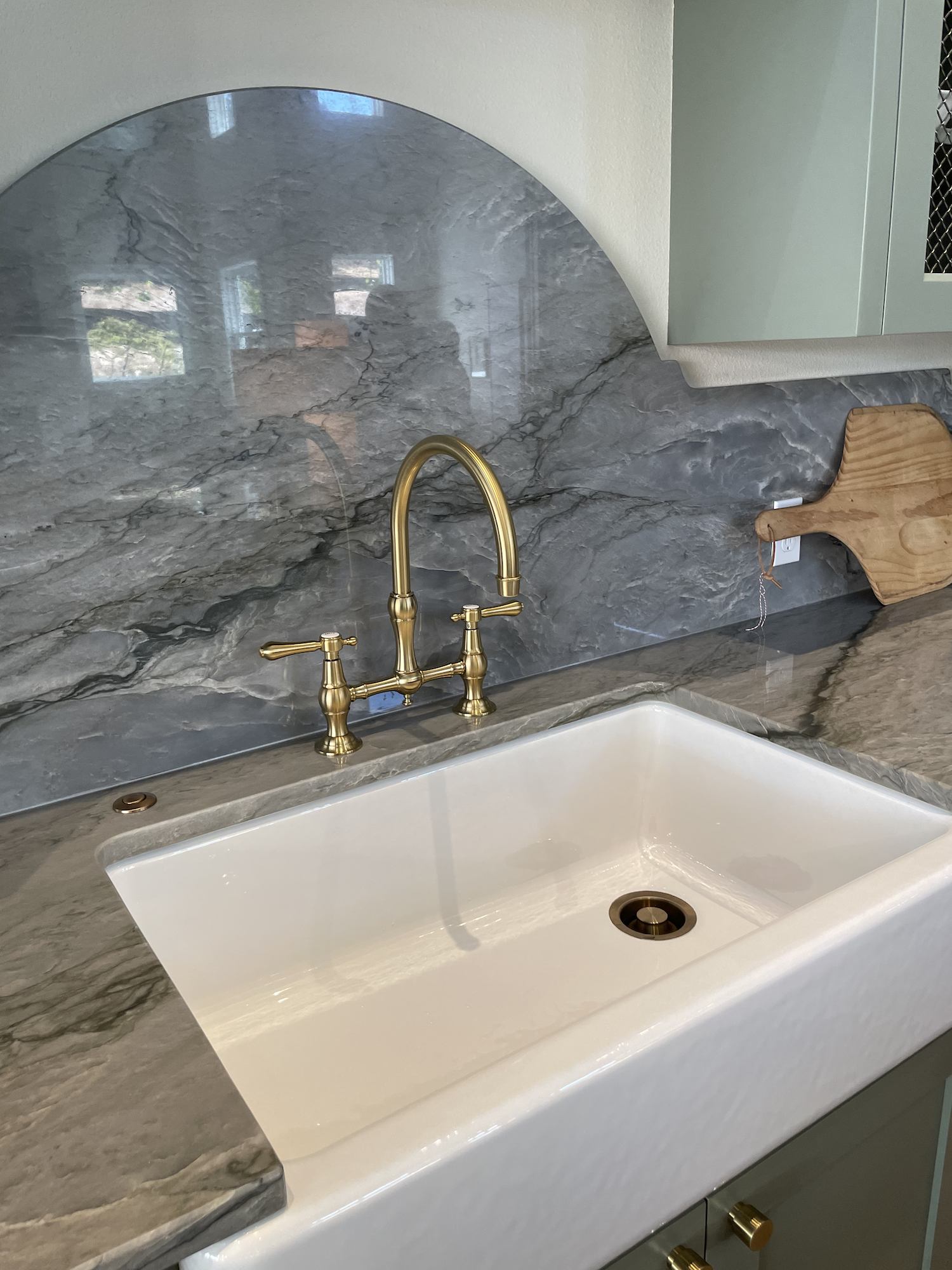
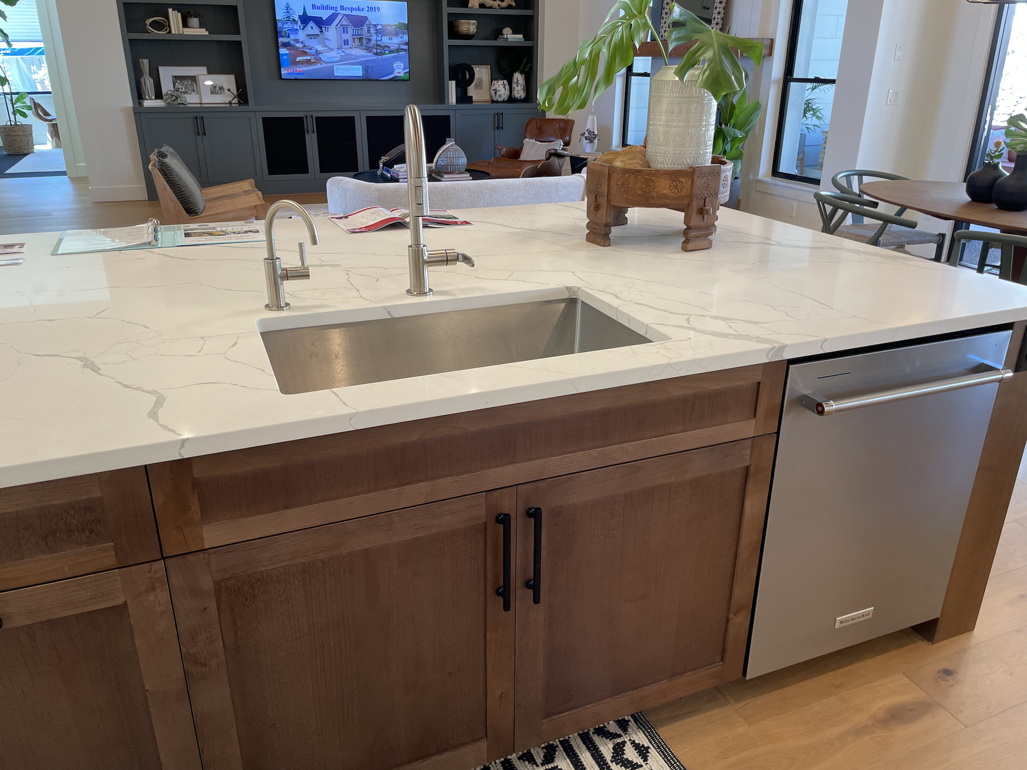
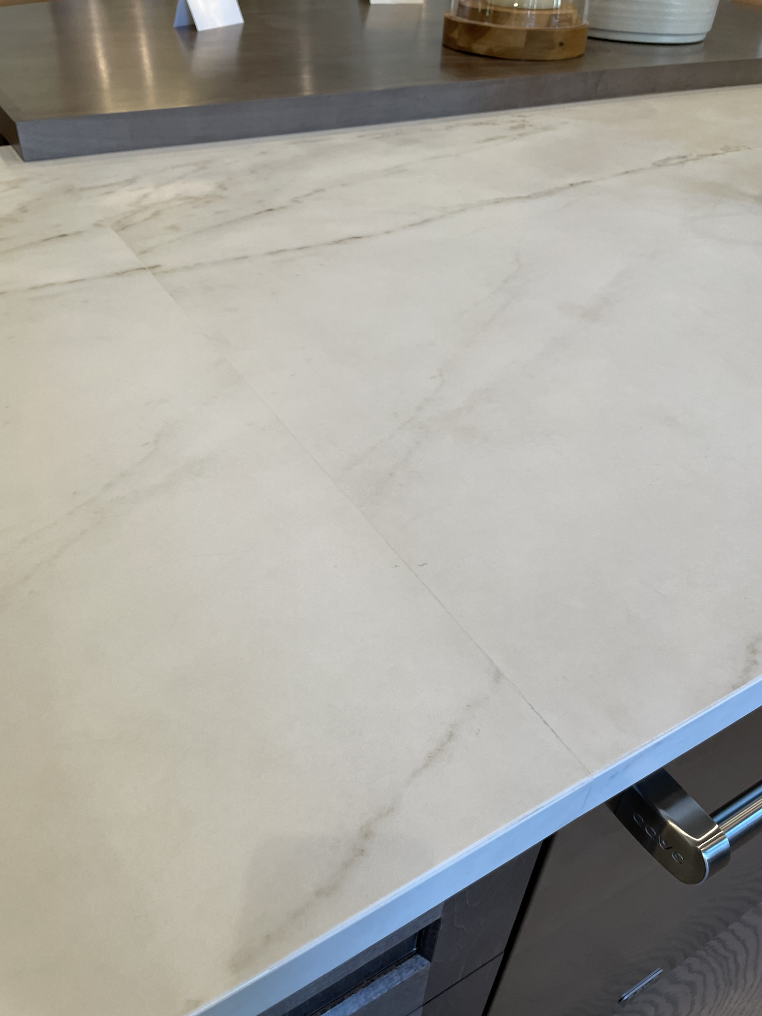
I guess I can see how in the great room they sort-of tried for a form of simplicity, but they utterly lost that in the kitchen with the enormous greenish-veined granite slab that extended into a custom curve above the sink. They definitely committed to the sage green cabinetry… even the cabinet interiors are green!

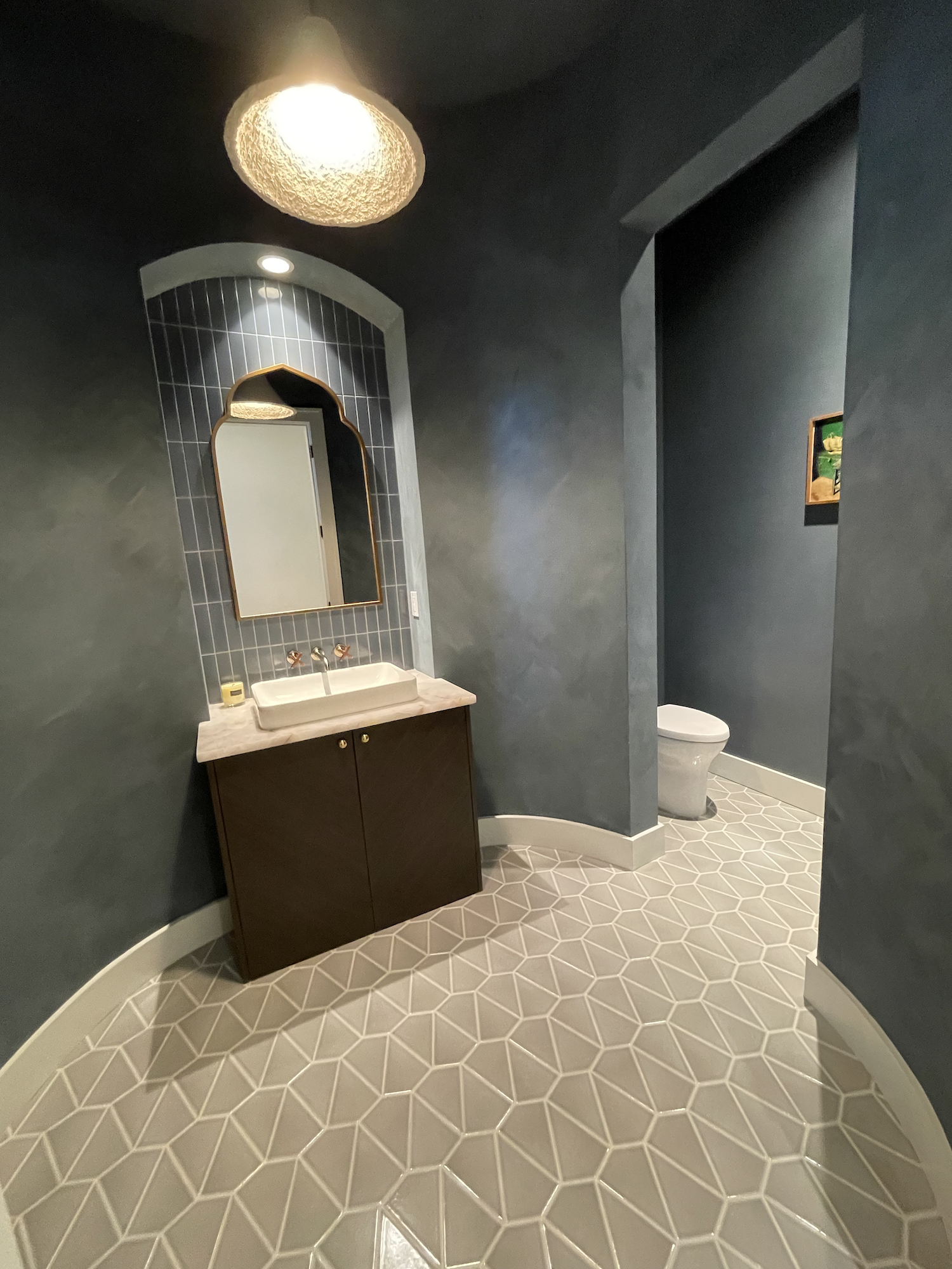
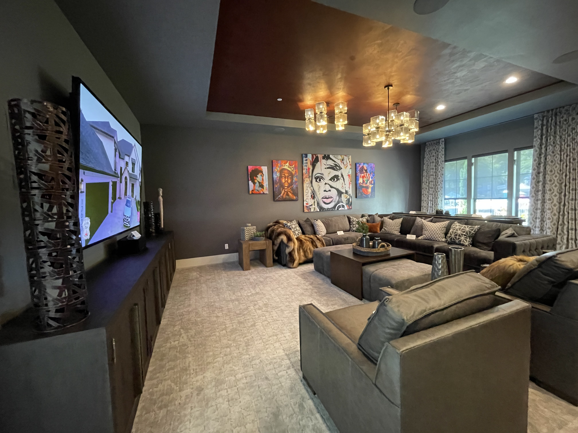
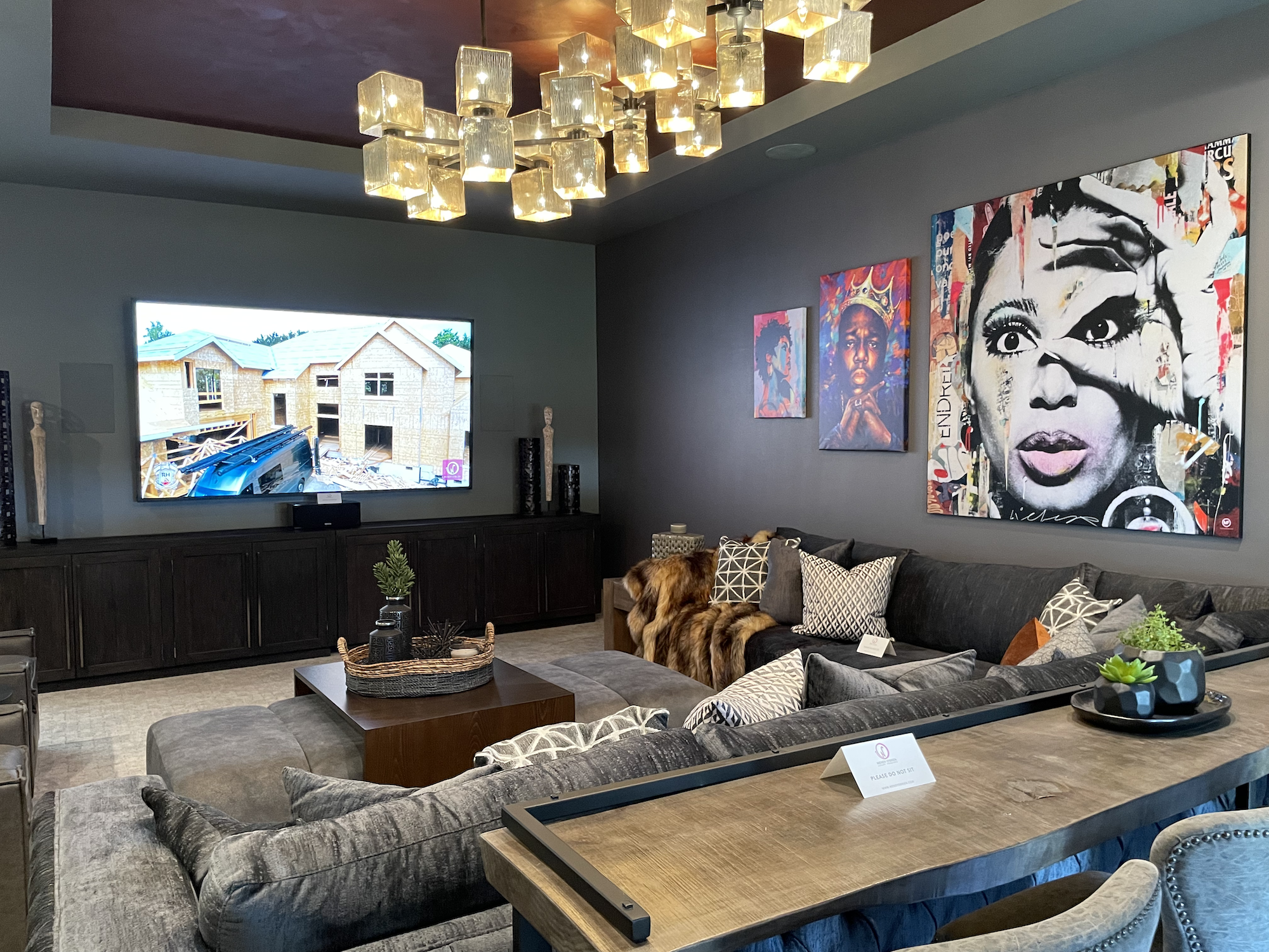
Sparkle Carpet!!!
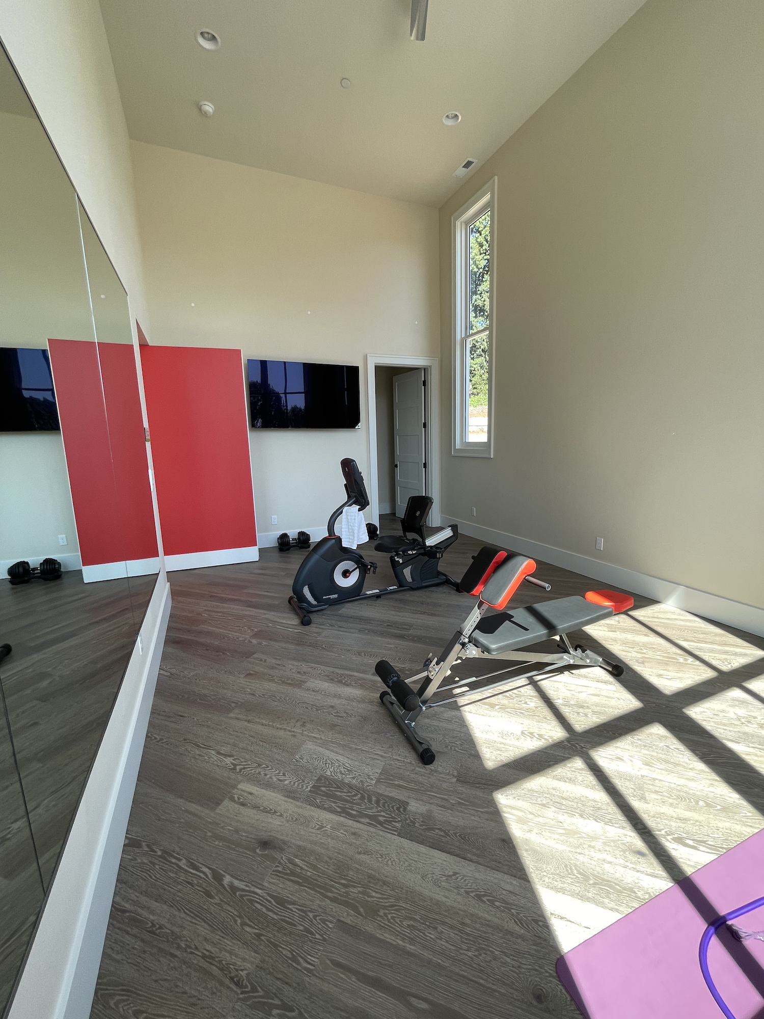
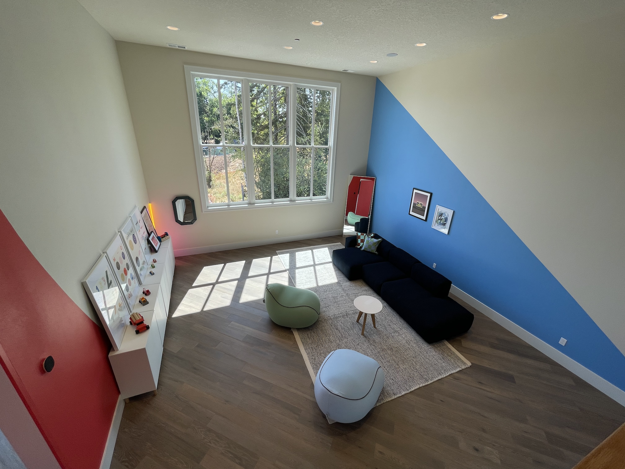
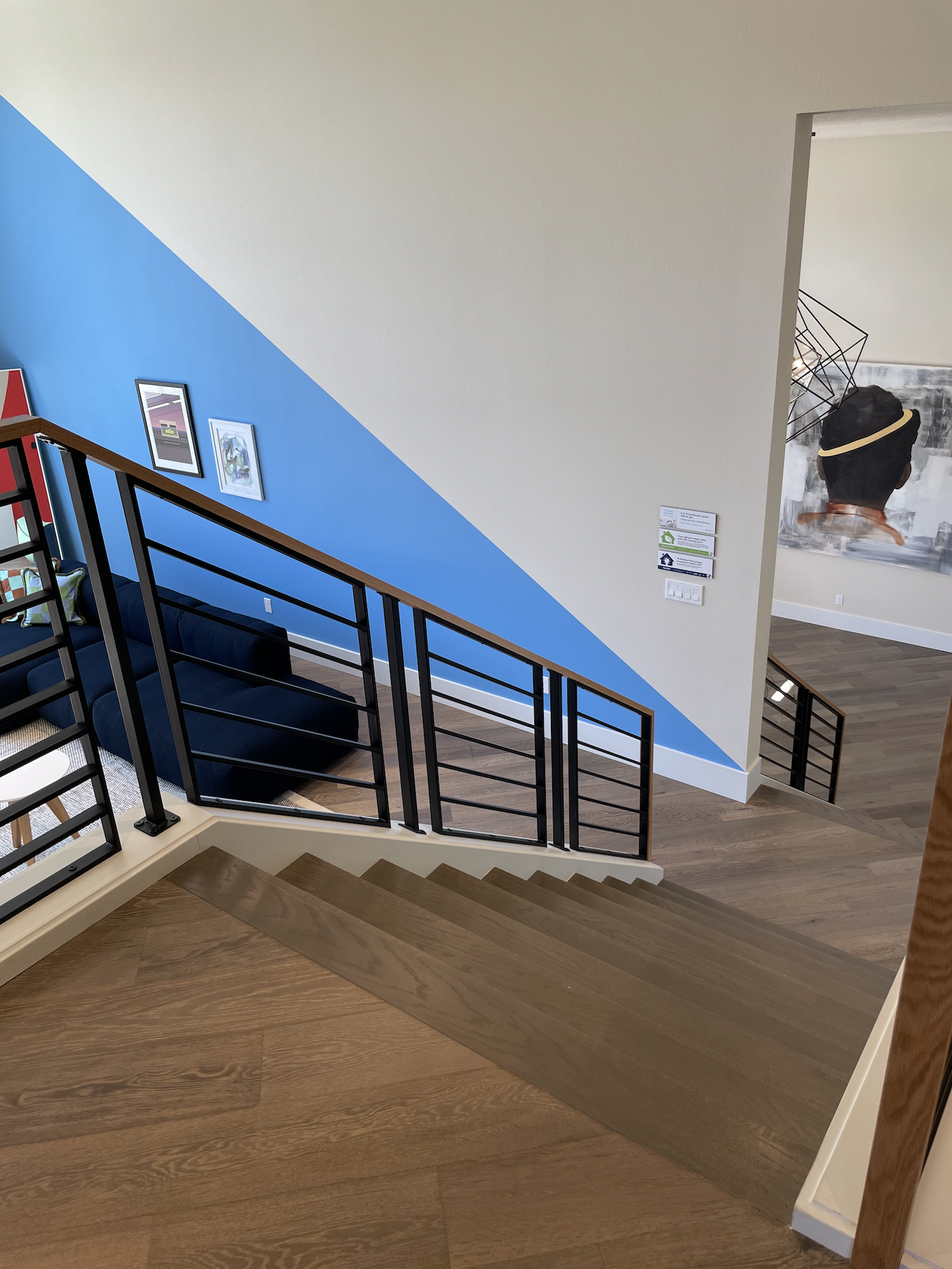
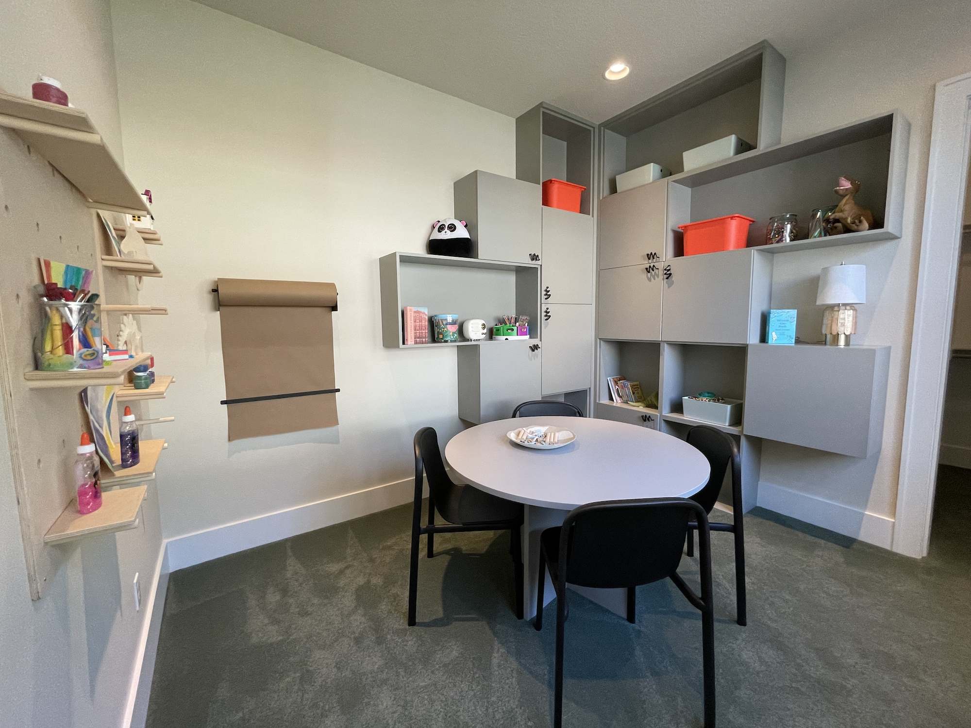
The floor plan was decidedly odd. I can see why they wanted a double height gym, even though it felt kind of weird, because the literature says that they intend to install a climbing wall. Hopefully they intend to do that in the big, open playroom, too; despite the red and blue colored triangles on the feature walls, it currently feels like you’re romping around an enormous sterile warehouse space. Maybe they’ll put in a trampoline?? Given that this big room is completely open to the stairway (it’s located halfway up the stairs), echoing noise is going to be a concern.
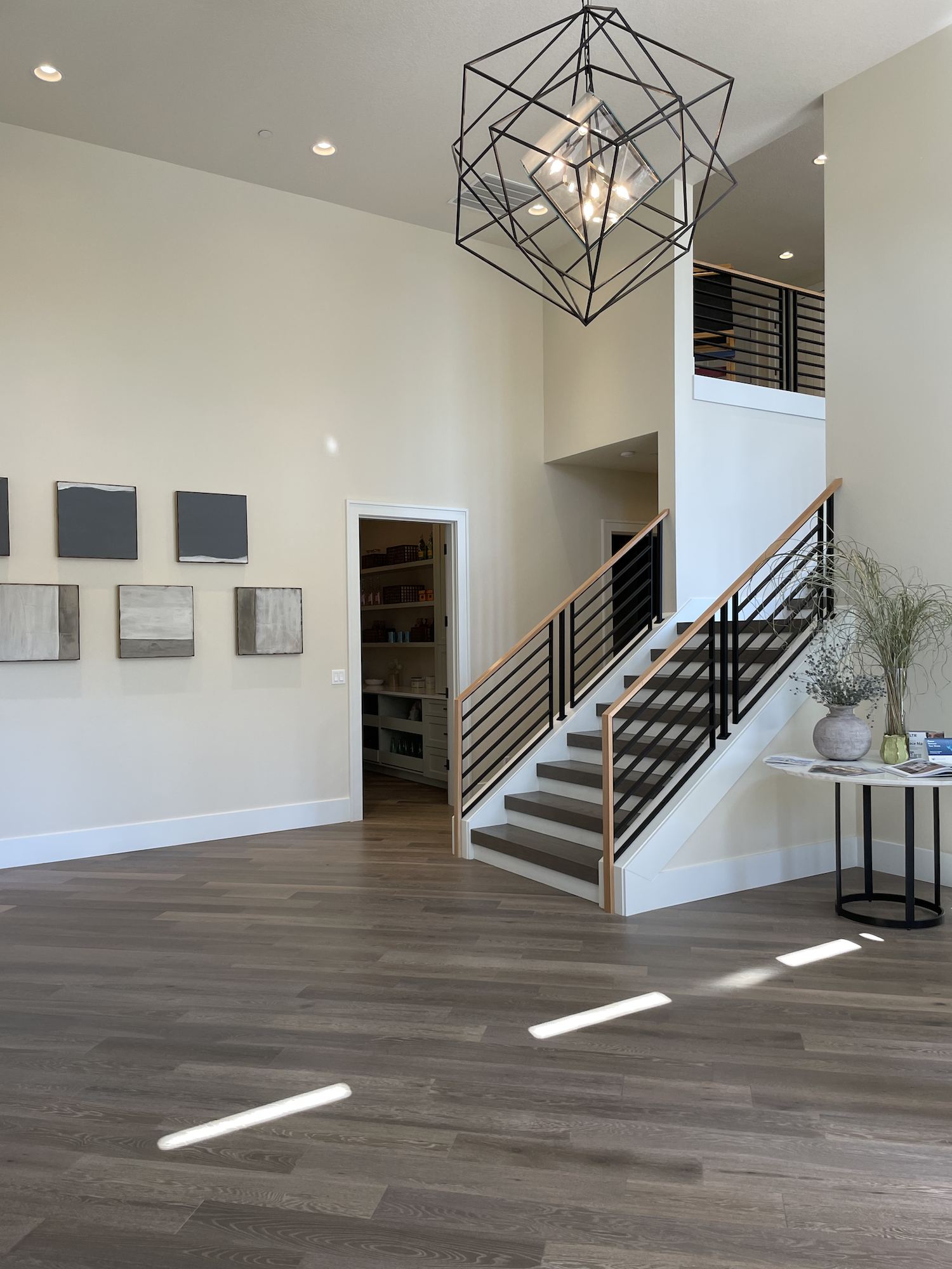
The foyer is also double height, not unusual, but it was the size of a great room! I know personally from going through the design process of my own custom home how difficult it is to properly size the foyer area. It tends to be in the center of a house and abuts many different rooms. But, this was kinda ridiculous. I couldn’t even get a picture that showed how large it was (without using a panorama and catching other attendees in the picture).

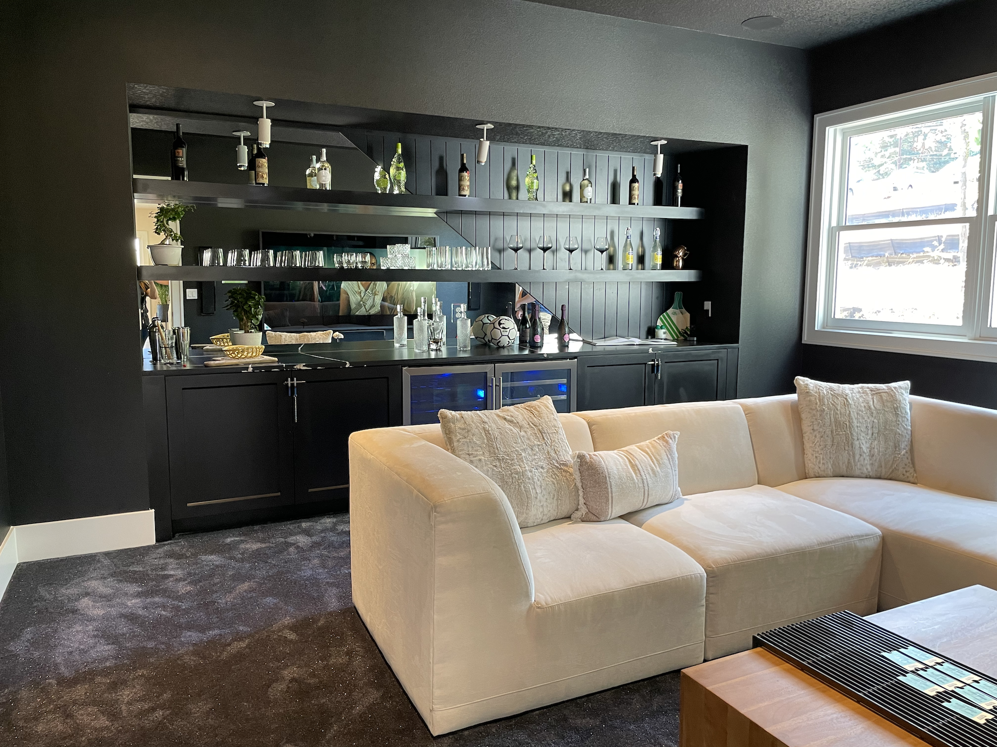
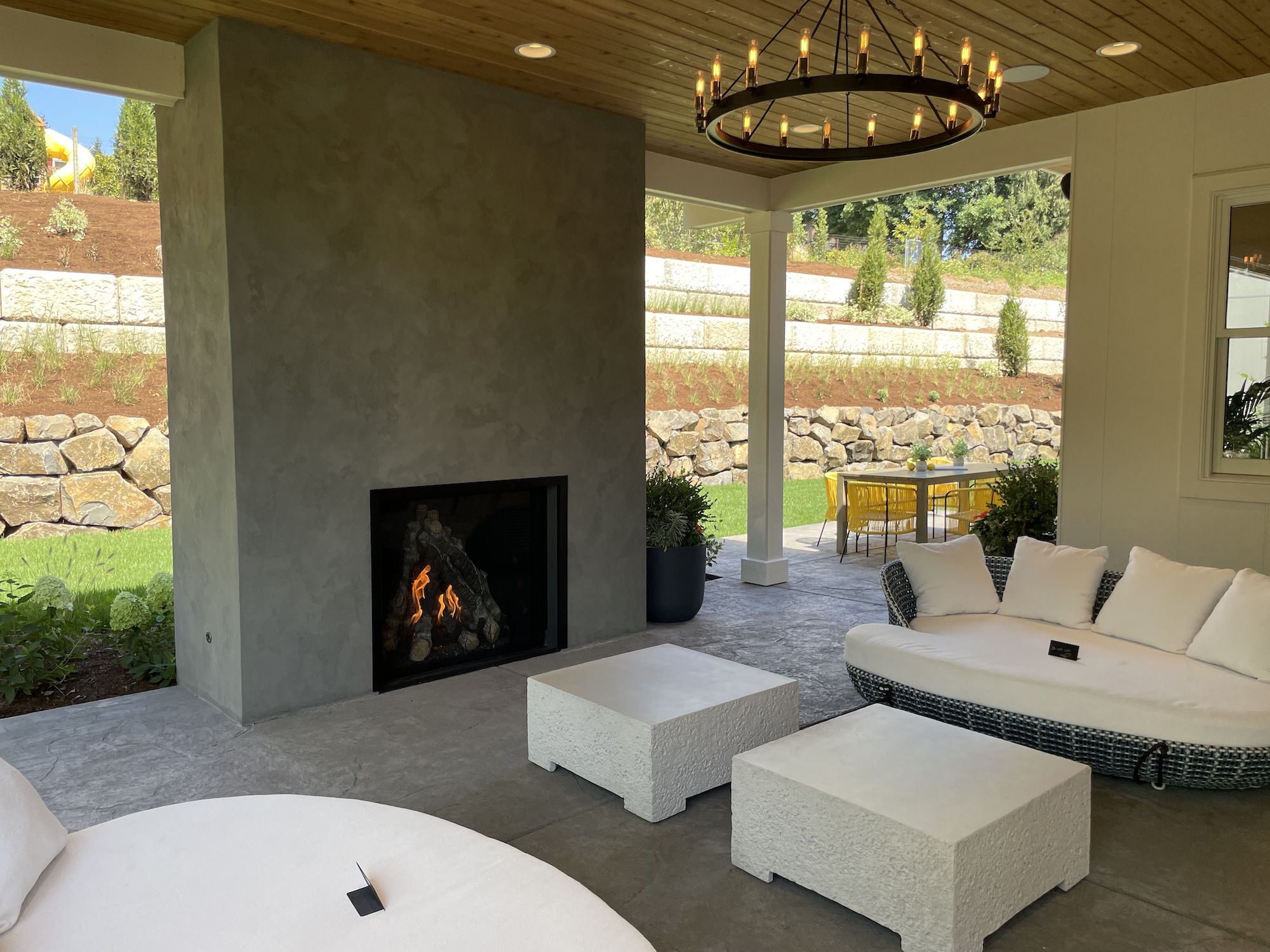
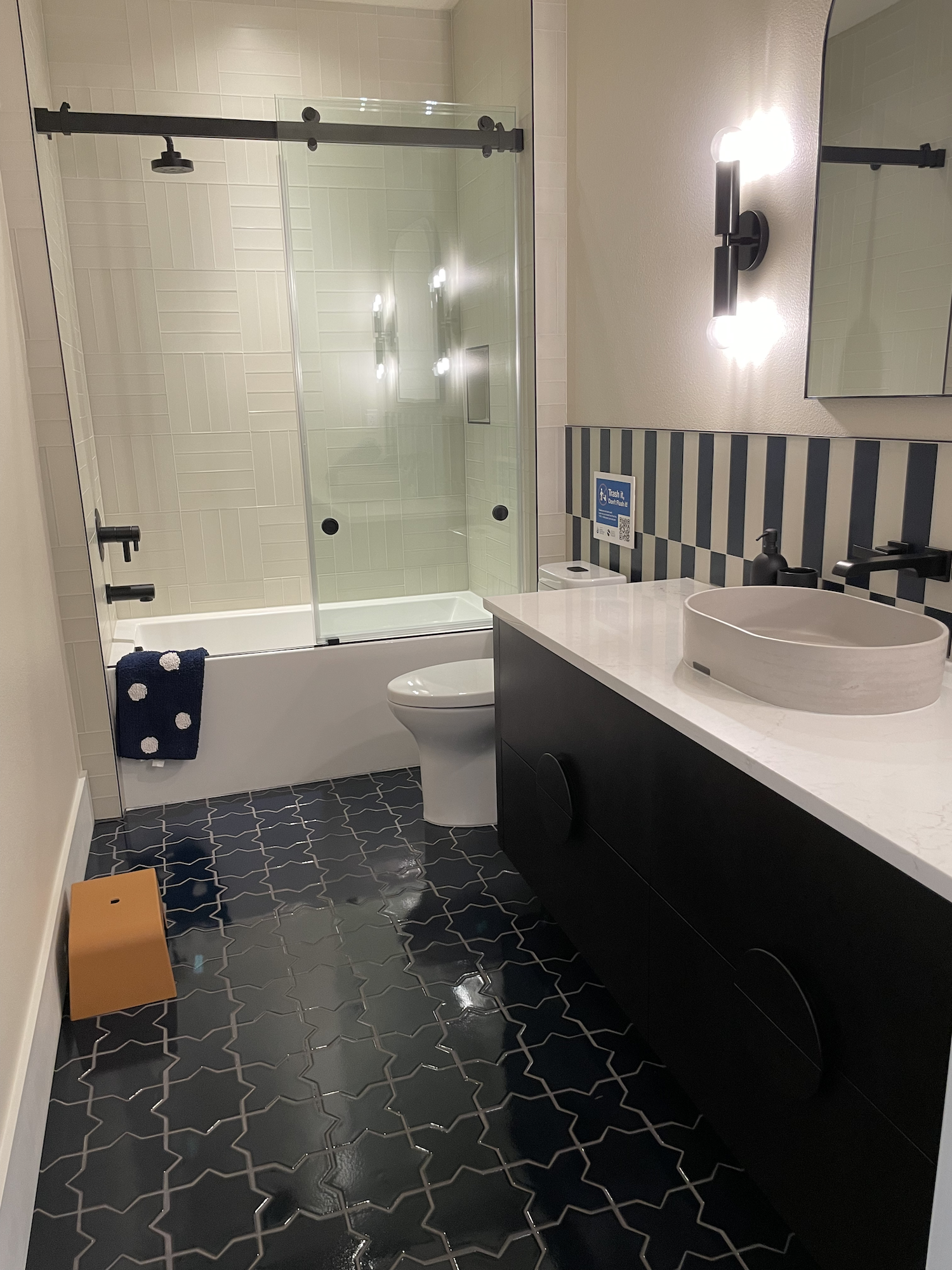
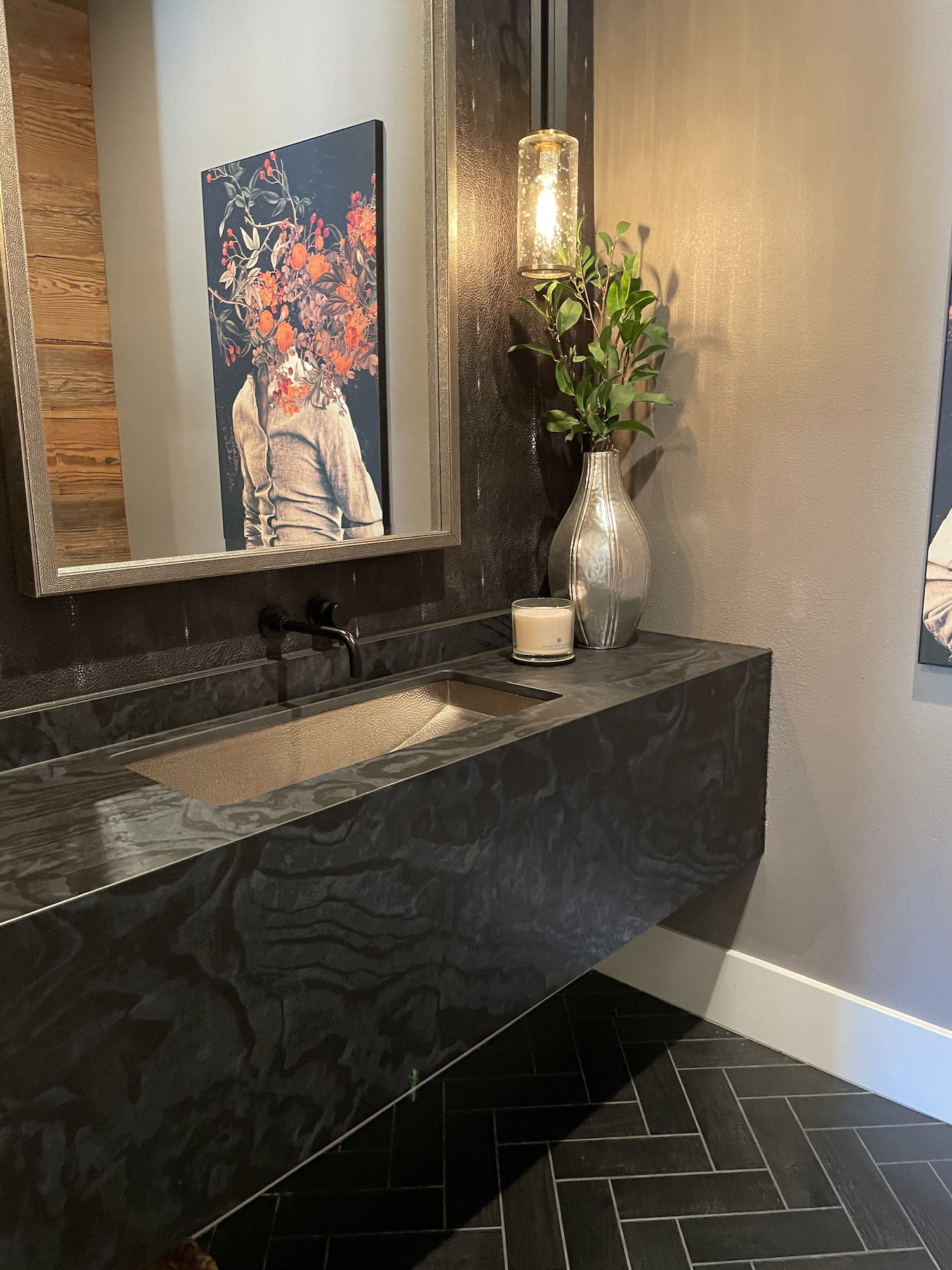
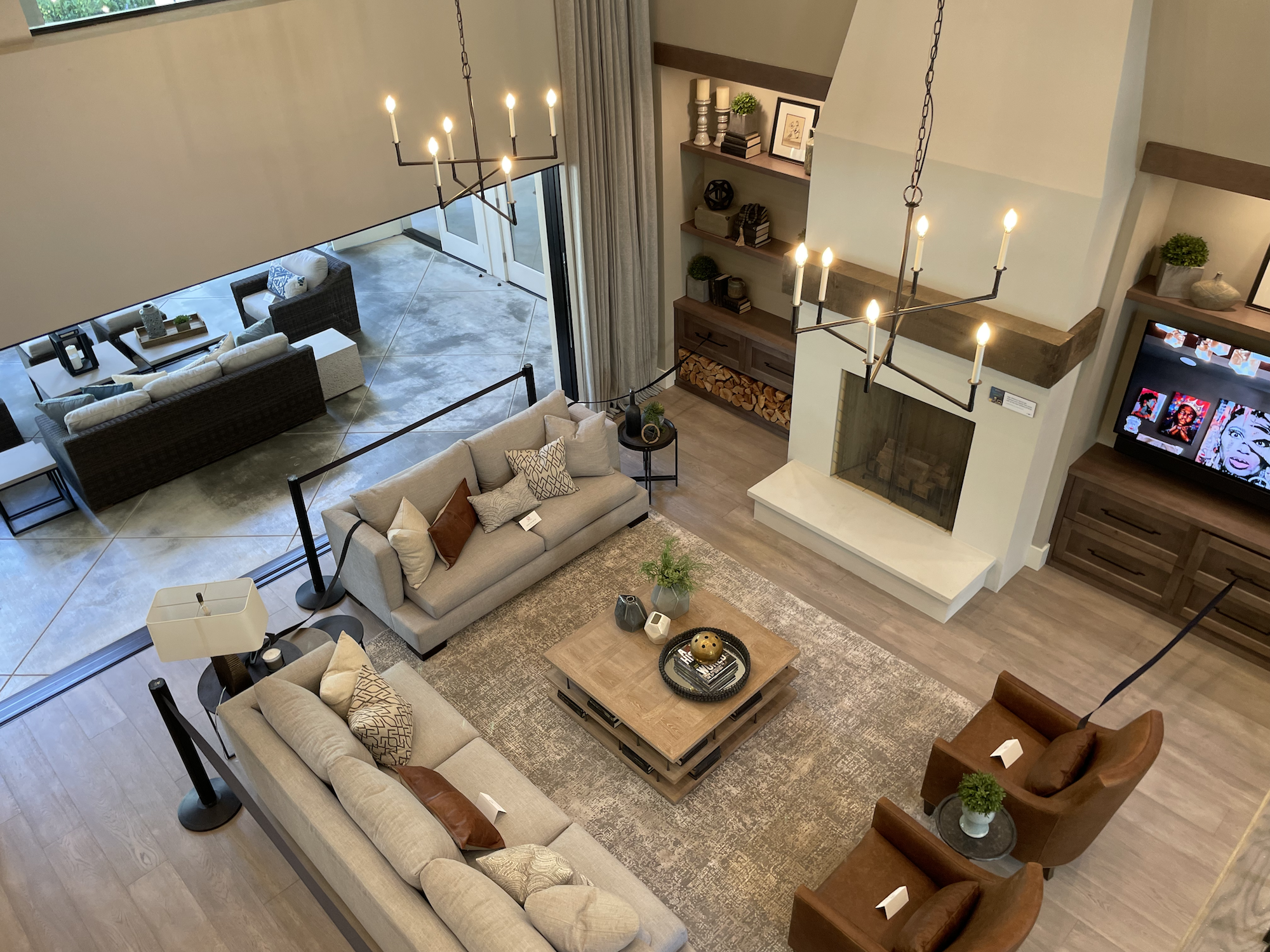
Can we talk about the entertainment room for a moment? It is REALLY tough to make all-black walls and ceiling look good, especially with the semi-gloss paint and traditional orange peel texture used here. But, it was easy to get distracted away from the walls because of the dark blue SPARKLE CARPET. I did my best to take a picture of it but you would have had to be there… this carpet absolutely glittered. Is this something you’d ever find in Norway??
I do LOVE the idea of getting creative in an entertainment/media room, I just don’t think the end result here was very well done (see Home 3 below for one that hit it out of the park).
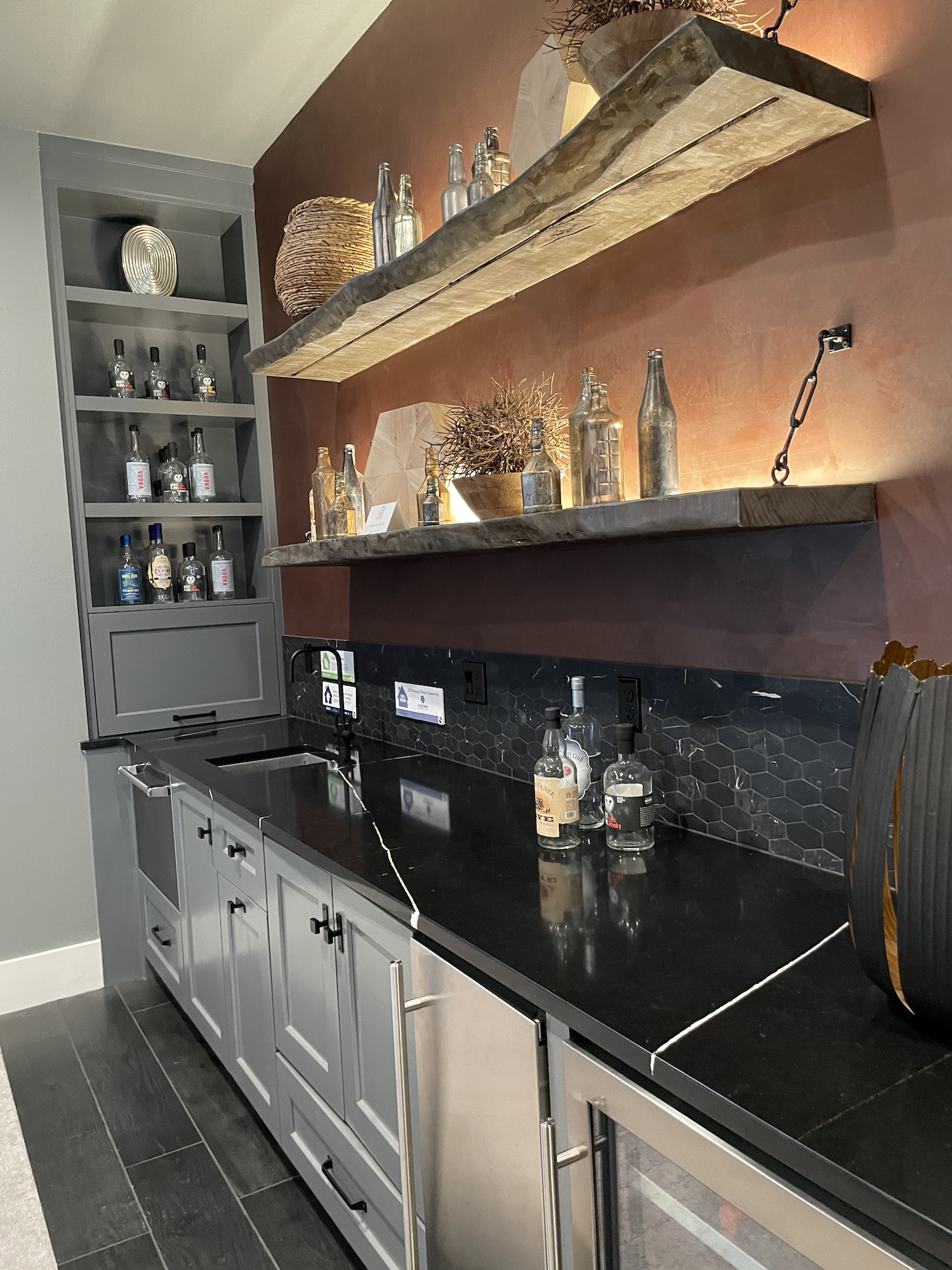
However, that bar area was slammin’.
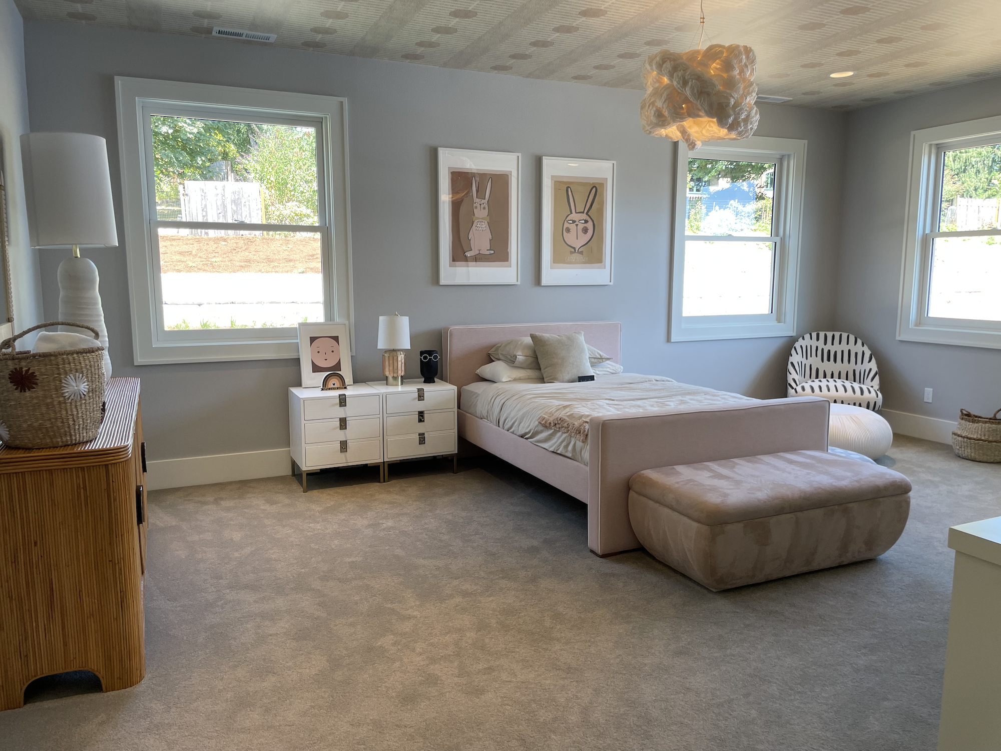
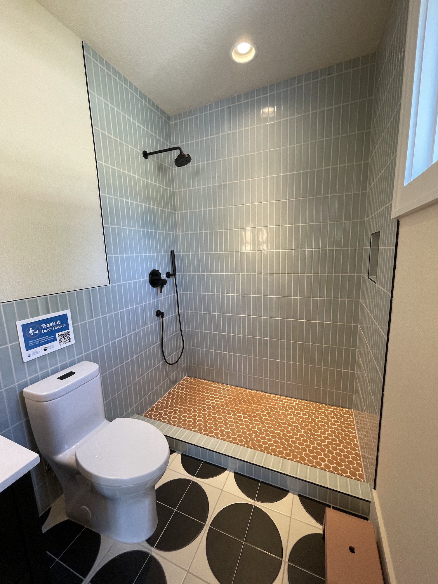
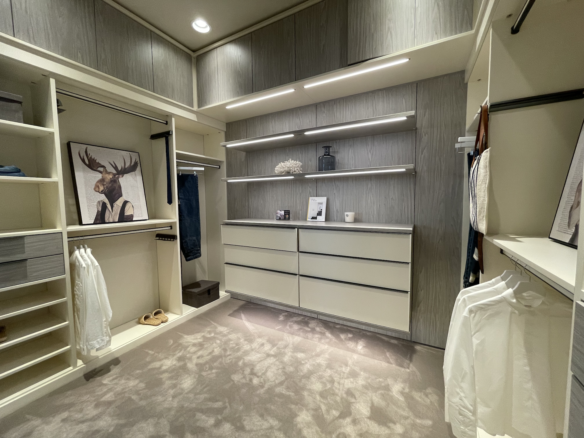
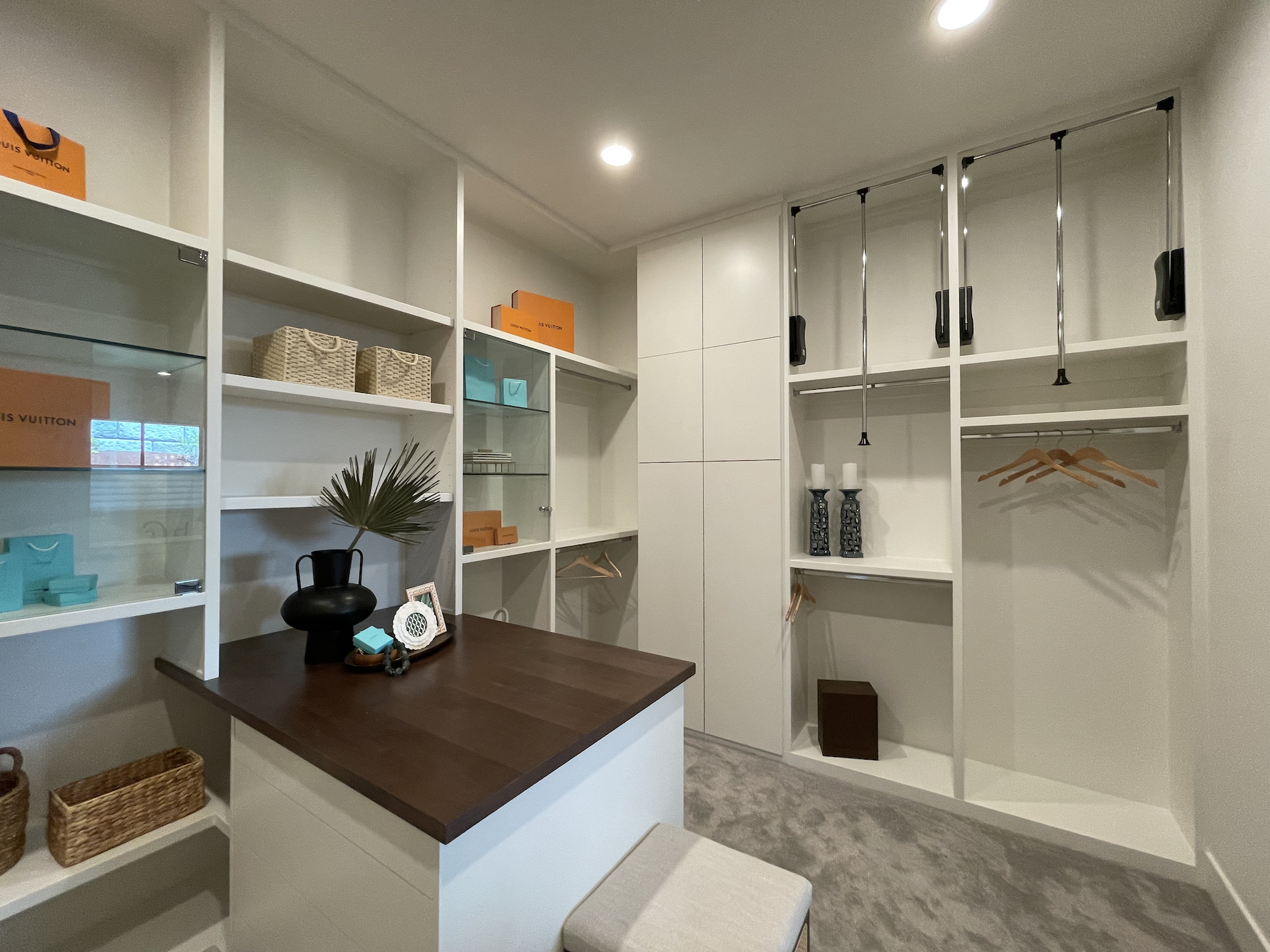
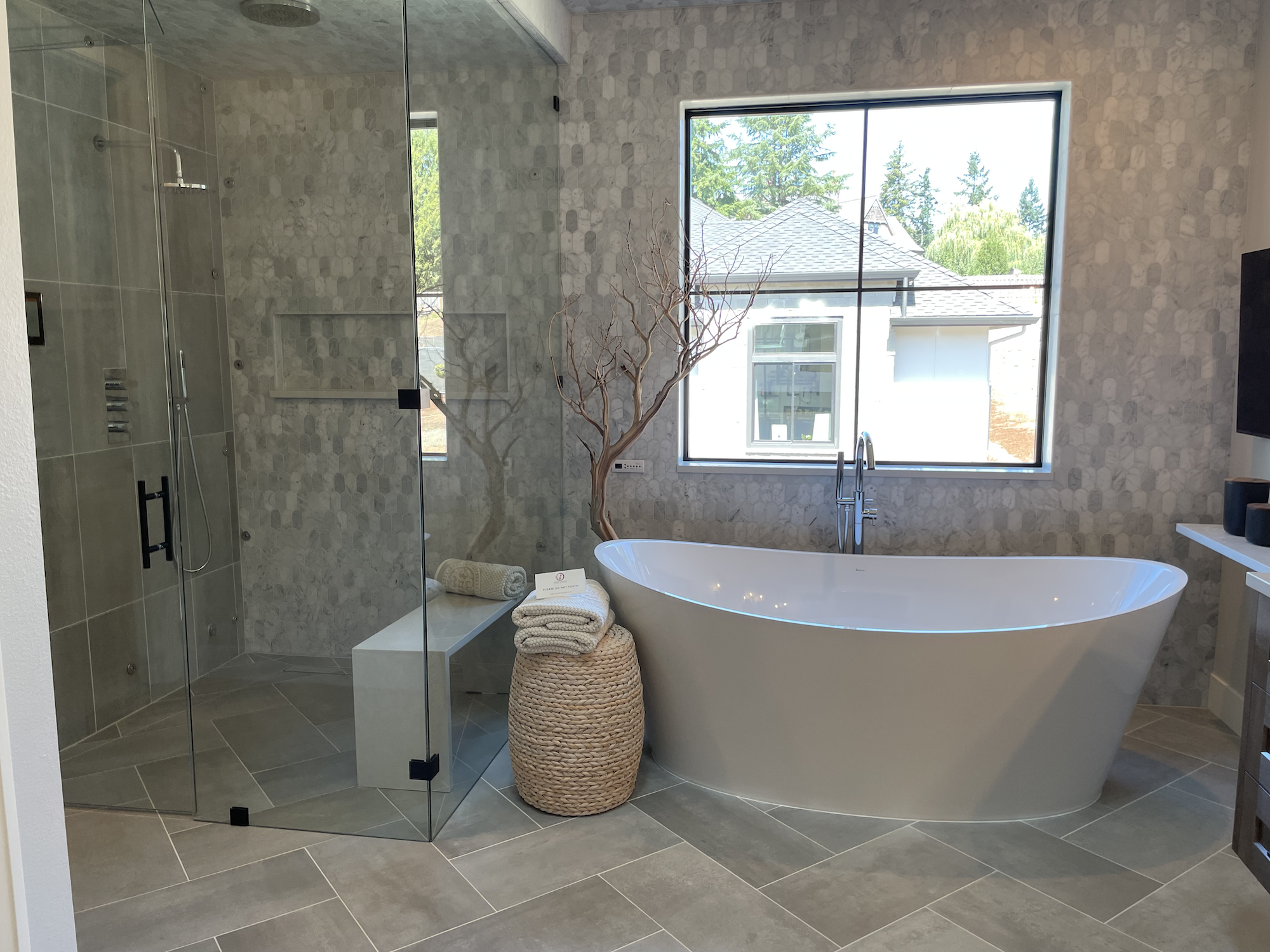
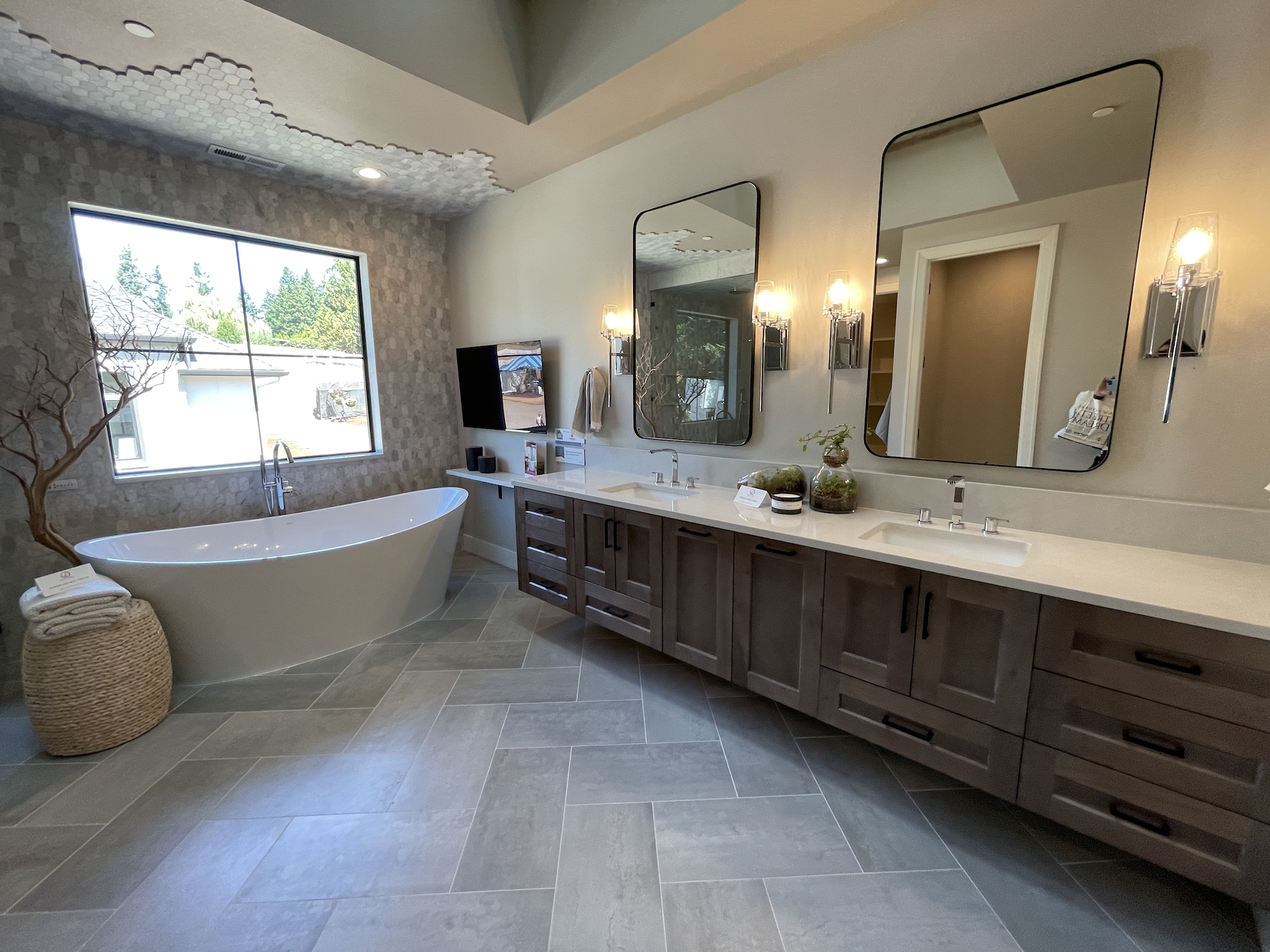
The primary bedroom was fairly small (14’ x 13’) given the size of the home, but they made up for that with the huge bathroom and closet. What surprised me was the oddly shaped yet narrow doorways into the closet. Take a second glance at the picture… those aren’t 90 degree angles.
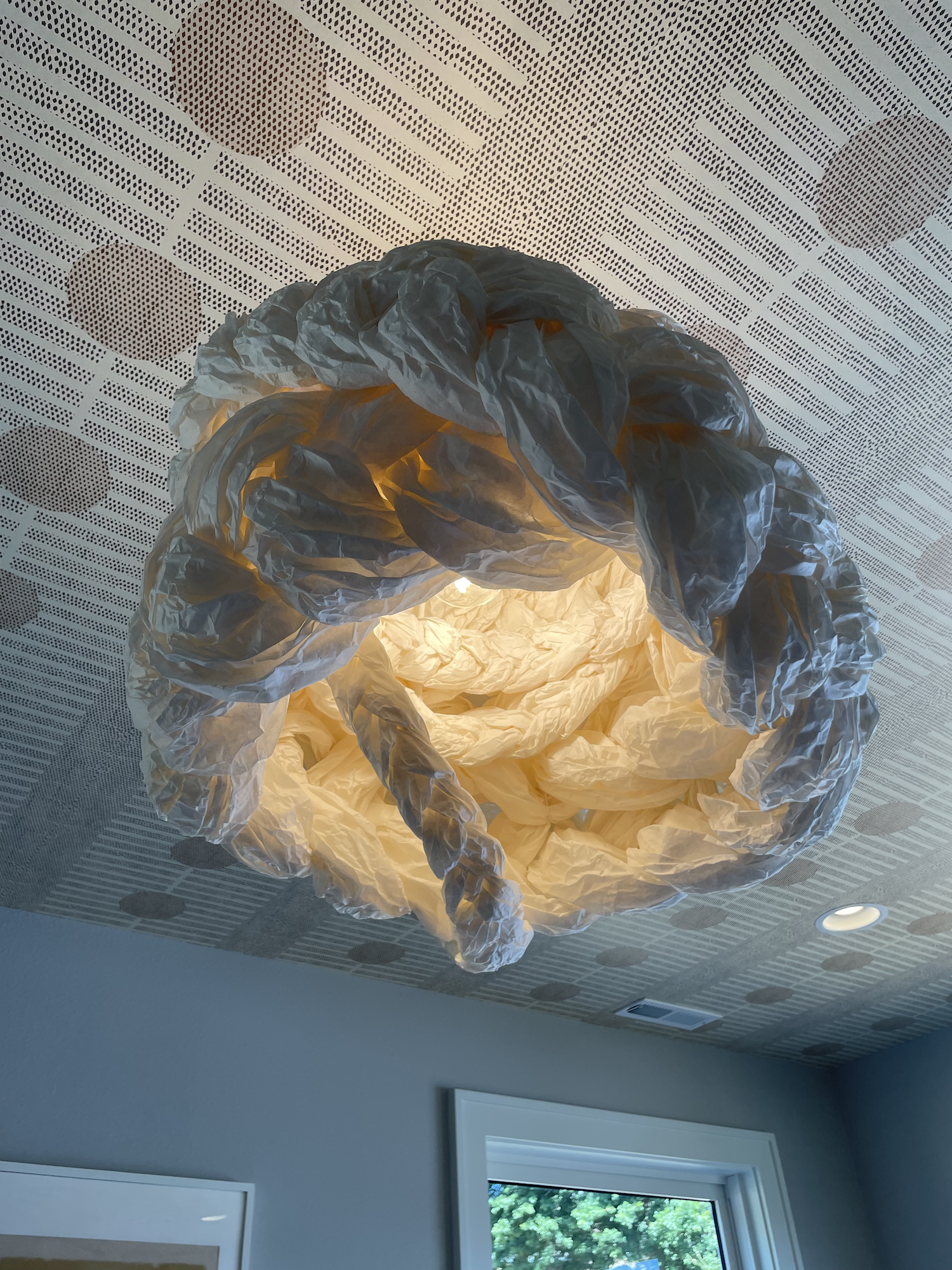
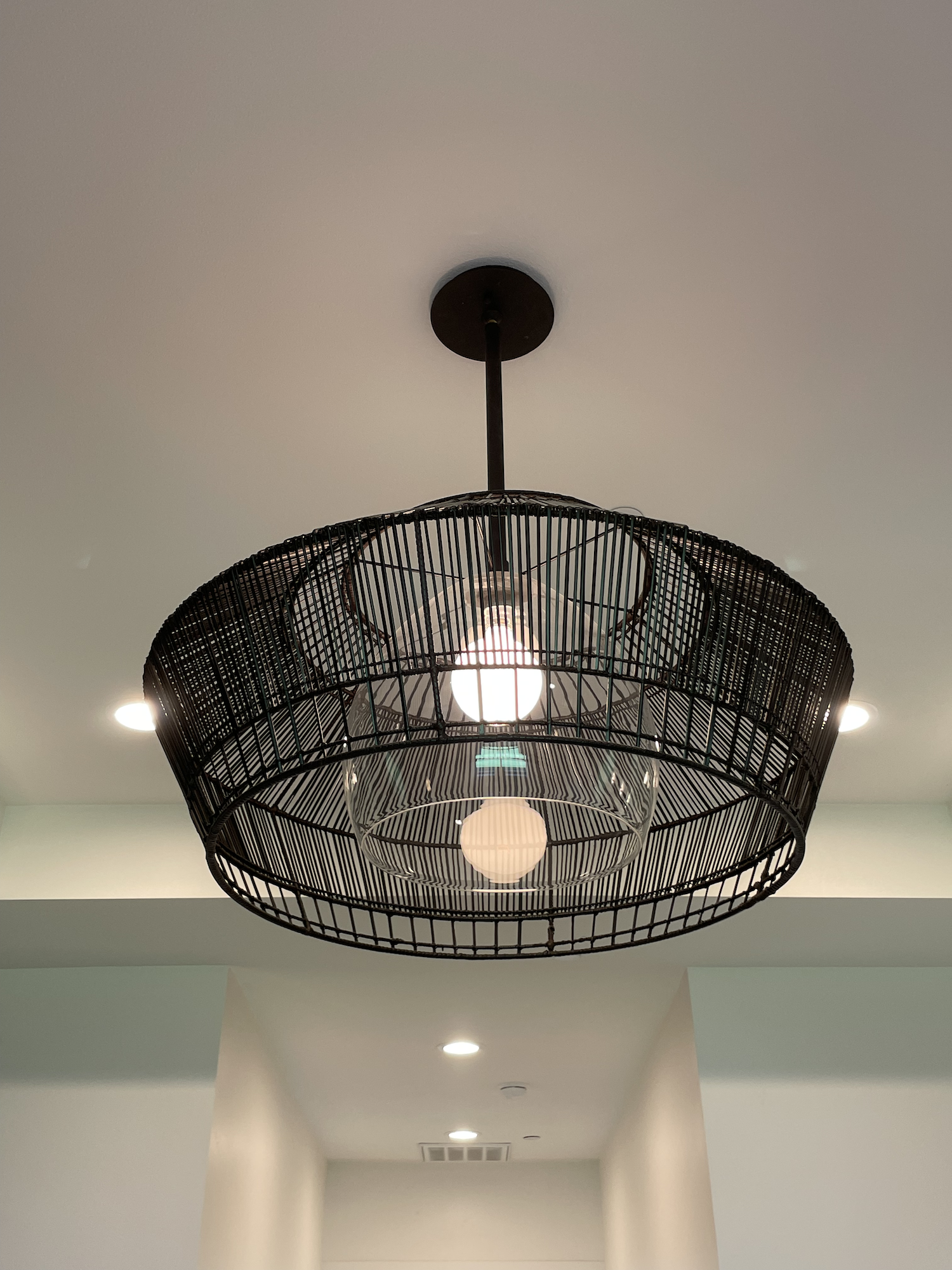
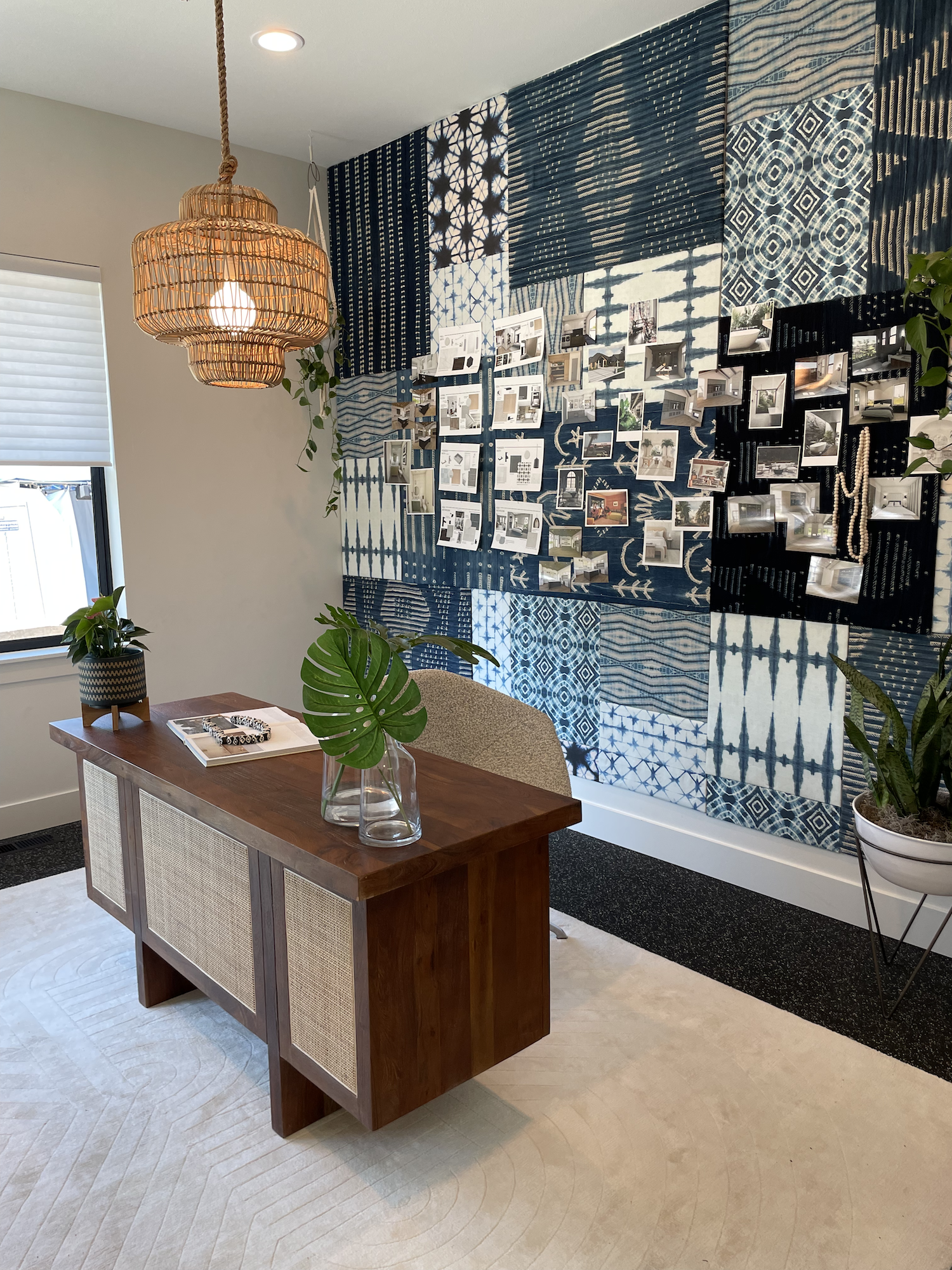
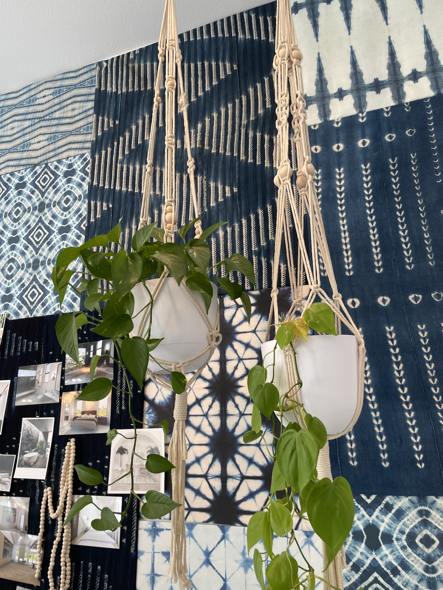
I don’t want to go into too much detail about the various interesting tile, ceiling wallpaper, and light fixture choices… I’ll let you be the judge of whether or not you would have gone for similar pattern, color, and texture combinations.
Whether you like it or not (and judging from the comments of my fellow attendees, most people were not digging it)… I do applaud the homeowners for their bold choices!
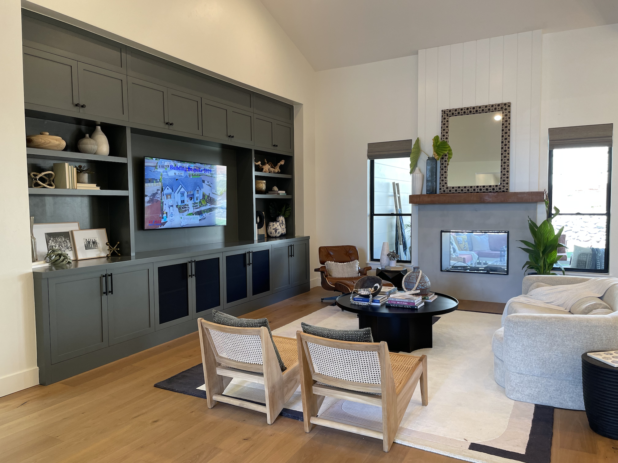
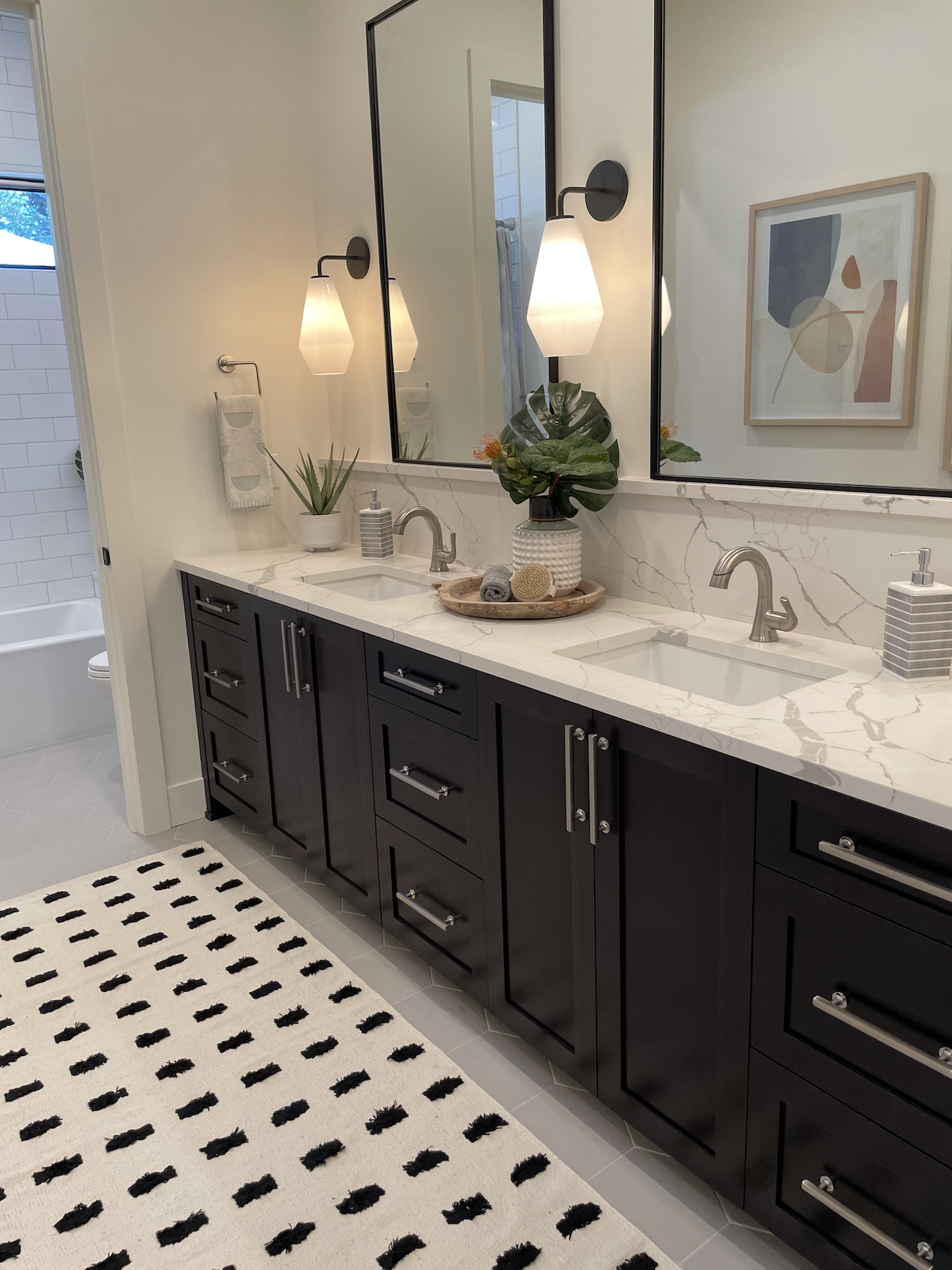
Home 2 - Ohana

Square Feet: 3,384 or 3,834?
Bedrooms: 4
Bathrooms: 3 Full, 1 Half
Ohana was built by Red Hills Construction (who also built Home 3). They describe it as a transitional home that focuses on bringing the outdoors in. It definitely had a bit of Hawaiian flare for styling.
I’m not sure if the home is 3,384 or 3,834 square feet… The SoD website says one and the SoD magazine says another. Since the published floor plans on this one don’t include room dimensions, I’ll leave it to you to guess! (I’d put my money on 3,834.)
I really appreciated the single level floor plan with lots of age in place features. If you’re going to spend the time and money constructing a custom home, it makes sense to try to make it a forever home!


I didn’t love that steep driveway but sometimes you have to compromise to build a dream home.
Okay let’s look at pictures!
Click a picture to enlarge and scroll through. Click here to view the floor plan. Info about various sub-contractors is available on the show guide.
My commentary is below!
What Was Great!

Can you tell there’s a garage to the left of the entry?
I think the floor plan here was mostly a hit. When I walked up to the home, I didn’t even realize there was an extra 2 car garage tucked away to the left of the entry!
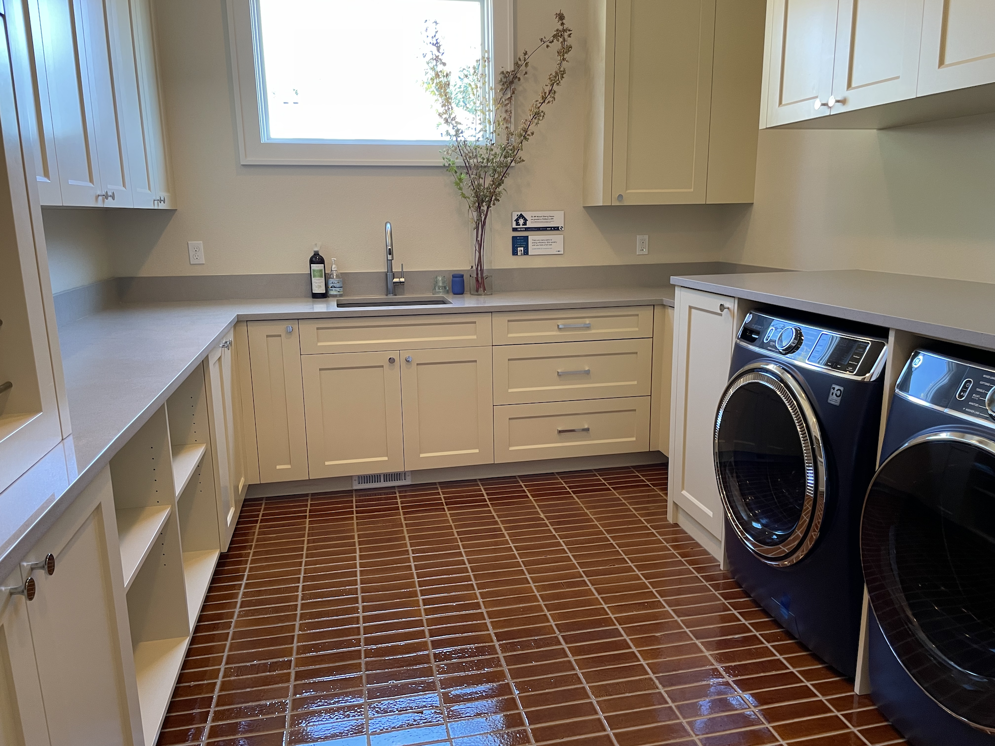
The primary bedroom suite + a fitness room take up the entire west side of the house and all the other bedrooms + laundry are on the east side of the home off the main garage.
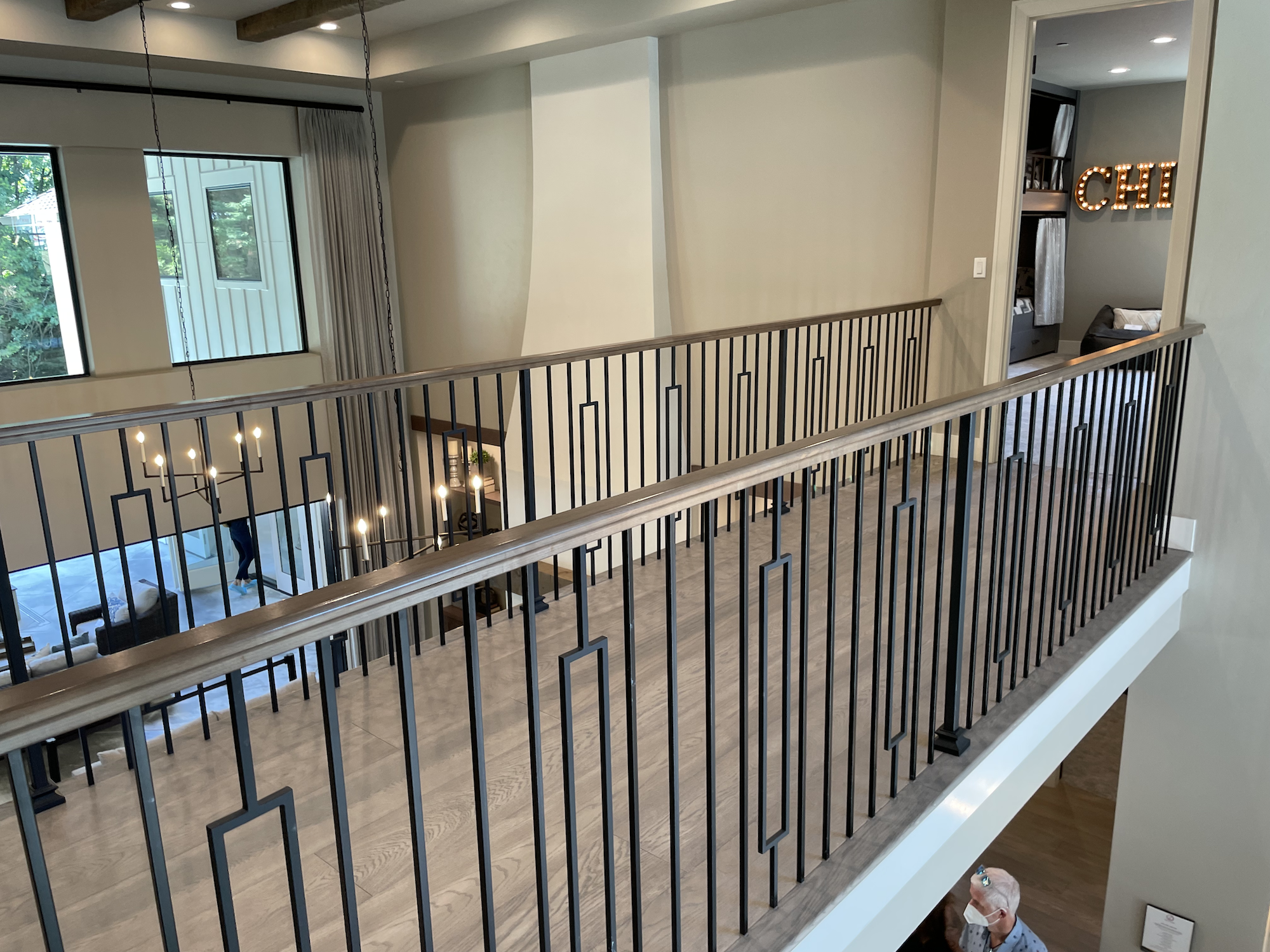
We don’t know for sure what the square footage is, but whether it’s 3300 or 3800, this is a more modest sized home compared to Homes 1 and 3. And yet, it’s got all the things. Media room, fitness room, lots of bedrooms, big primary suite, and a good sized great room.
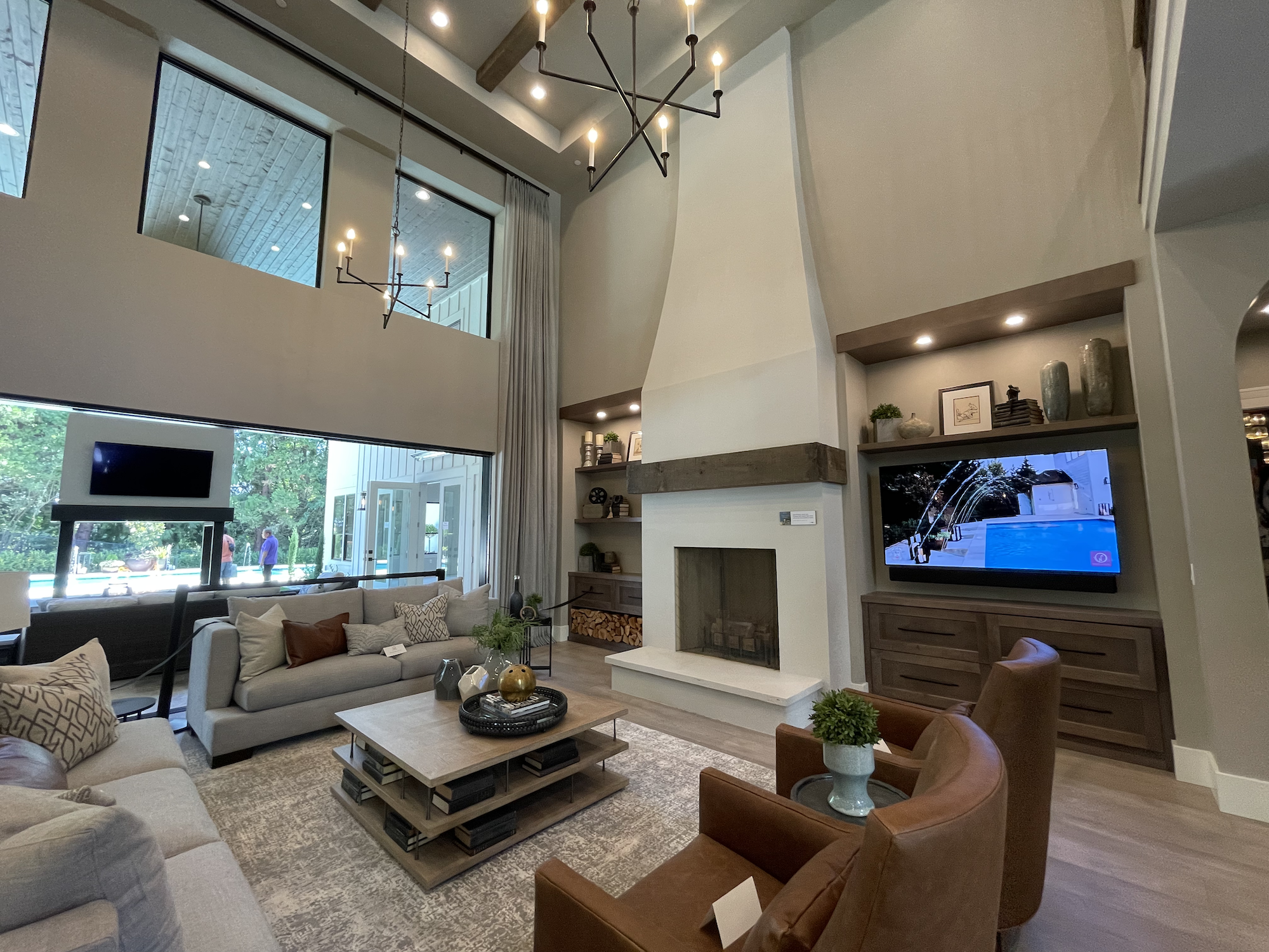
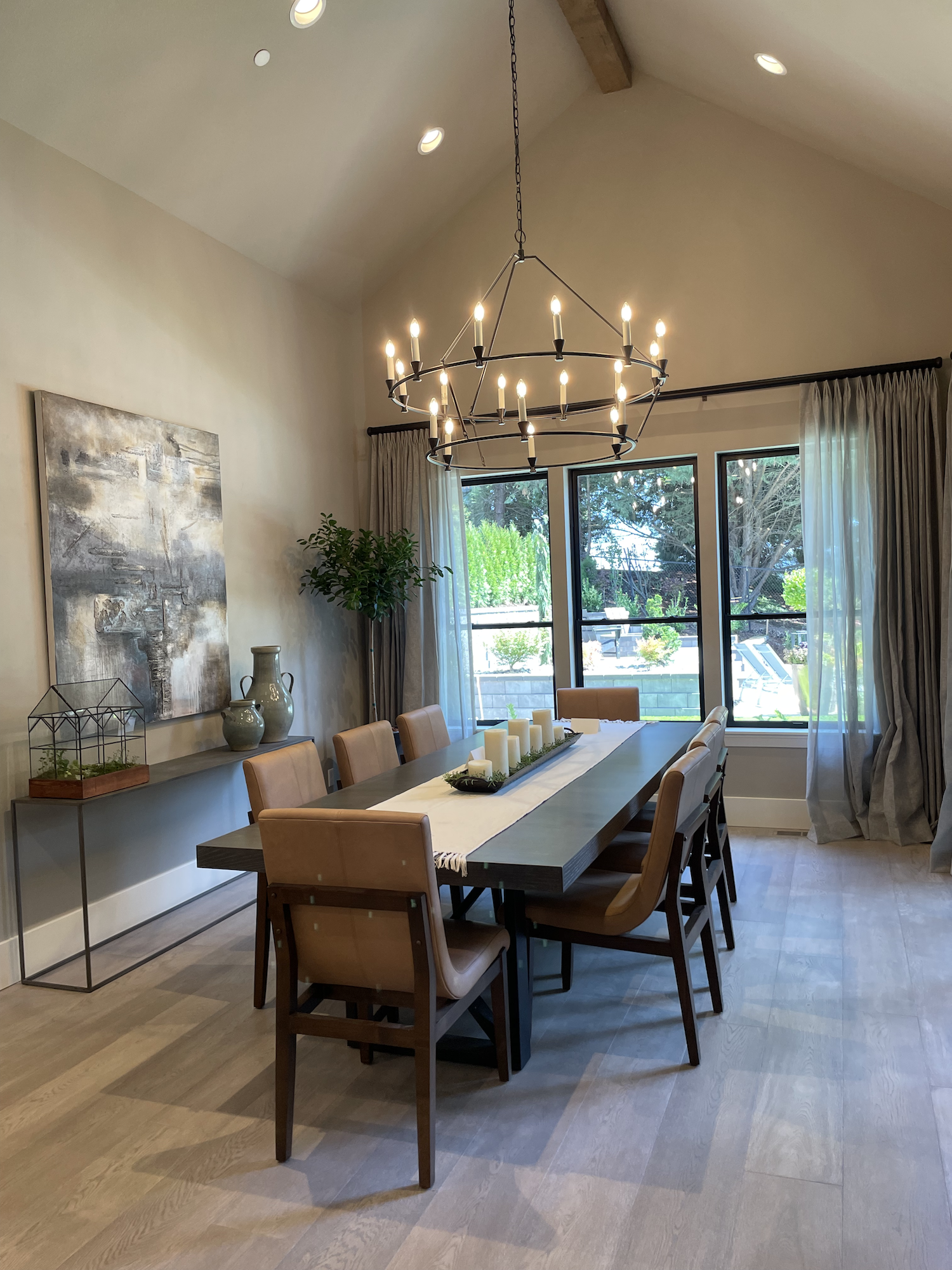
In fact, the entry and great room I think are a highlight of this home. There were some very nice details used on both the walls and ceiling that stood out. Light fixtures were interesting and added to the style without being obnoxious. The layout was open with plenty of space, but didn’t feel like you were living in a warehouse.
Granted, I’ve never been a huge fan of double height ceilings in great rooms unless the design is SUPERB, so of course I’m partial to the design of this home. It had high ceilings (not double-height) but still felt cozy.

Everyone loves a good niche.
I thought the tile and color choices made sense and the added textures they chose in the decor all balanced well. They also used a lot of well-made built-ins and niches which everyone loves.
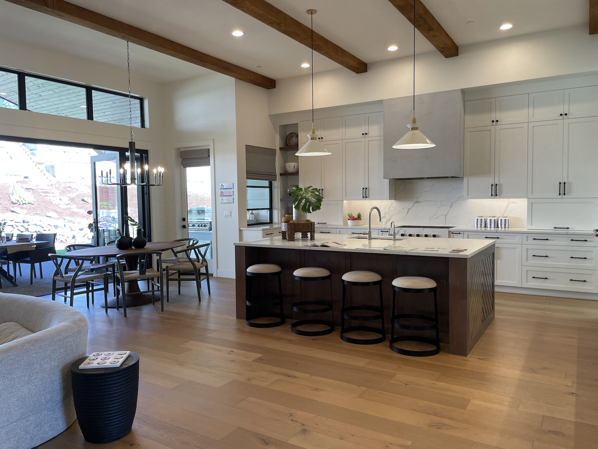
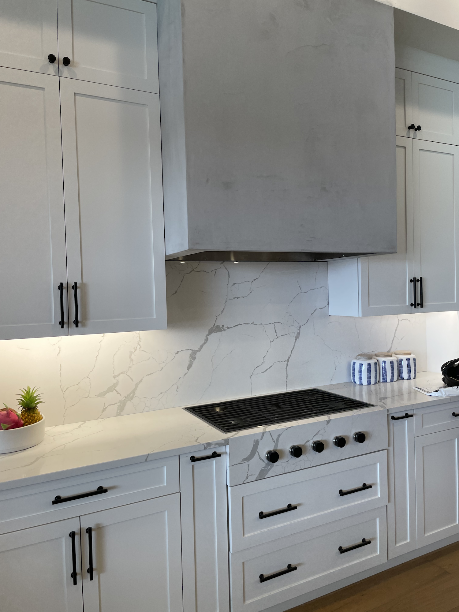
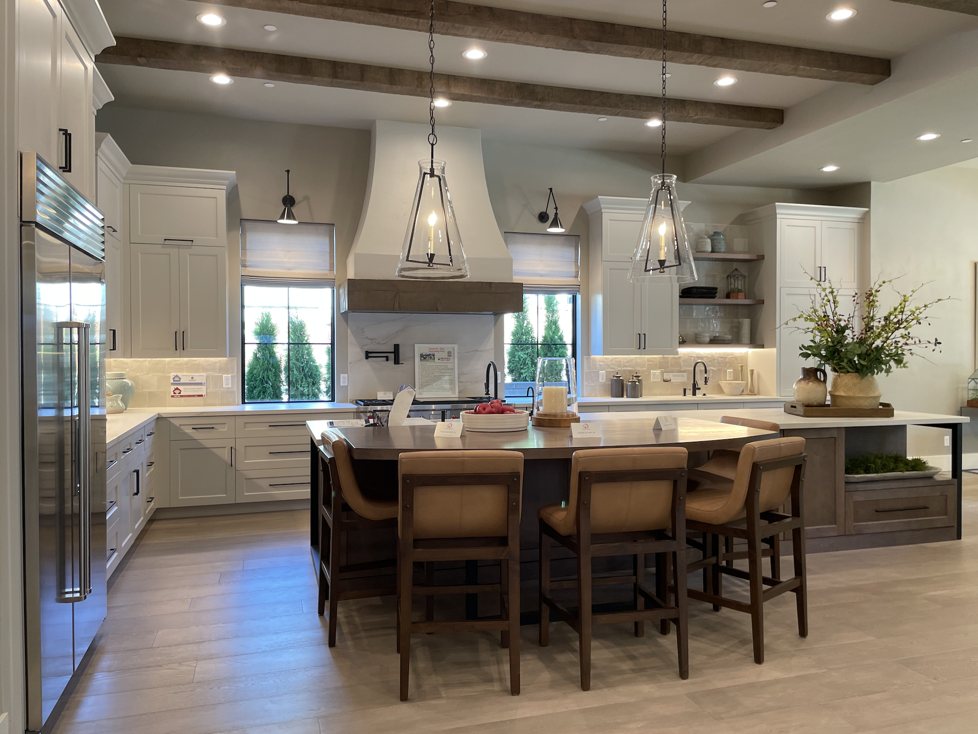
Oh, and one note about the kitchen. I ABSOLUTELY LOVE what people are doing with their range/stovetop vent hoods nowadays. I’ve always thought they were an eyesore. A major trend right now is to de-emphasize vent hoods by “wrapping” them, which is exactly what they did here. It places the highlight on the rest of the kitchen, like the tile, fixtures, countertops, and even that cool detail on the side of the island.
The pass-through to the outside was a nice touch as was the appliance garage next to it.

Sad fireplace
What… I Didn’t Understand
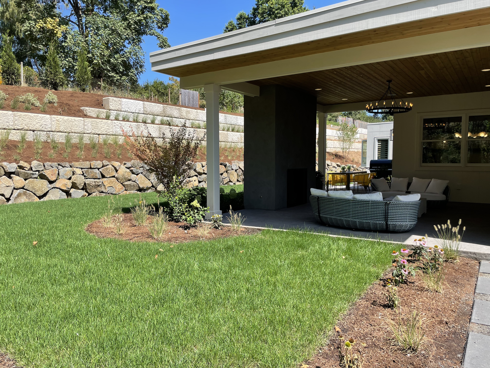
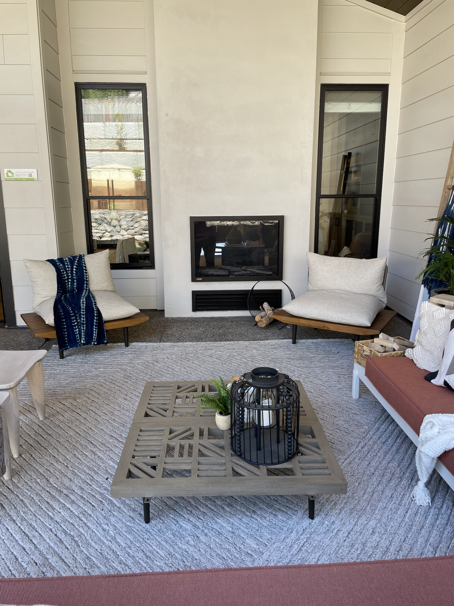
For a home that purports to connect the indoors to the outdoors, the backyard and covered patio area were underwhelming.
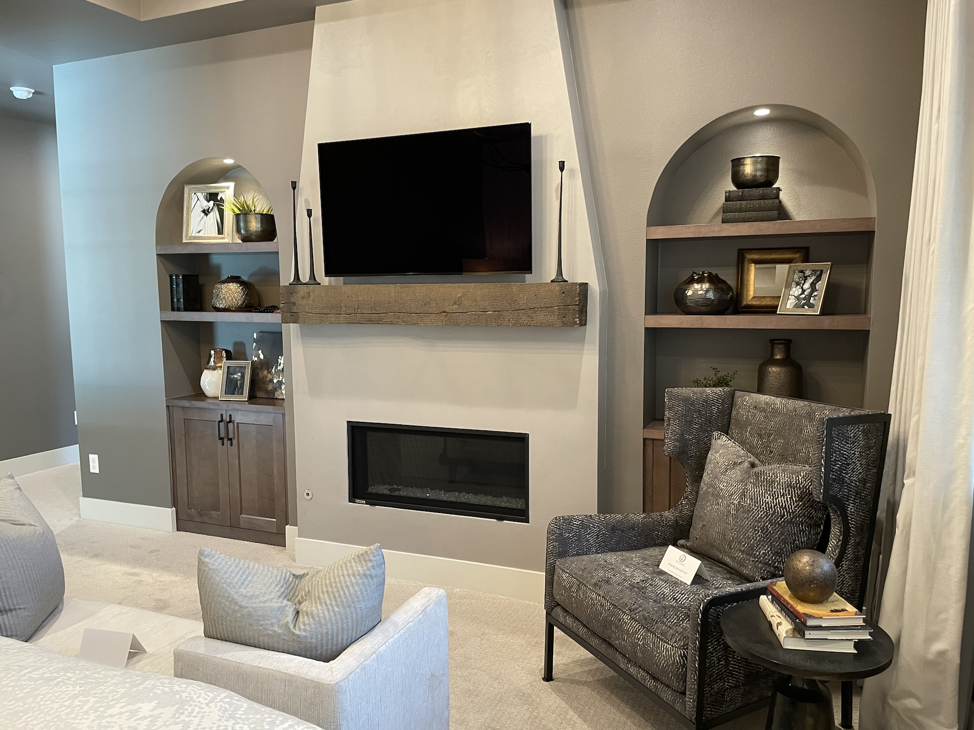
I absolutely LOVE a double-sided fireplace, but I almost forgot to take a picture of this one because of how lost it was here. The black gas fireplace insert is almost an eyesore in the white chimney.

These wood tones just don’t work.
(I loved watching the robot mower toodle it’s way around the grass, though.)
Alright now Imma get controversial. This home was… dare I say… boring.
I know, I know, I just lambasted Home 1 for having some unusual design choices… but, seriously, walking through this house was a bit of a snooze fest. I can’t even pinpoint why. They had some really interesting details with the textures, tile, light fixtures, etc. I didn’t even mention the funky office wall… which isn’t my style but it was fun!
The muted color palette may have played a part. The home also backs to the north and felt rather dark. This is something I’m debating with on my own custom home design. Getting plenty of light into the home but also having the covered outdoor area that’s practical. It’s tough getting everything into one house!
I can see how they were incorporating, as the show guide put it, “splashes of green and blue colorways” but they chose such dark and/or muted colors that instead of being features, they often detracted from the spaces.

Wall texture… it’s subtle (you may need to click to embiggen it) and not at all your typical orange peel!
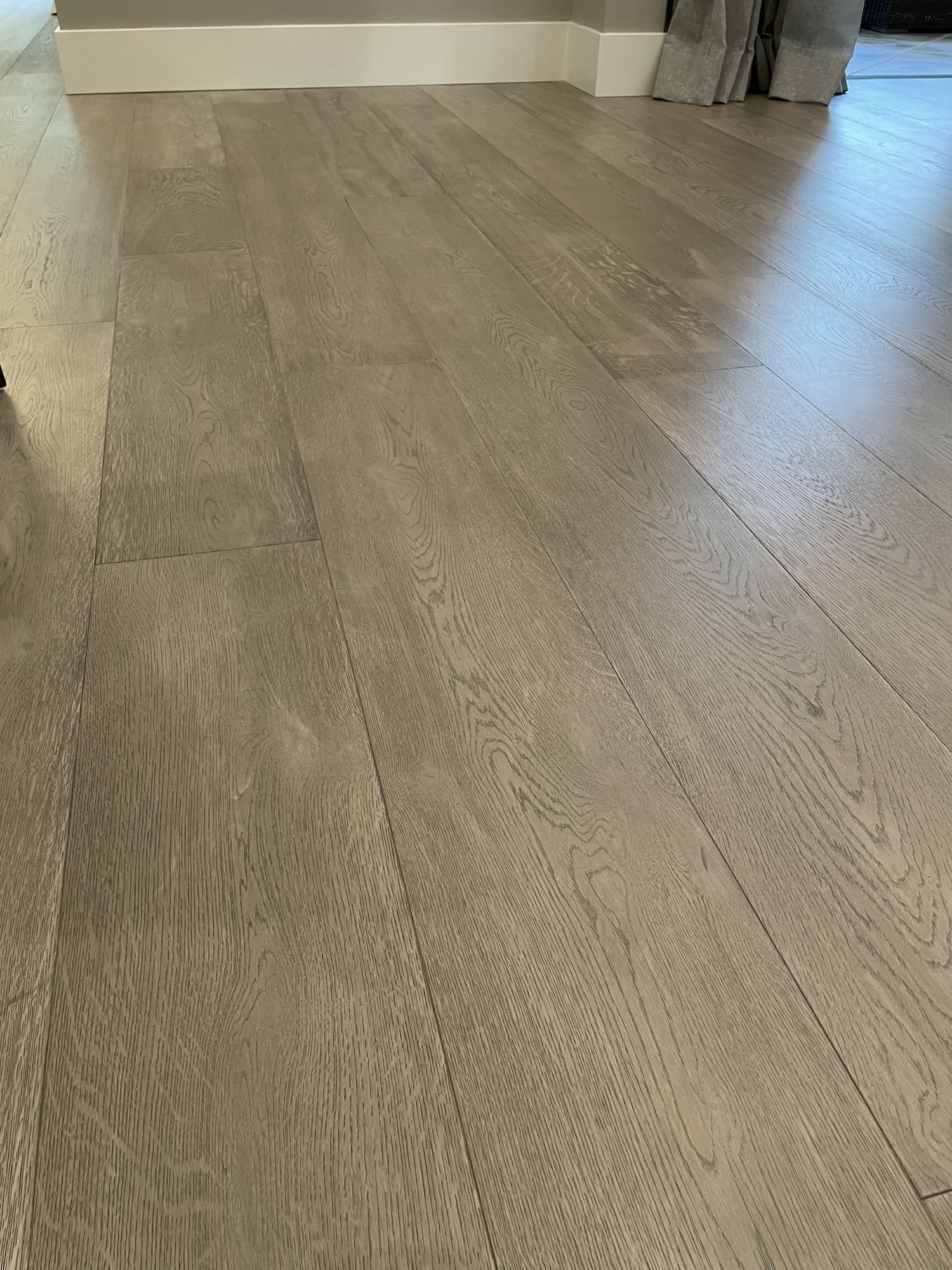
When it comes to the great room, I do wish they’d done a little bit better job finding wood tones that worked well together. I thought the cooler toned wood of the island was competing with the warmer wood tone of the floor.
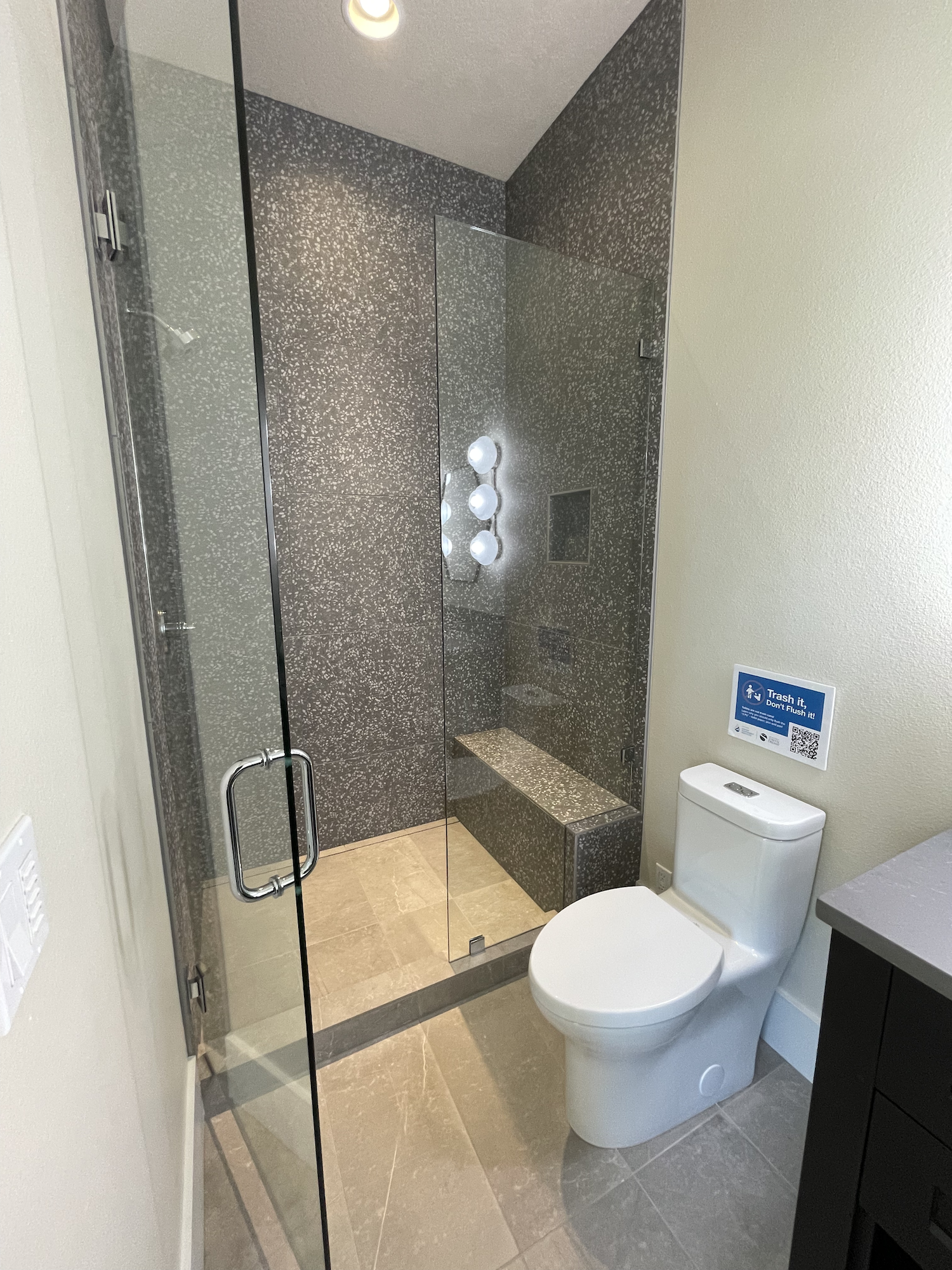
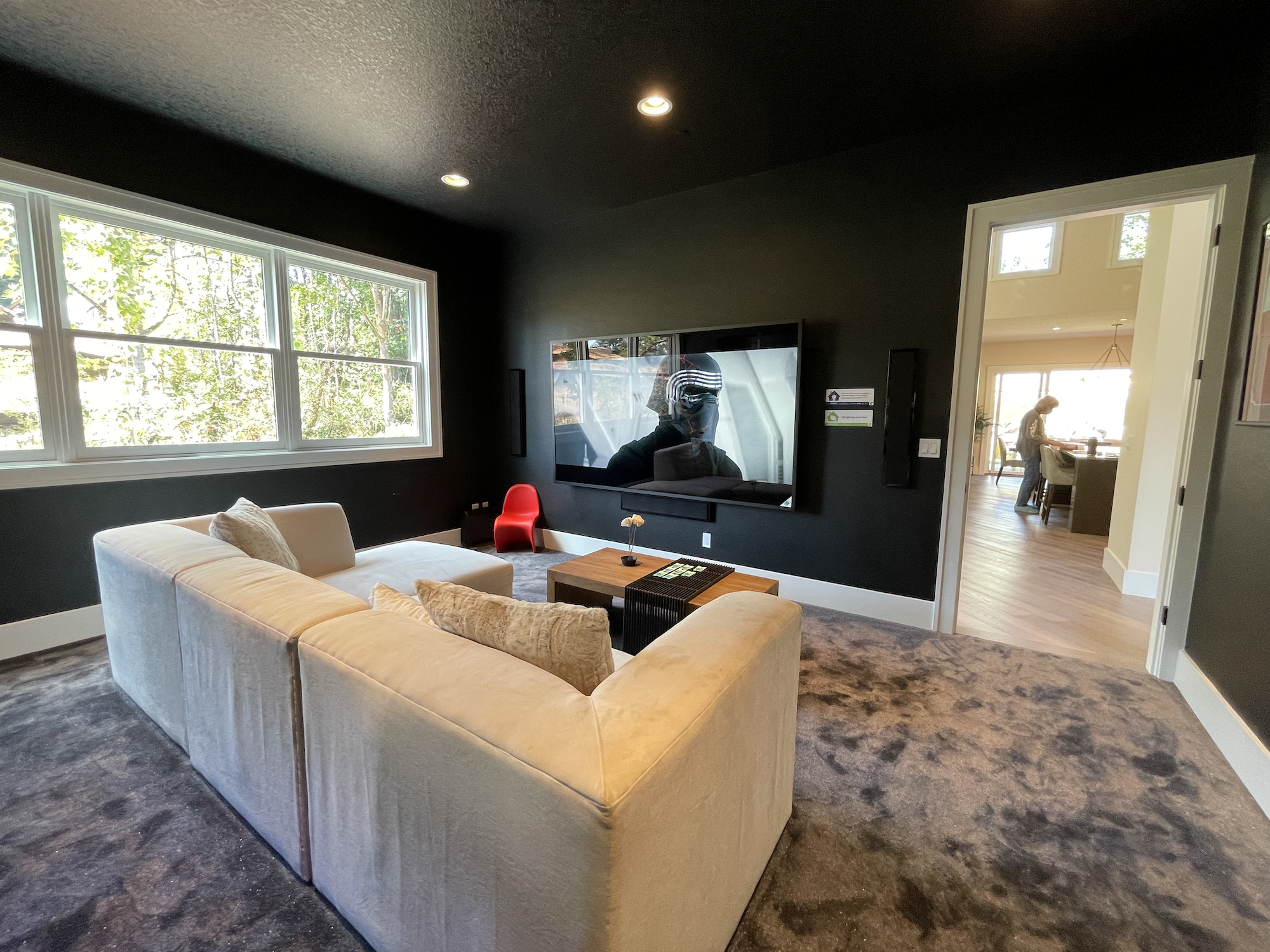
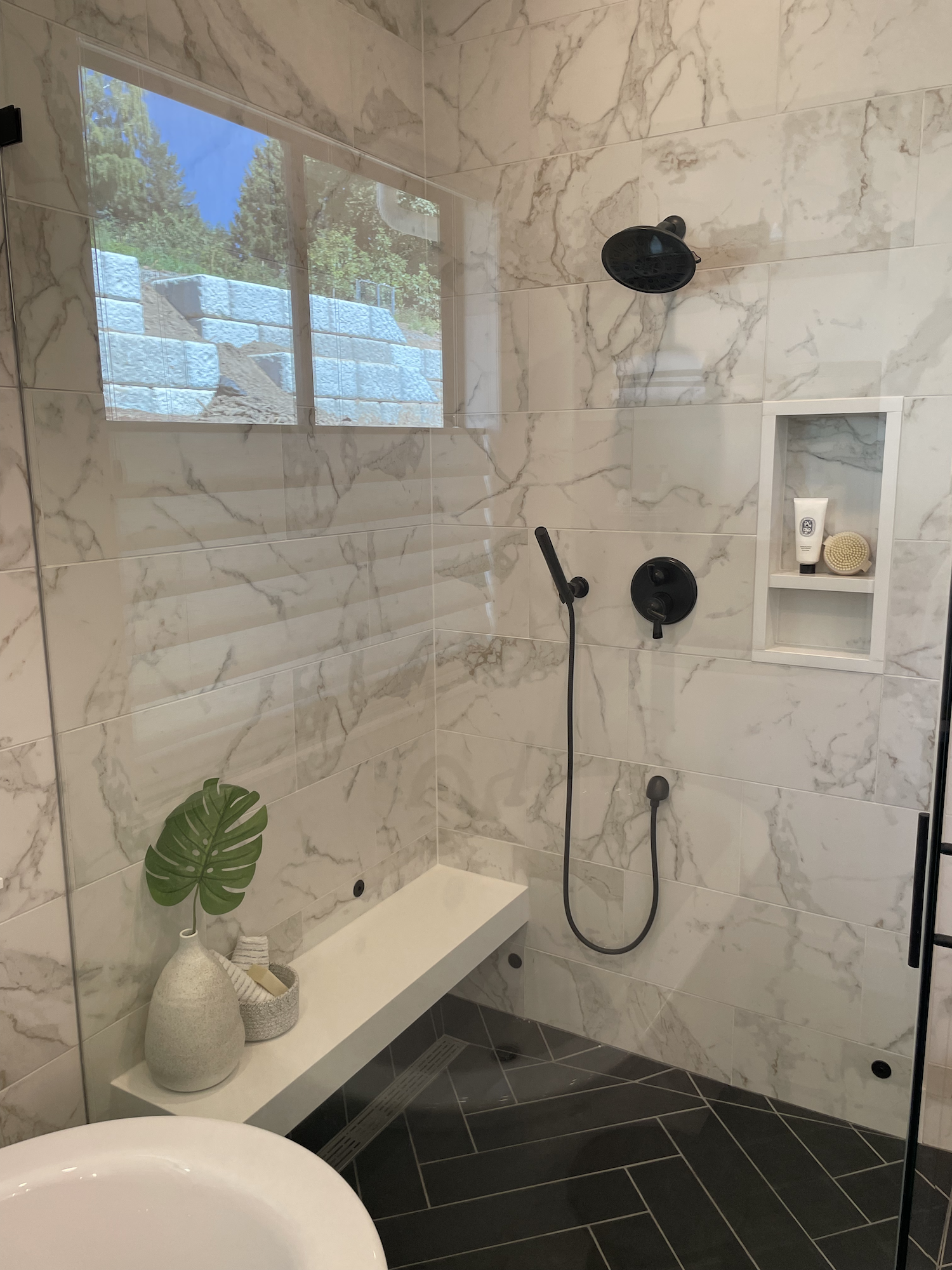
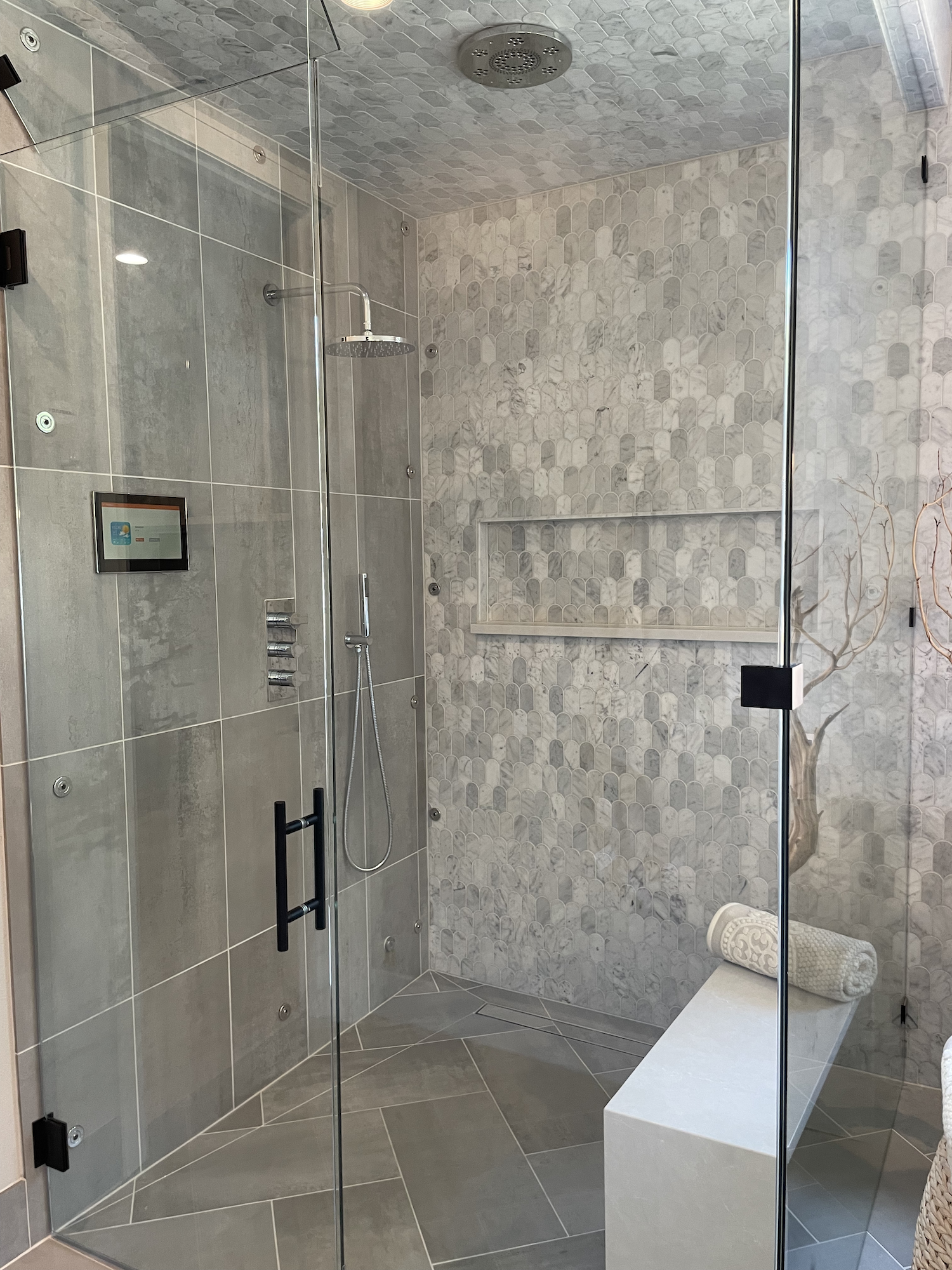
The media room was a miss for me. It’s just too narrow for such a huge TV and the TV was placed entirely too high to be able to comfortably view it from so close. Granted, that’s another pet peeve of mine with new construction, right on par with the tiny little shower niches that builders seem to think will hold everyone’s bath stuff and never does!
Another interesting detail, and maybe this is something the builder does a lot because I noticed it on Home 3 as well, is the subtle wall texture. It was nice, although it was SO subtle that I doubt many saw it. Which might be the point.
All of the above I think are pretty minor gripes and I’m sure the owners will absolutely love living here. All in all it was well done!
What do you think so far, am I being harsh? No? Good, cuz there’s more to come…
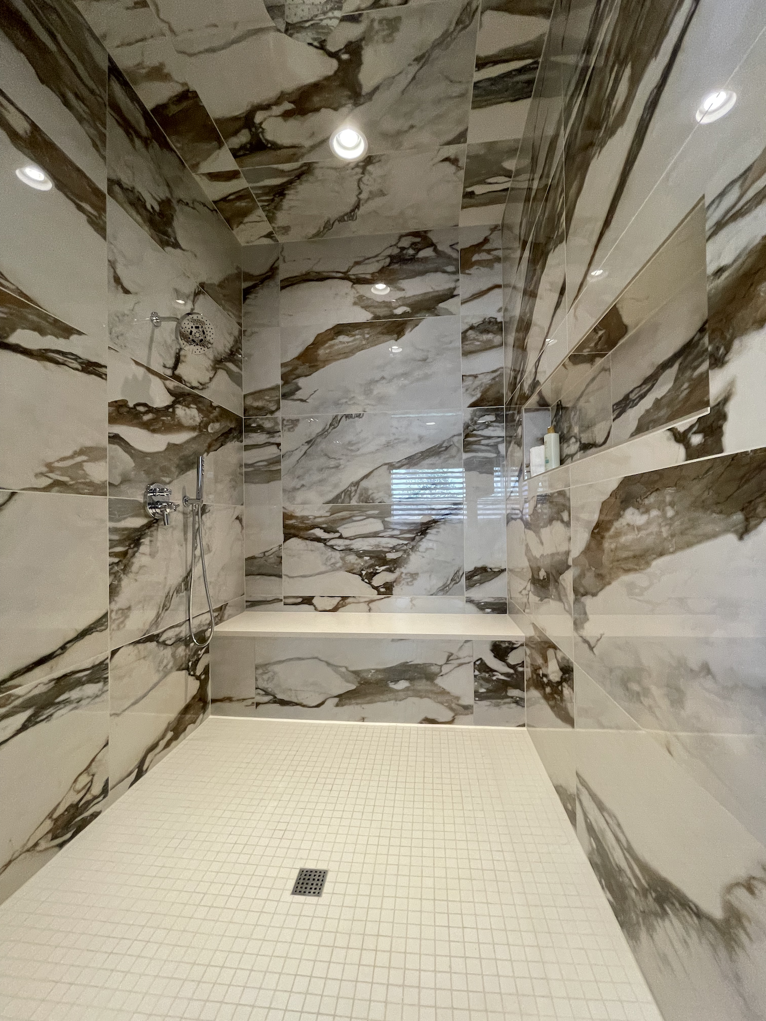
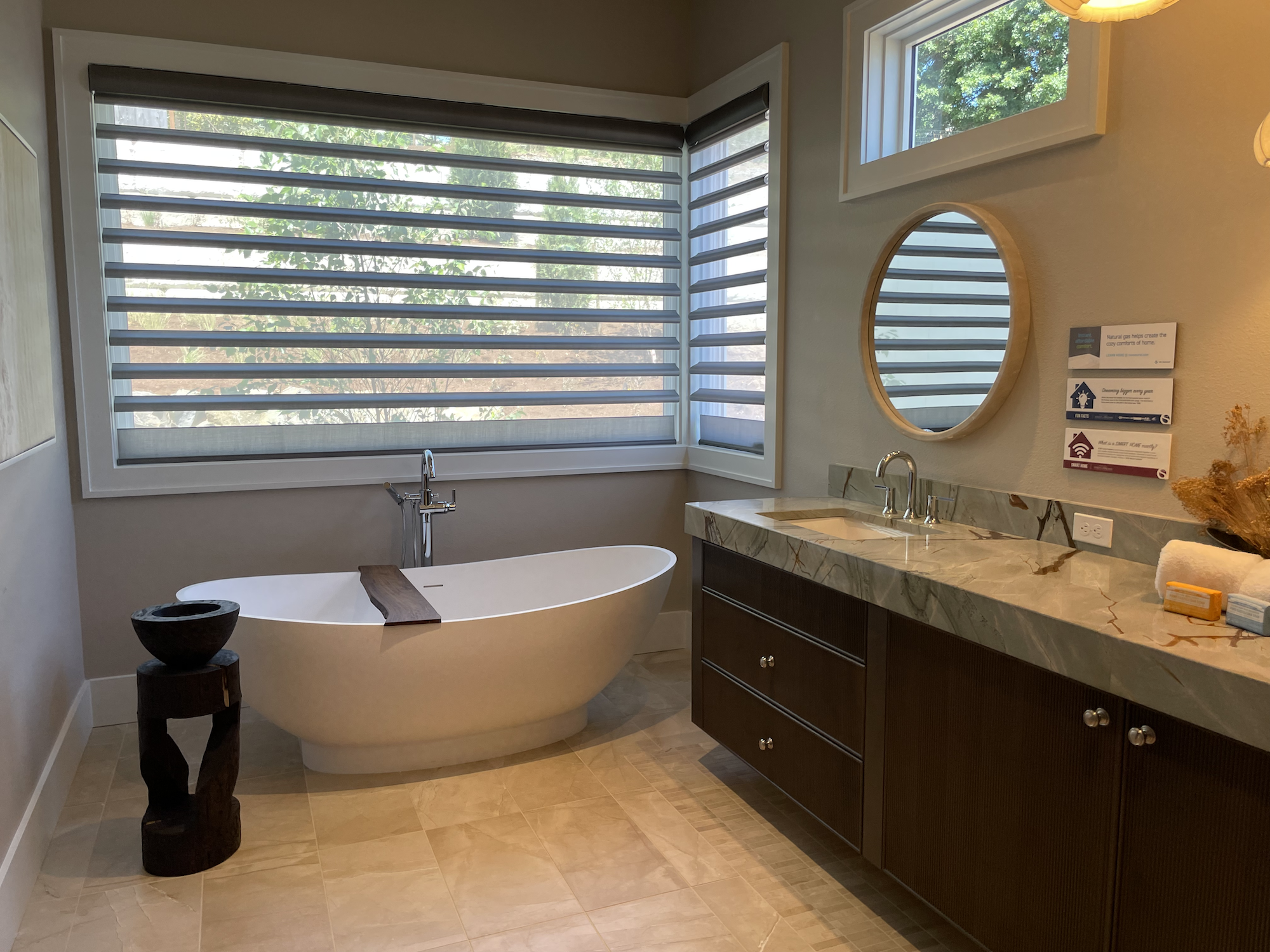
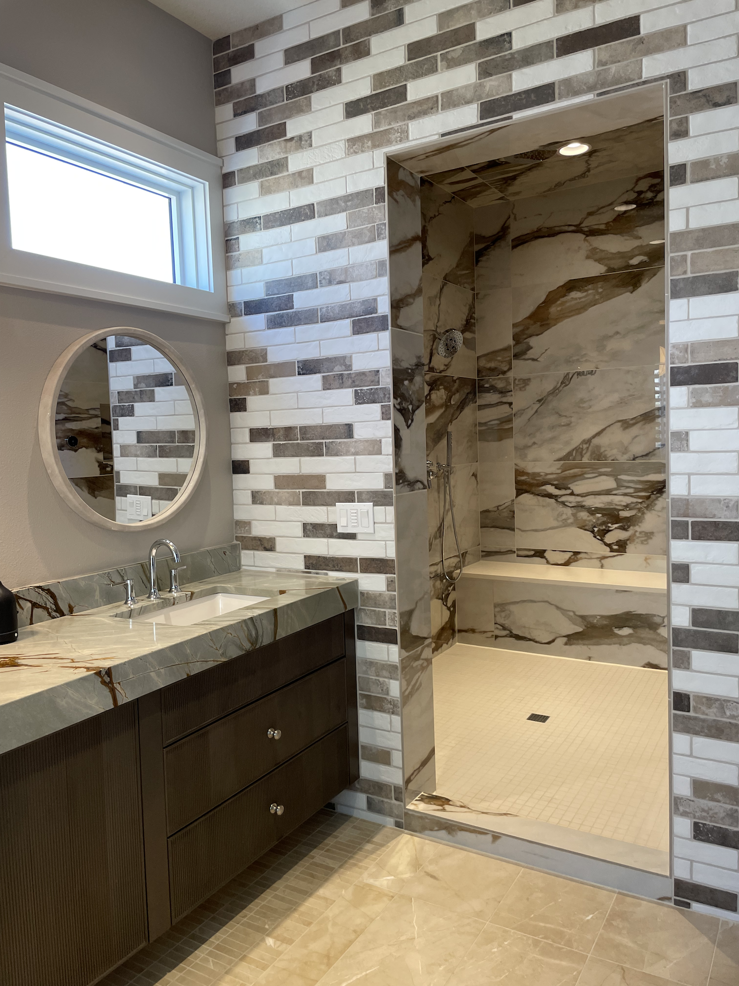
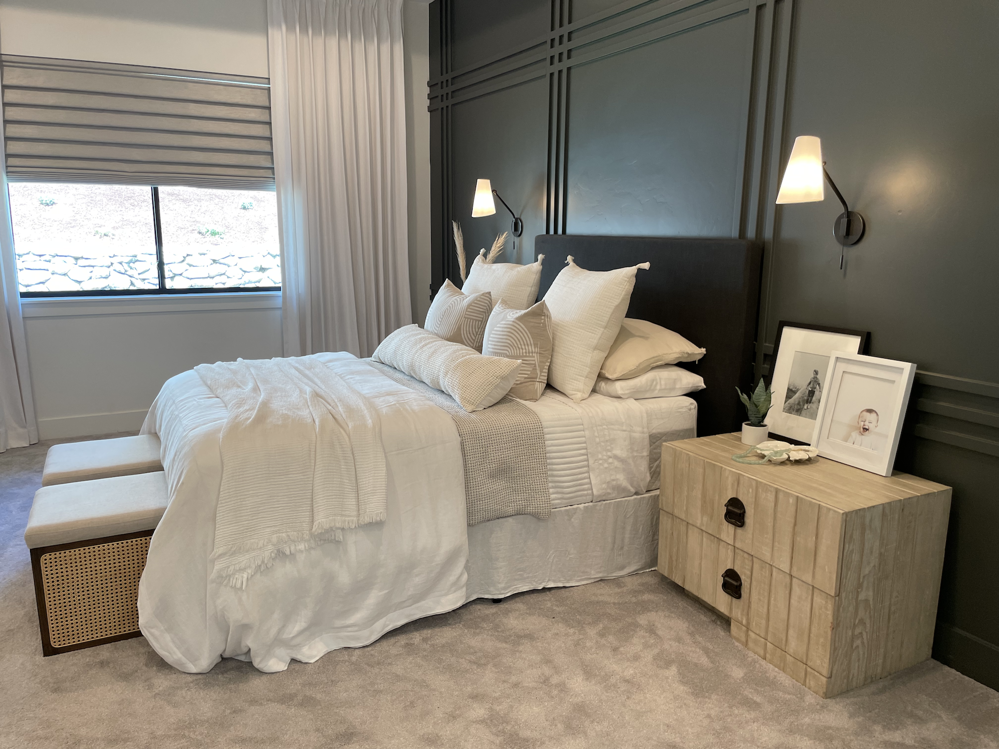
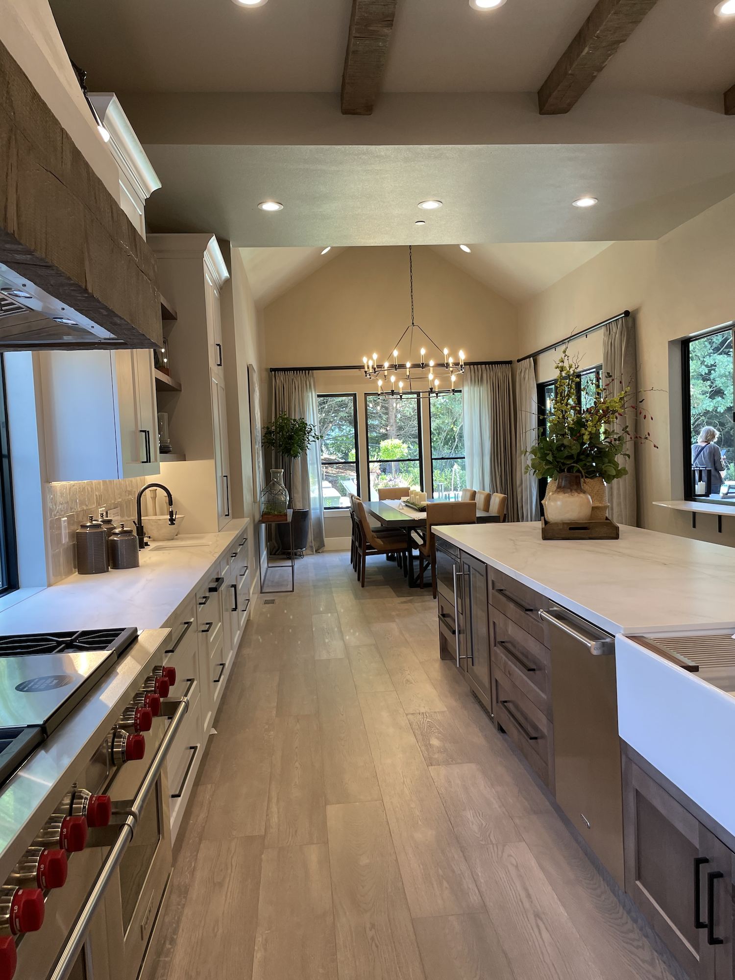
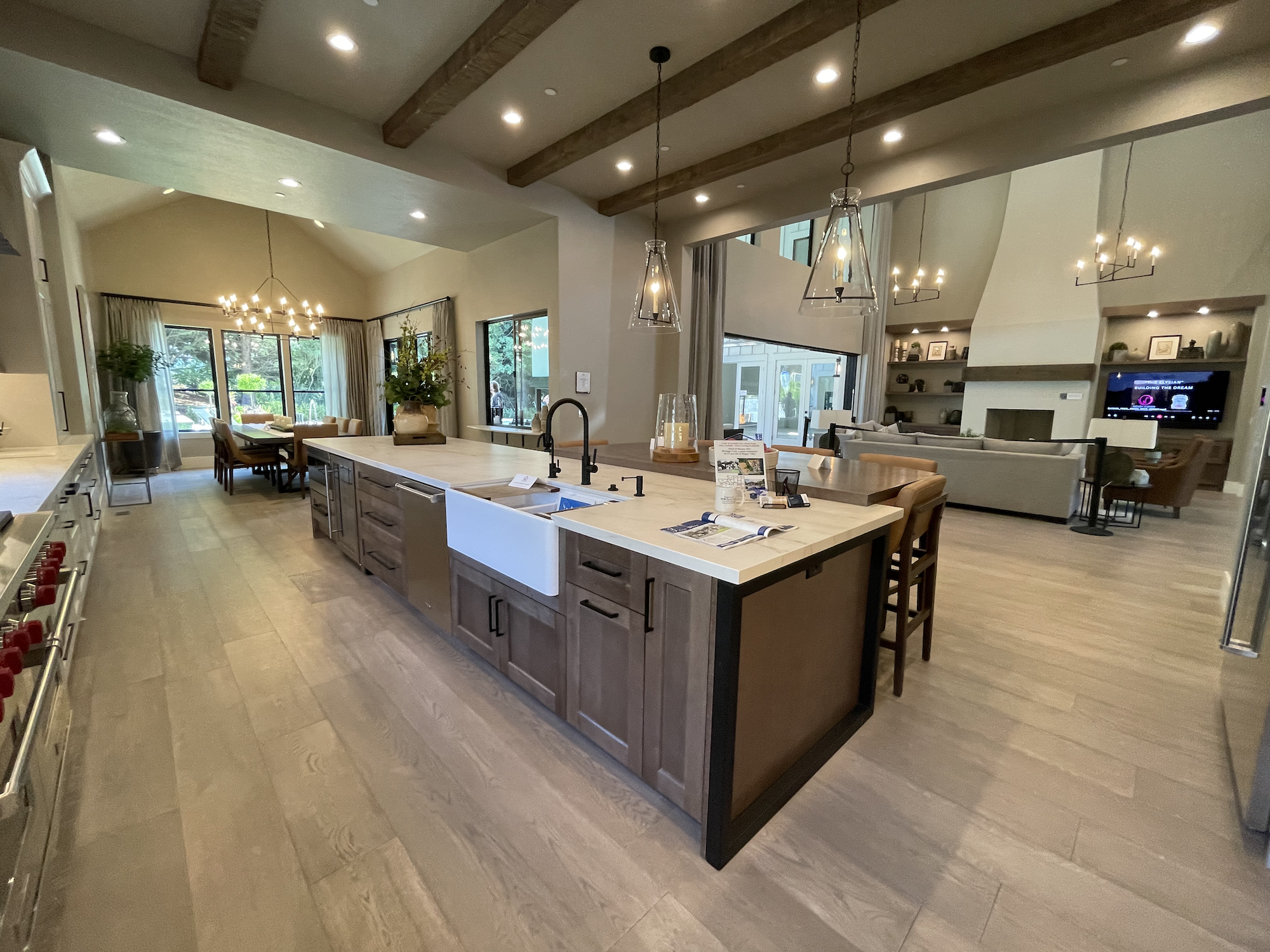
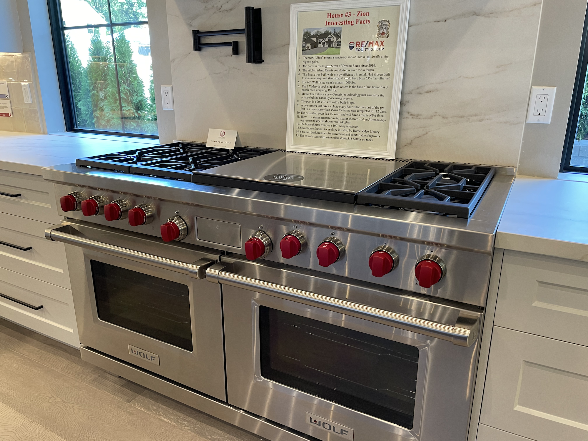
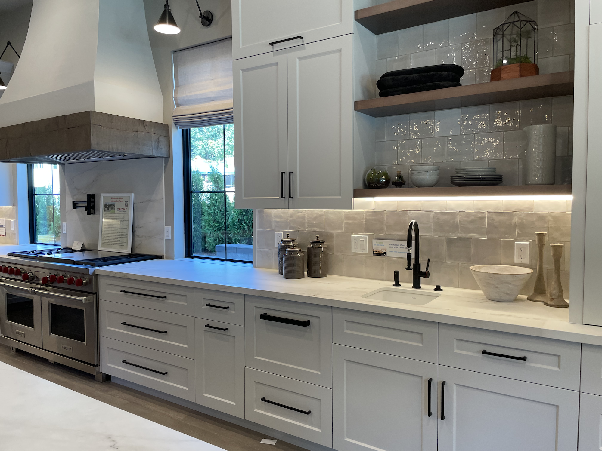
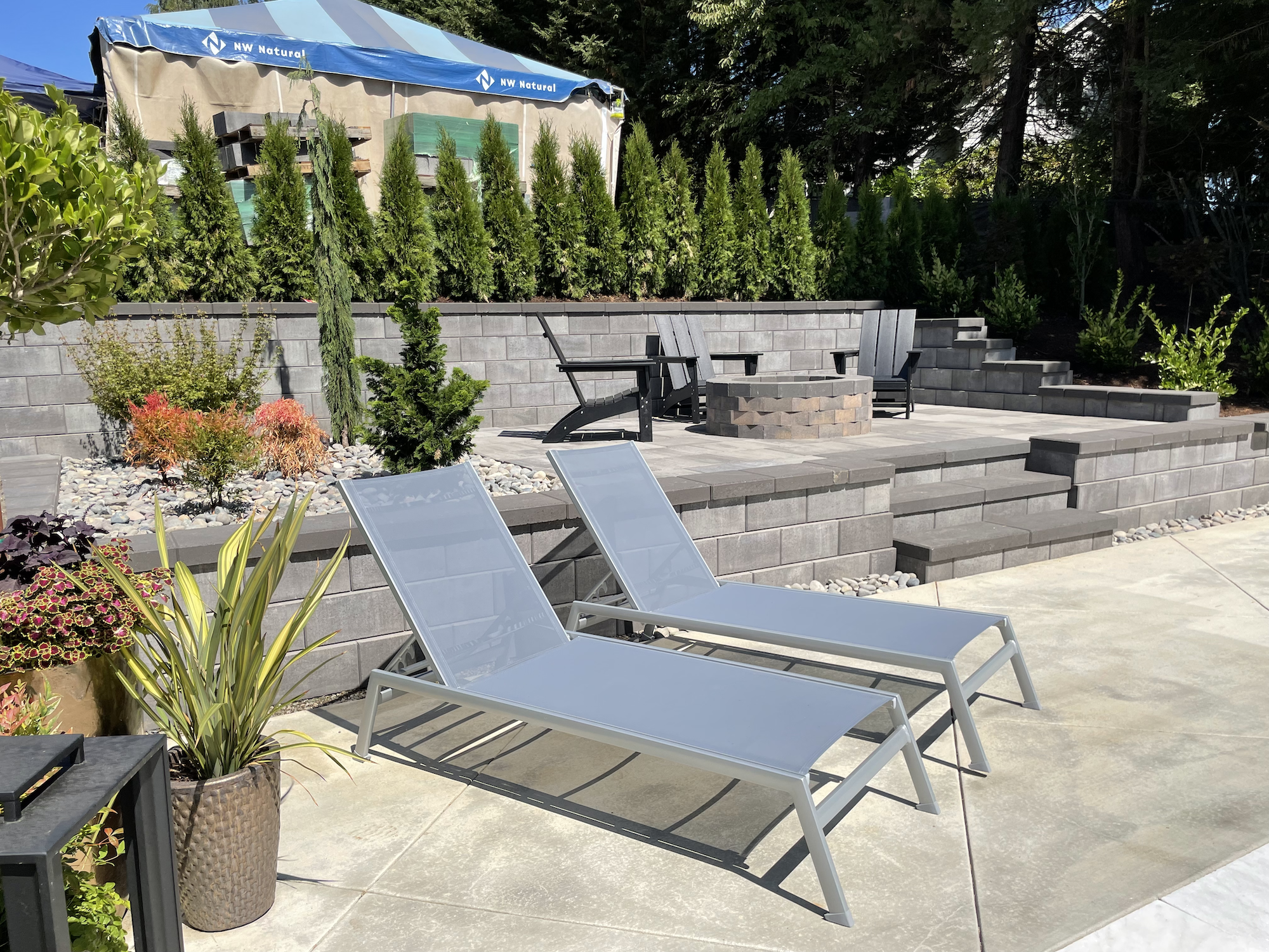
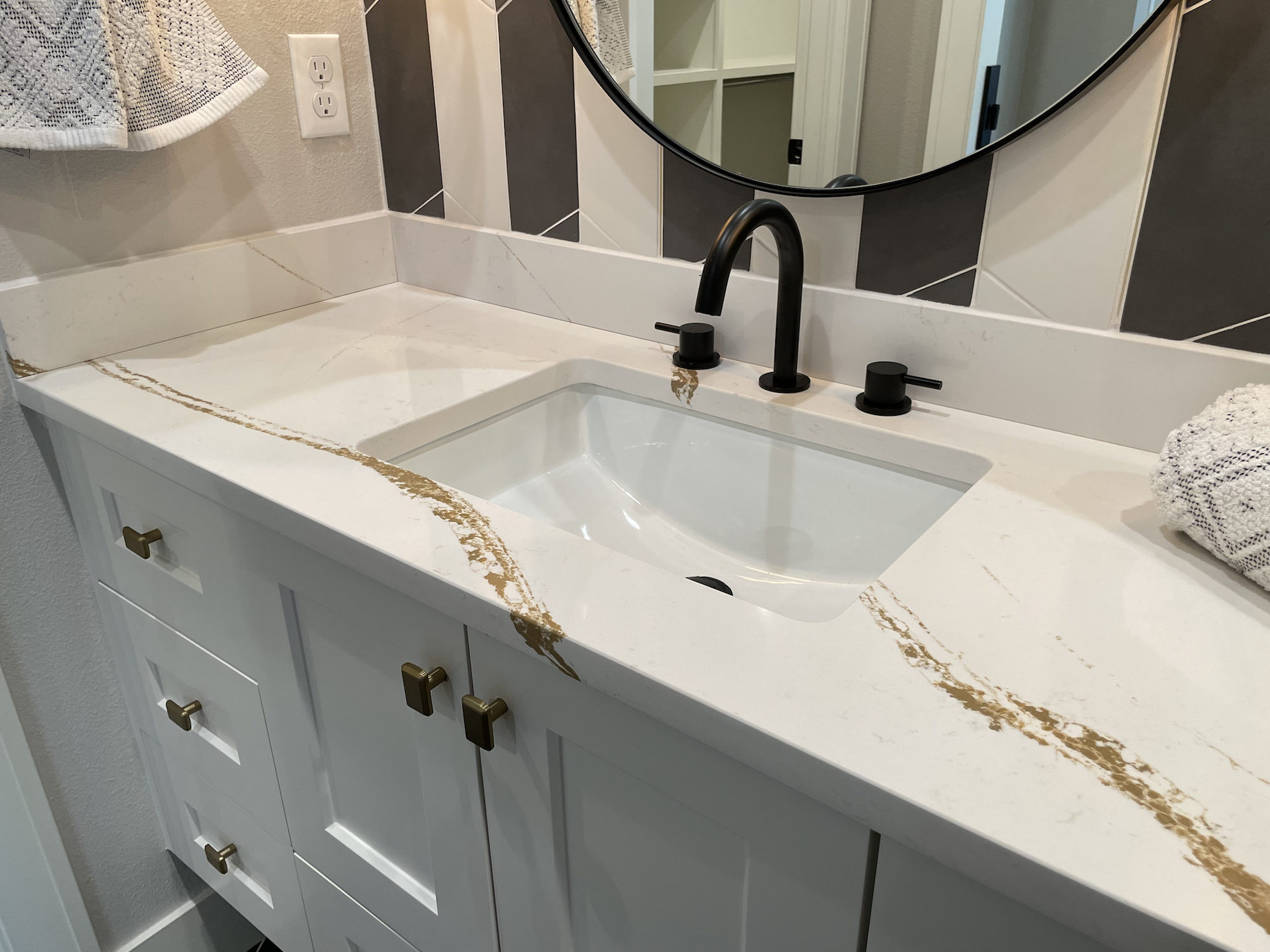
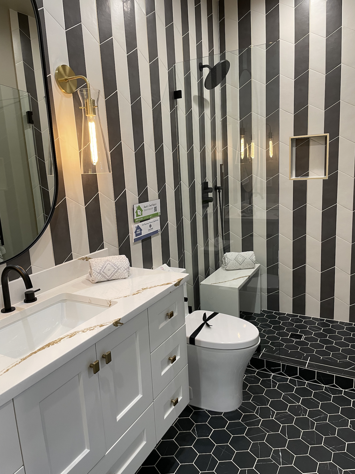
Home 3 - Zion

Square Feet: 7,338
Bedrooms: 5
Bathrooms: 5 Full, 1 Half
I have a confession… I actually viewed these homes in reverse order, so this was the first one I saw. Note how few humans are in my pictures. Reverse order works!
Home 3 was a heckuva first impression for the show. By far the largest home, it also included luxury features that were a big step up from the other homes.
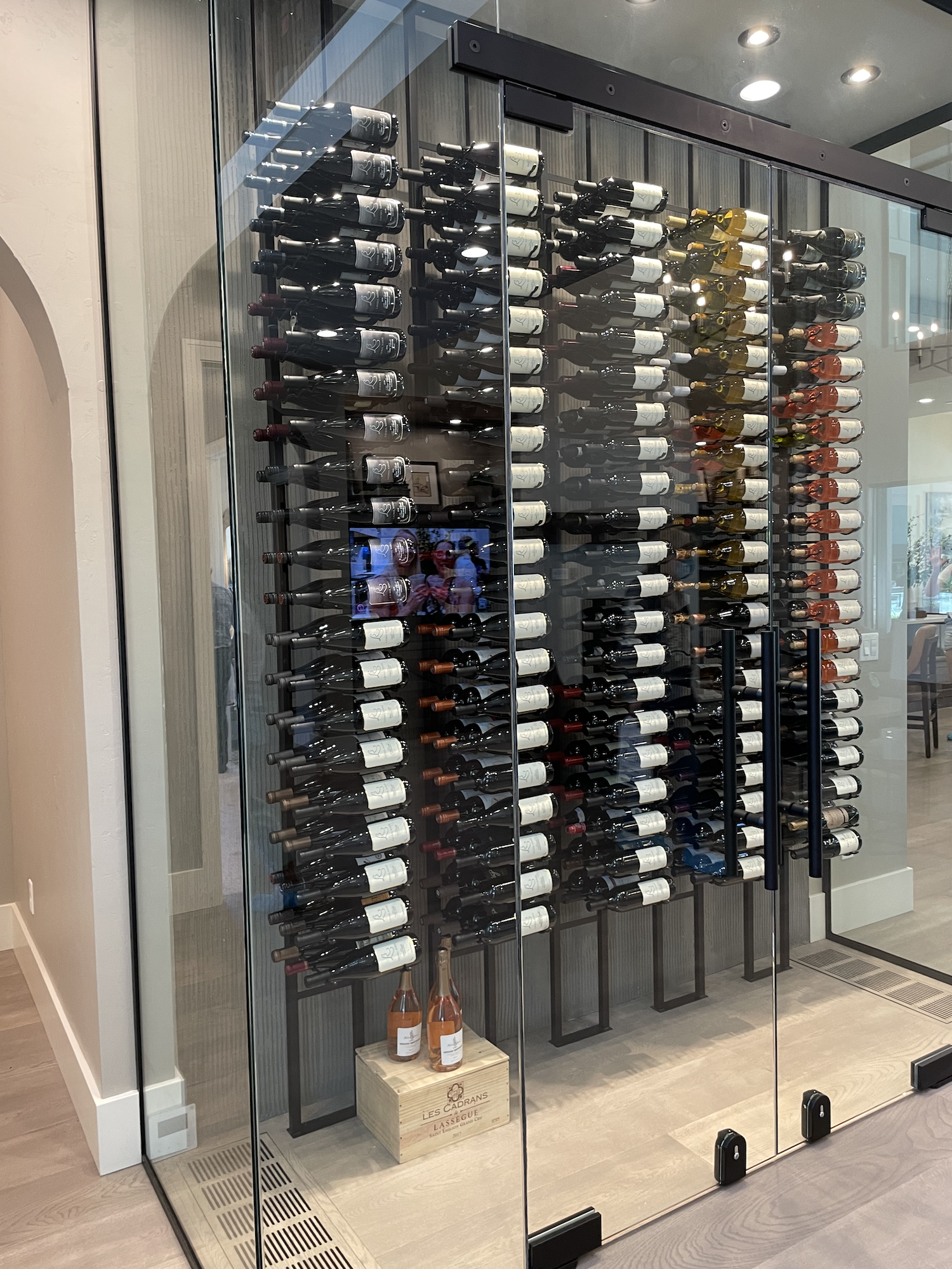
20 foot entryway with climate controlled wine cellar? Check.
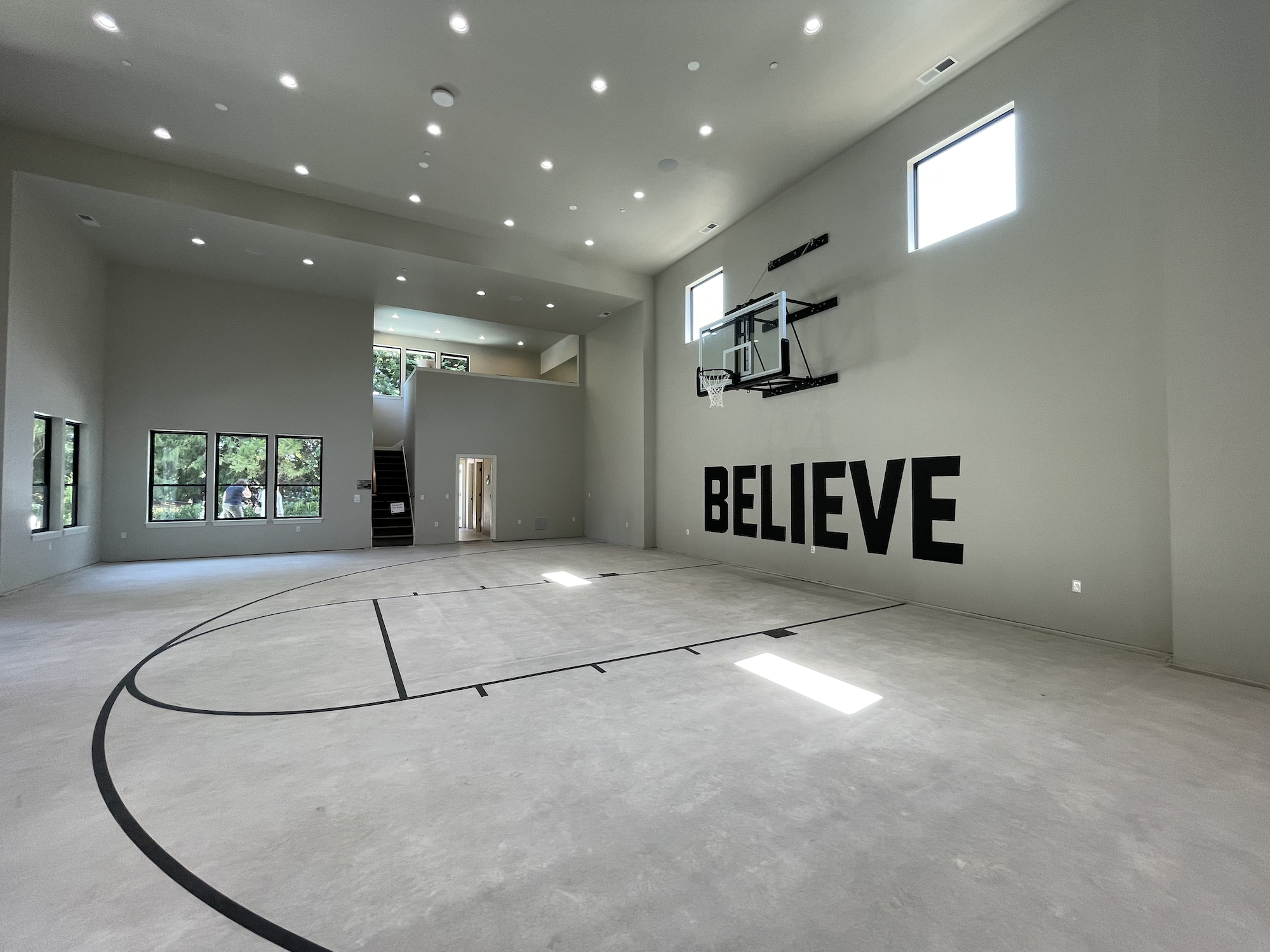
Indoor huge basketball court? Check.
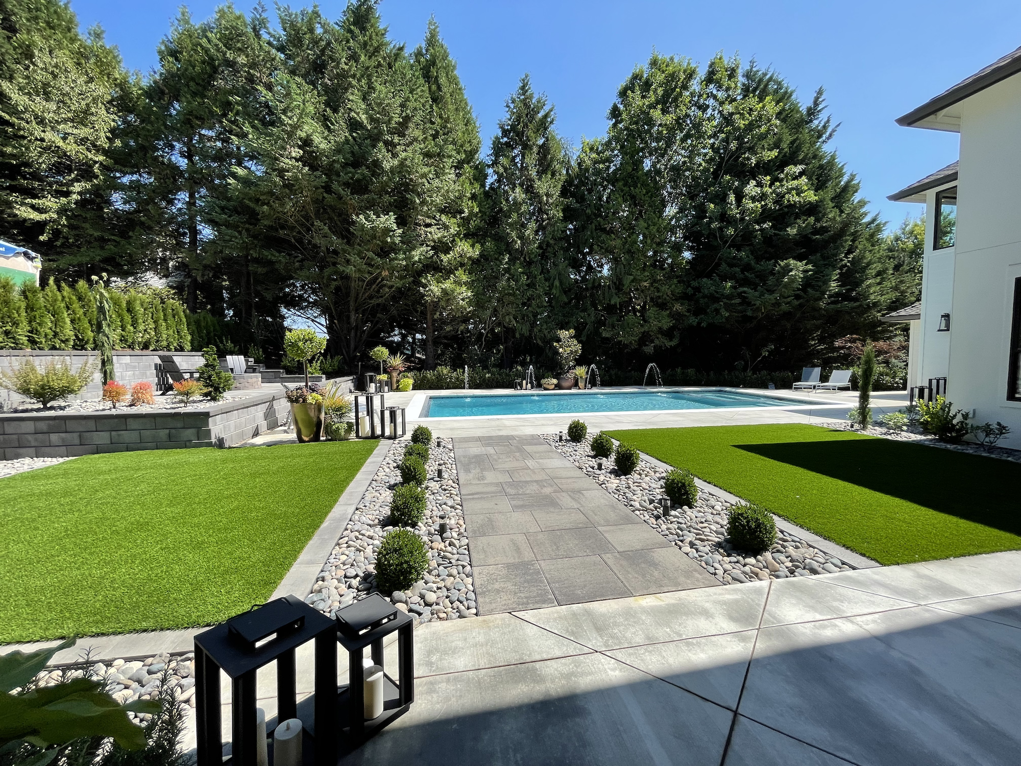
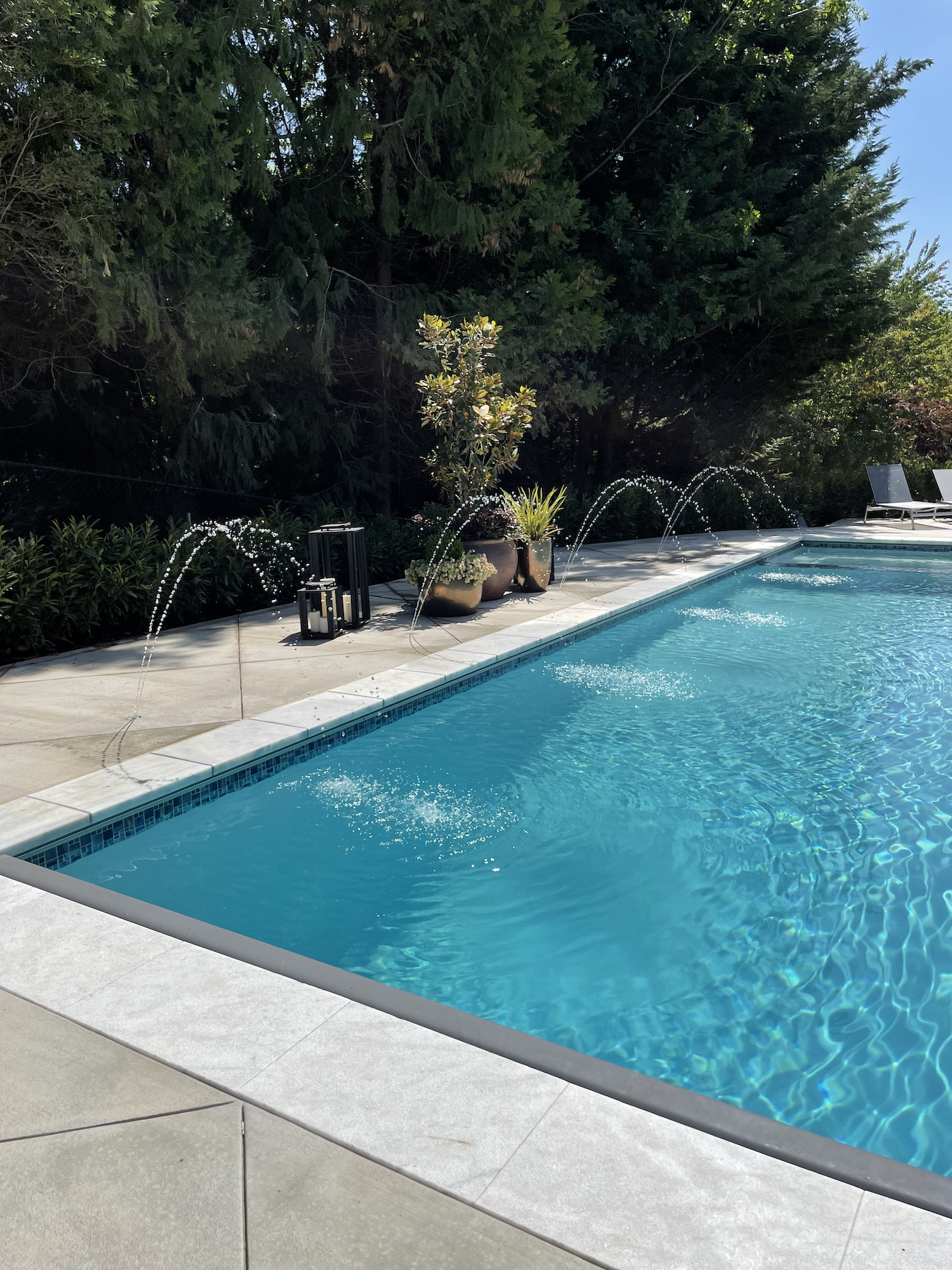
Full outdoor heated pool with water feature? Check.
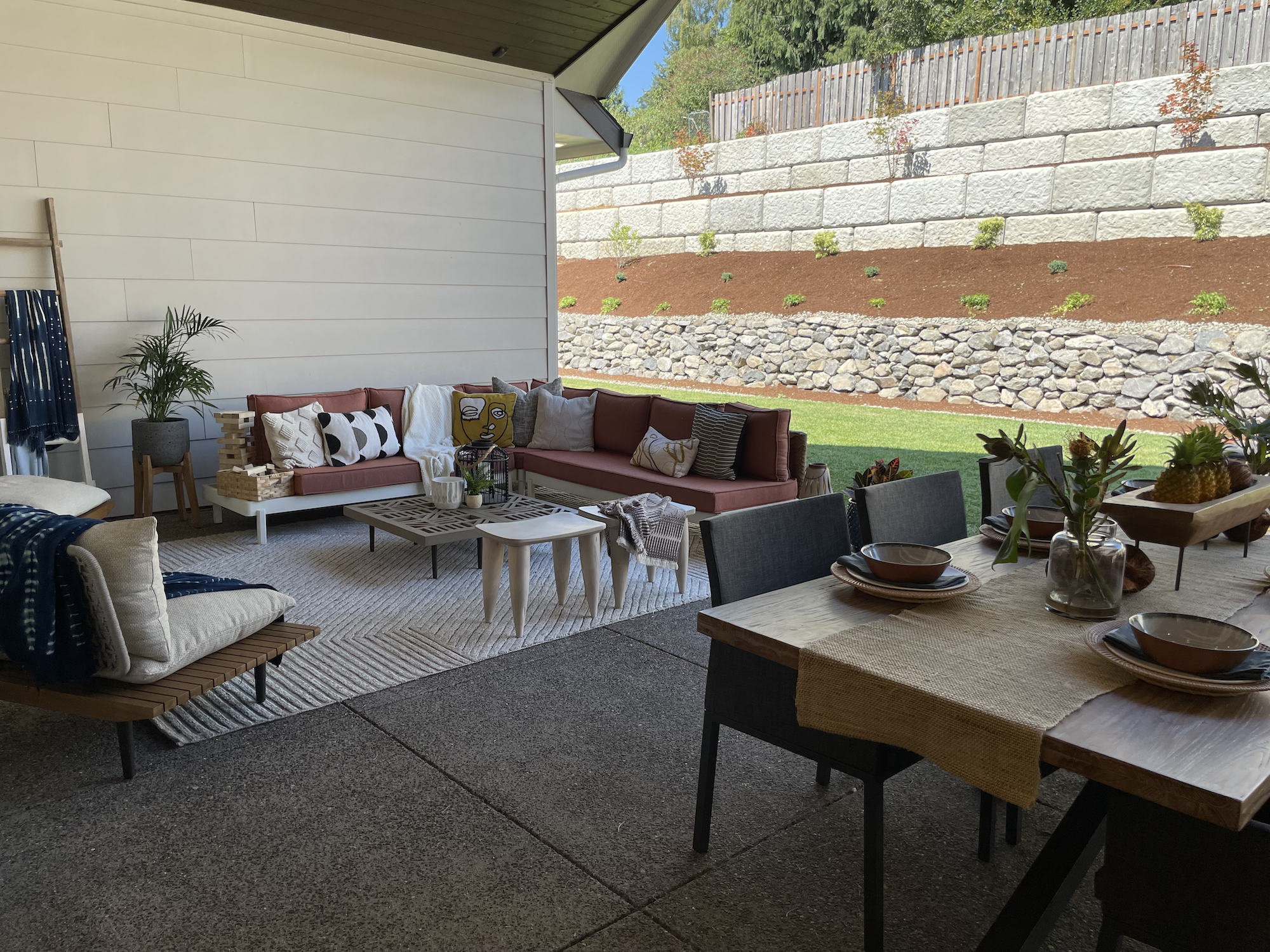
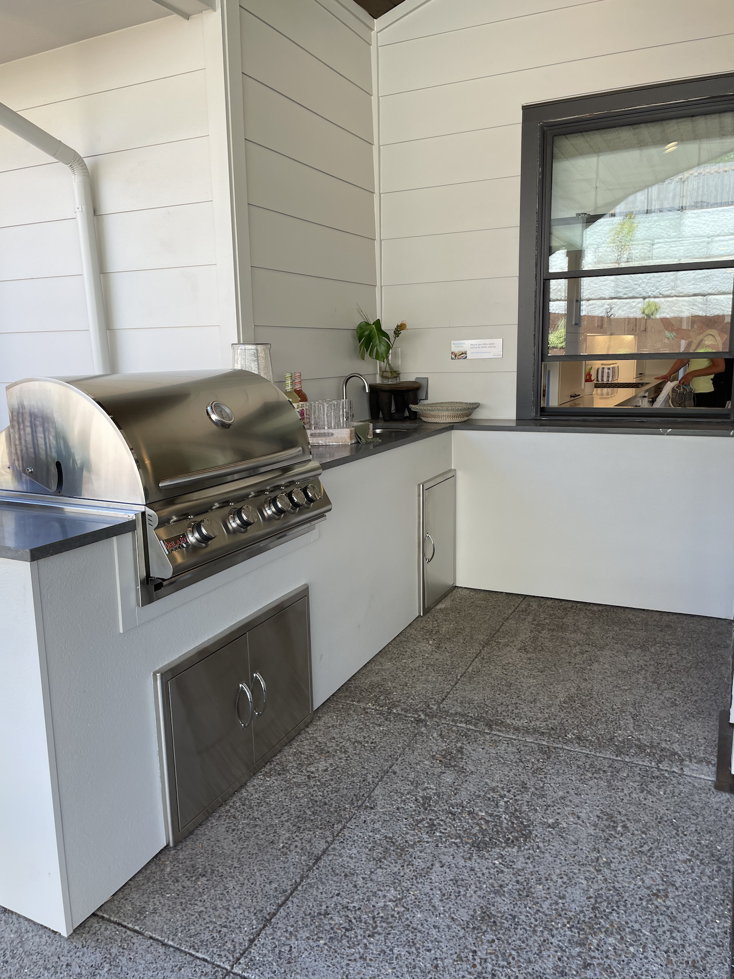
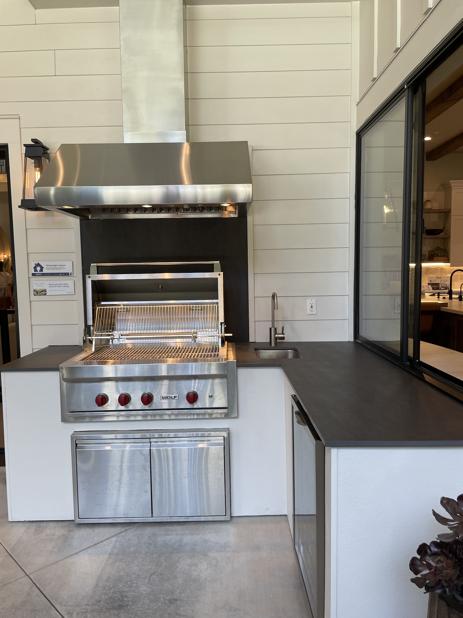
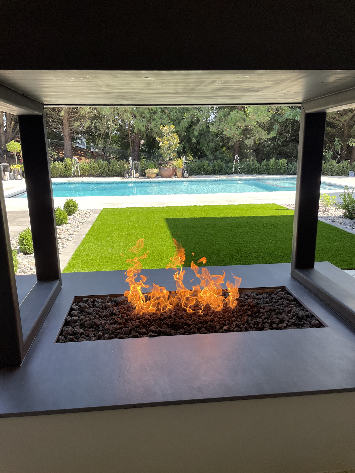
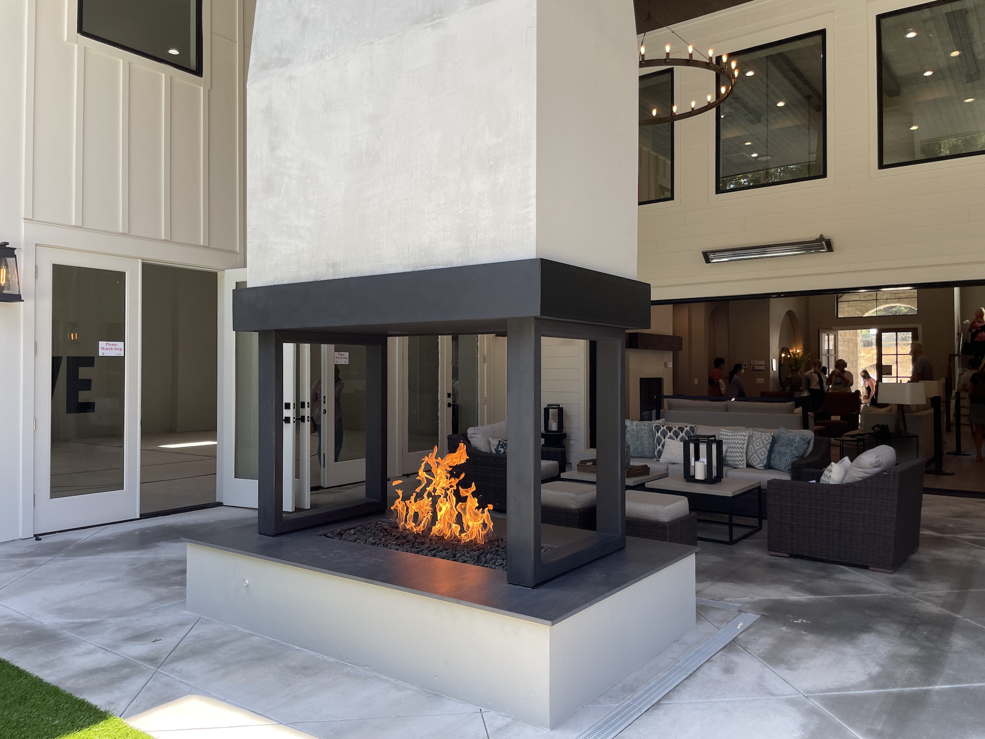
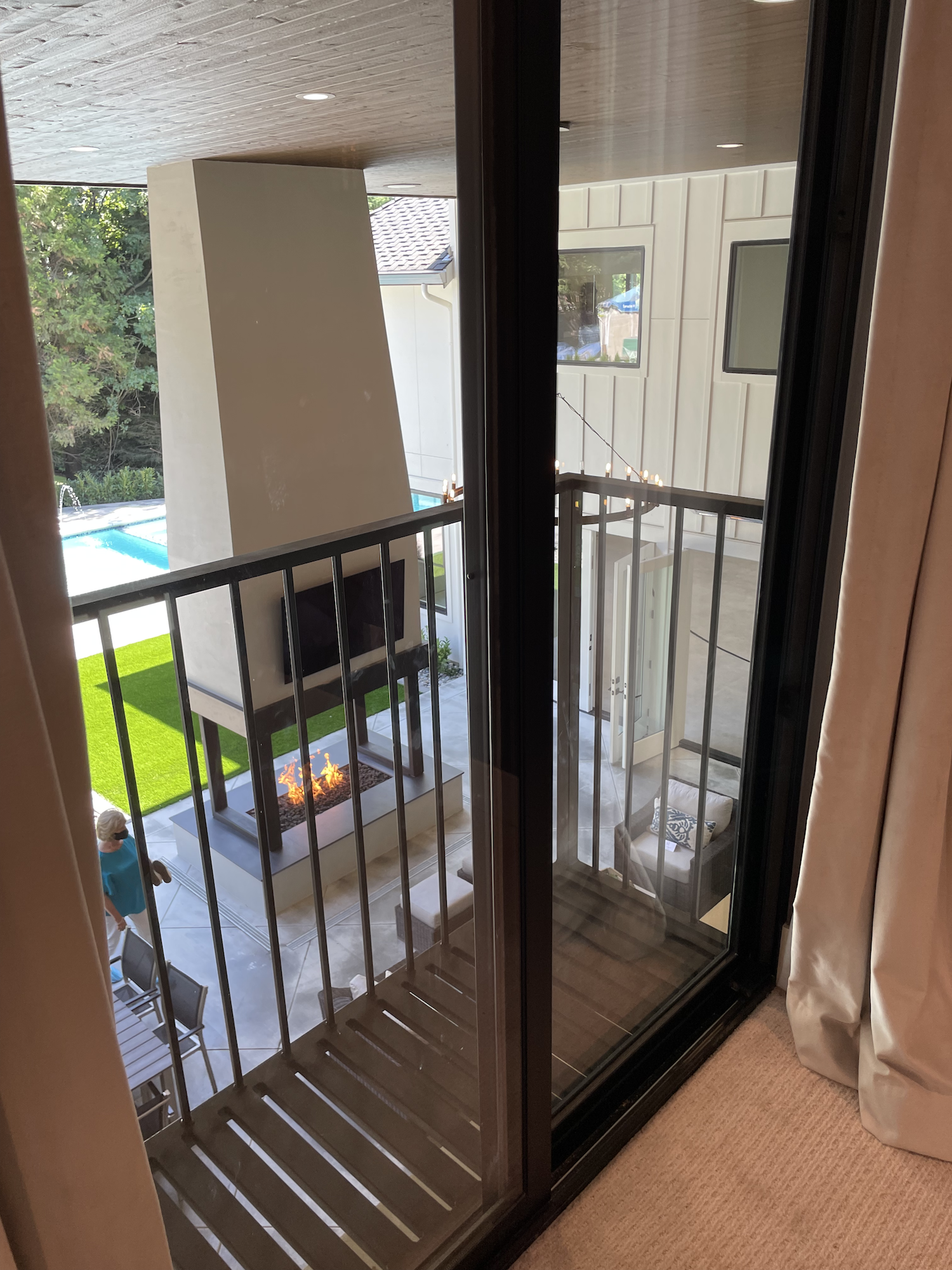
Amazing covered patio with built in grill, pass through window, and FOUR sided fireplace? Check. Check. Check.
Home 3 is perched on a hill (though not nearly as steep as Home 2). Just like Home 2, it was built by Red Hills Construction.

I’m not sure how many Modern Tuscan Farmhouses have a half court indoor basketball gym, but sign me up.
The show guide describes it as a, “Modern Tuscan Farmhouse with a touch of Mediterranean”. I’d say that’s about as accurate as anything I could have come up with because I was legit struggling to figure out how to classify it. I would have said that the exterior is ALL typical new construction modern farmhouse, except the arched stone entryway threw me off.
TBH, I think that cream-colored stone arch stuck out like a sore thumb amongst all the white, vertical siding and sharp angles of the rest of the exterior, but I’m guessing the various people involved with the project felt like they had to do something to the exterior to make it match a bit better with what was going on inside.
Okay let’s look at pictures!
Click a picture to enlarge and scroll through. Click here to view the floor plan. Info about various sub-contractors is available on the show guide.
My commentary is below!
What Was Great!
There’s a lot to like about this house. I mean, how can you rag on a 7000+ square foot luxury home with a basketball court and pool and huge kitchen and… just… all the things?
(Yeah, I’ll still rag on it but no matter what I say, this house would still be a joy to live in.)
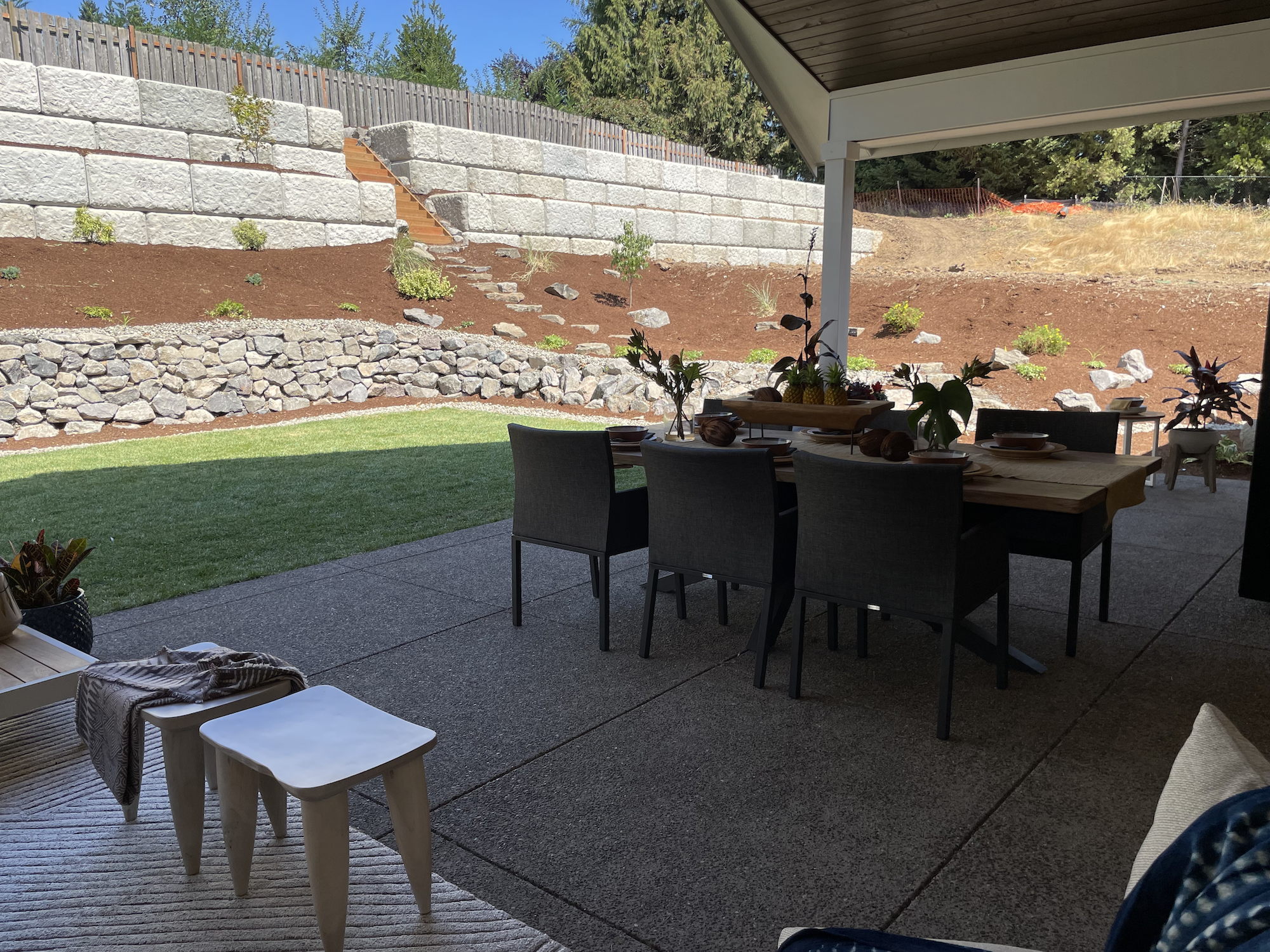
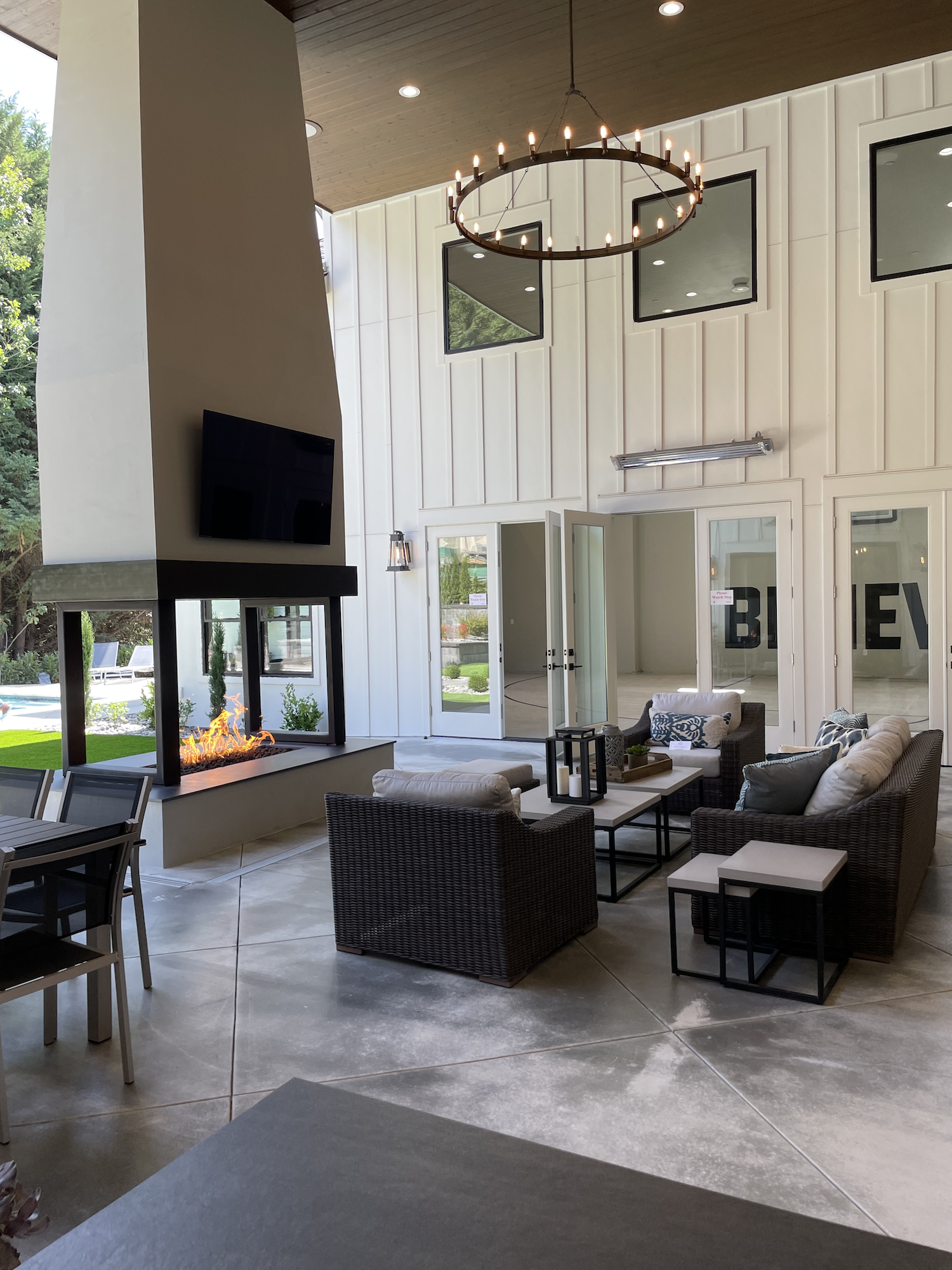
I think the most exceptional thing about the home was the backyard. The covered patio area with the four sided fireplace, television, dining area, grill area, and doors that slide fully open for that “indoor-outdoor” feel that everyone wants.
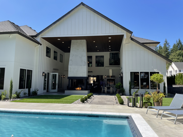
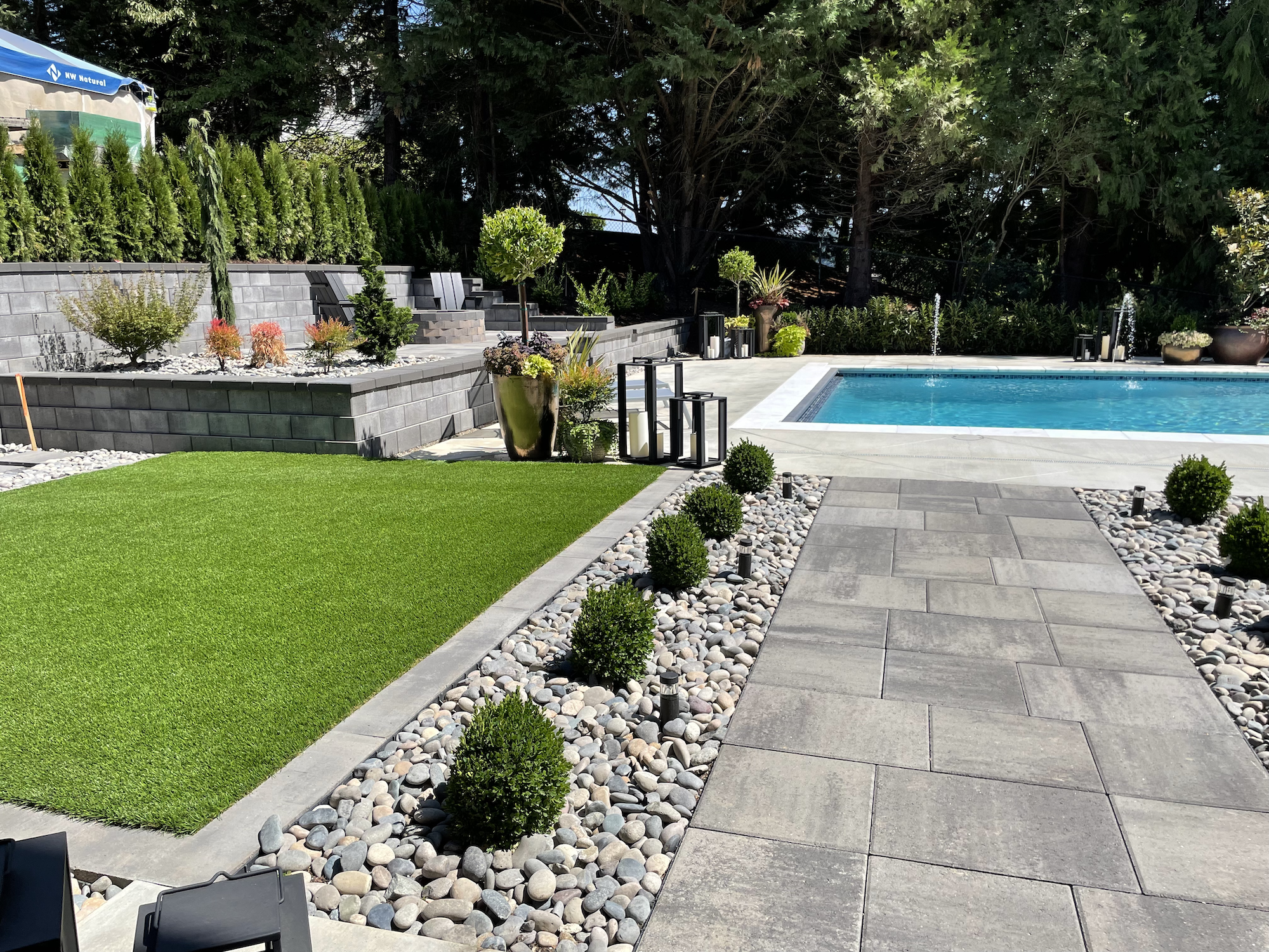
Once you’re out from under the covered patio, the rest of the yard is even better. First, I want to give a shout out to whoever sourced the faux grass. It’s probably the best fake turf I’ve ever seen. I’d like to credit a specific vendor, but the show guide actually didn’t list any landscape or exterior hardscape contractors… so I guess it was Red Hills Construction that did the landscape??
This is a big pool for our area but it absolutely works in the space. It has just enough lounge area around the edge of the pool, with a raised fire pit seating area for hanging out on cooler nights. The pool was done by VIP Masonry (sorry, I couldn’t find any website or contact info for them other than a phone number: 360-909-1255).
It’s nice that the pool had a little extra swag in the form of 4 double water jets…

Theater Room Bar.
Okay, I’m not personally a huge fan of the stream-of-liquid water feature (click “Manneken Pis” if you’d like to know what it immediately made me think of…). But, it still added a little somethin-somethin…
The home backed to the woods and that definitely made the whole experience a LOT better. While I don’t expect 100% privacy anywhere in the Portland metro area, a little bit goes a long way!
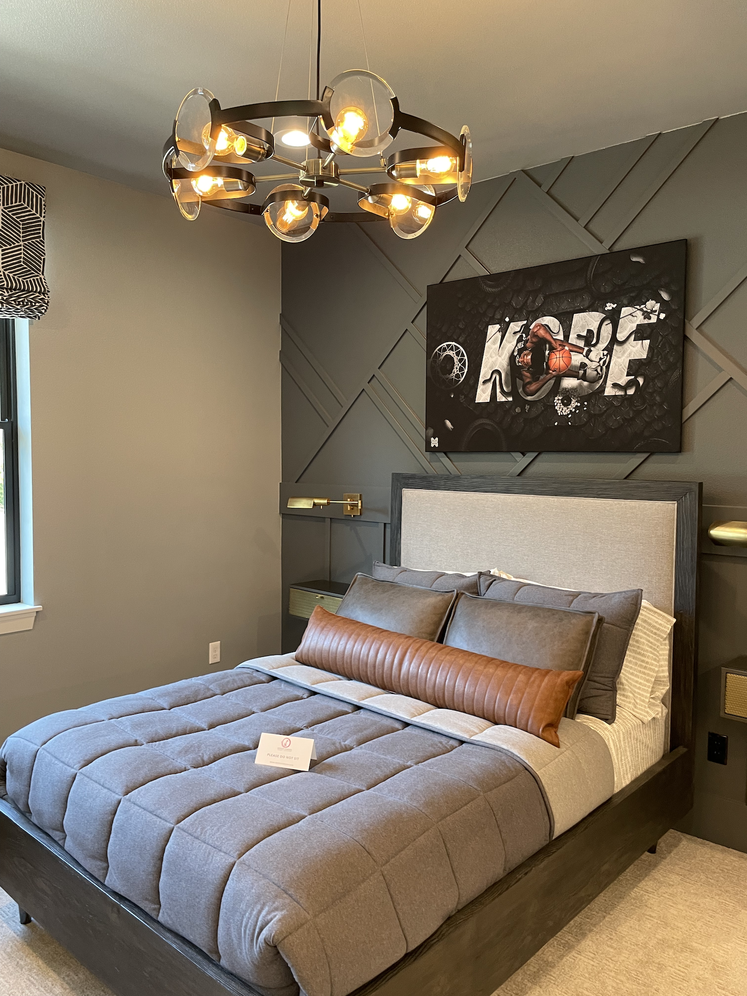
The interior feature that shined for me was the Theater Room. I LOVED everything about this. The size, paint, artwork, bar area… everything 100% worked. From the draperies to the “Burnt Ember” accent walls (Benjamin Moore)… it created the perfect ambiance for hanging out and watching a movie or your favorite sport. The extra bit of seating in the form of a live-edge sofa table with bar stools was a smart touch.

Too cool for school.
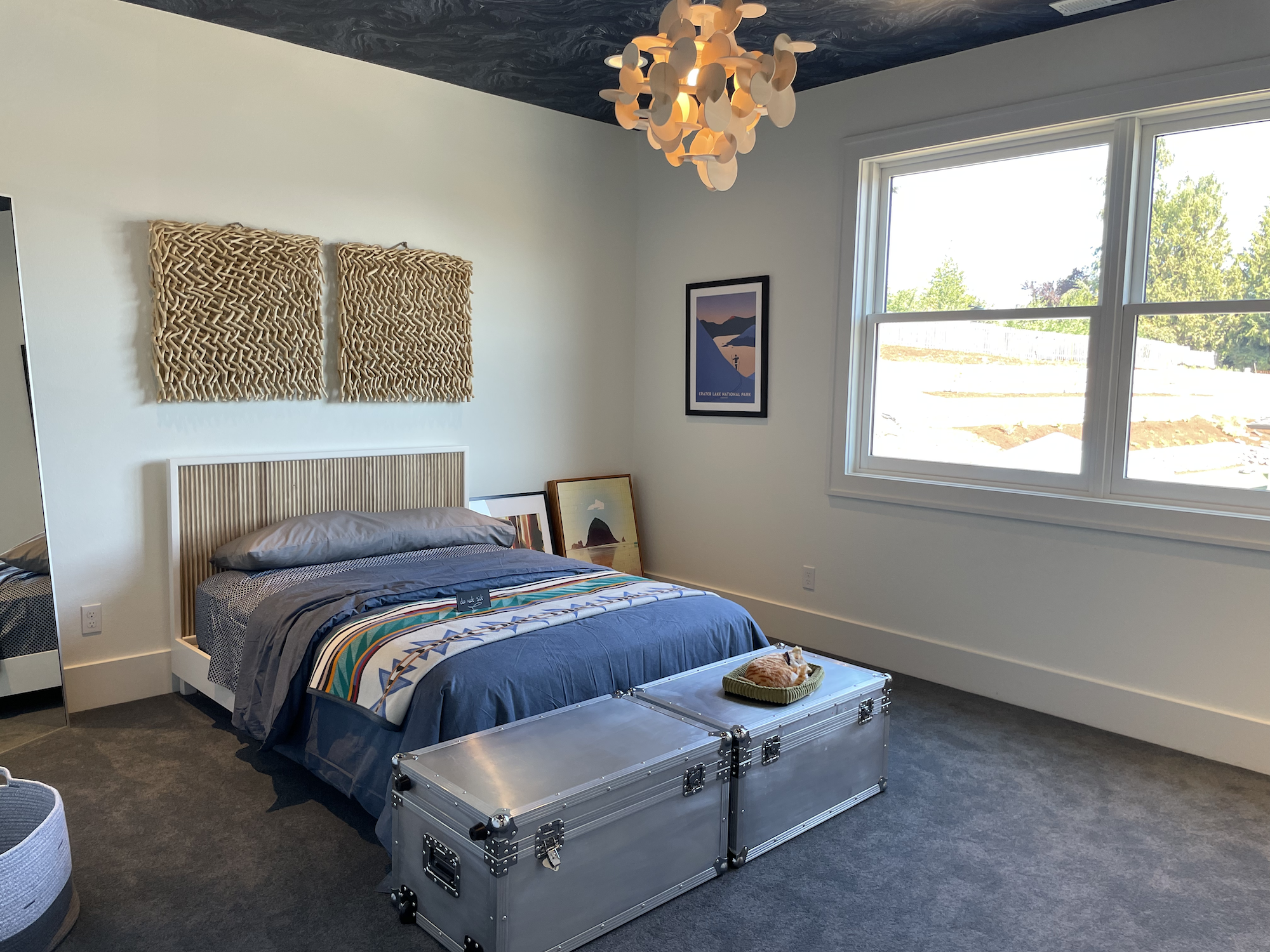
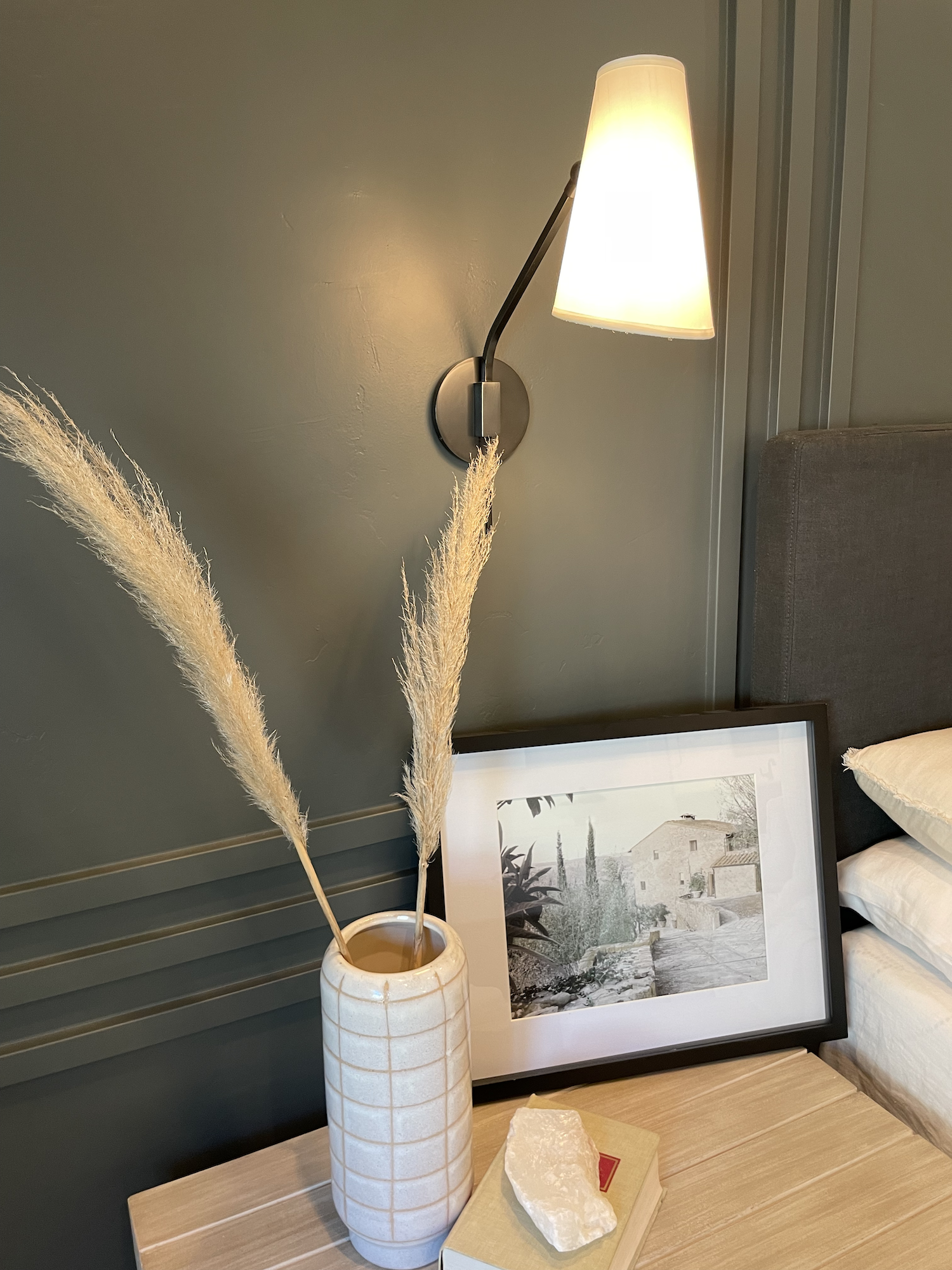
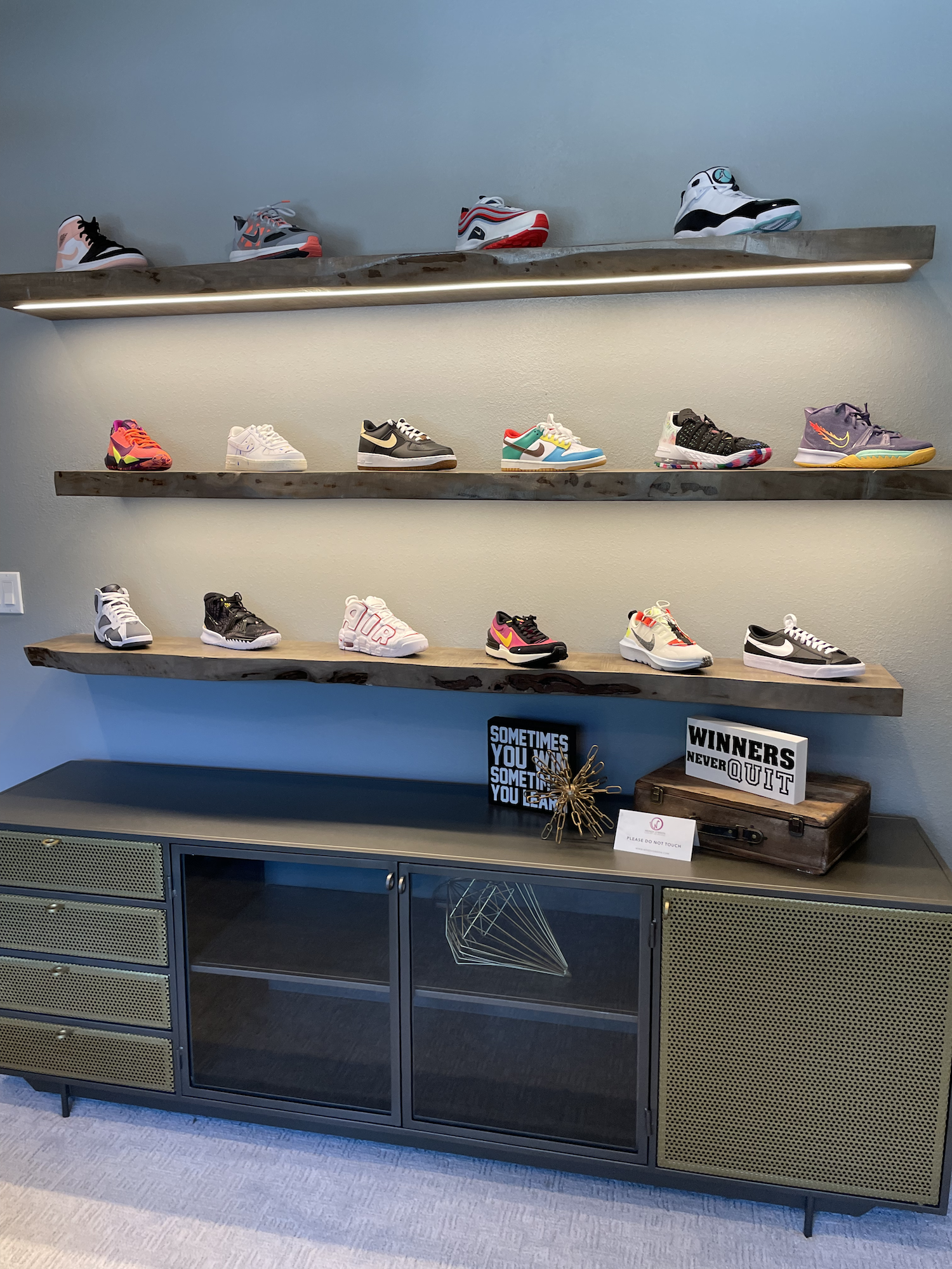
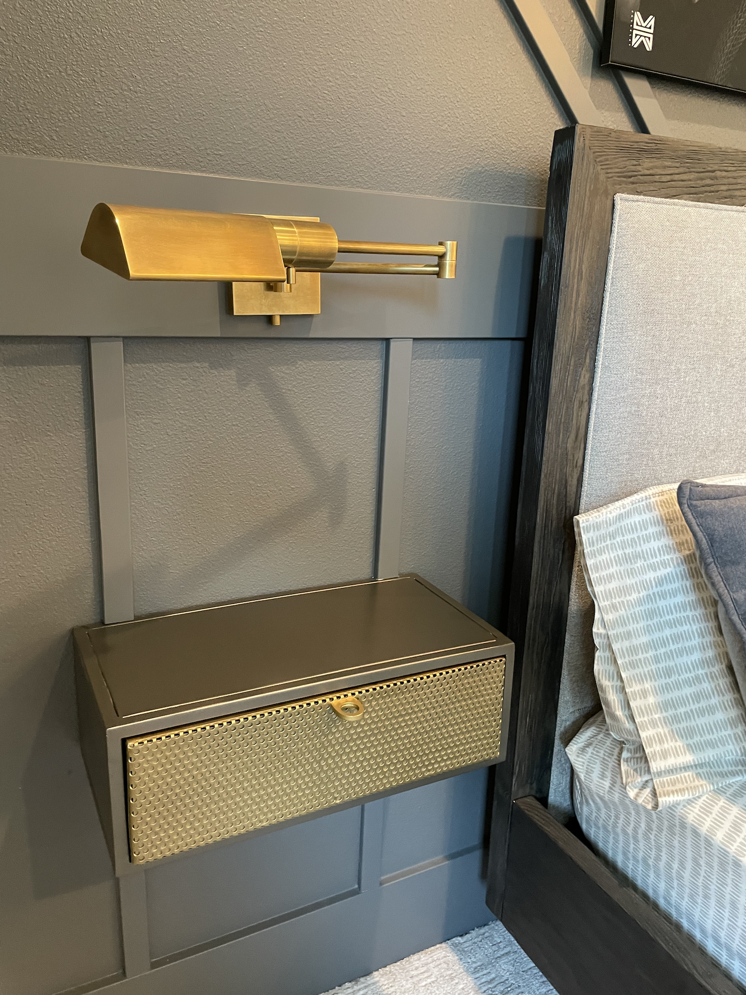
I really liked one of the secondary bedrooms (Bedroom 2 above). It had a really cool, deeper gray feature wall with built in nightstands and light fixtures. Then on another wall it had live edge display shelving showing off a cool collection of kicks.
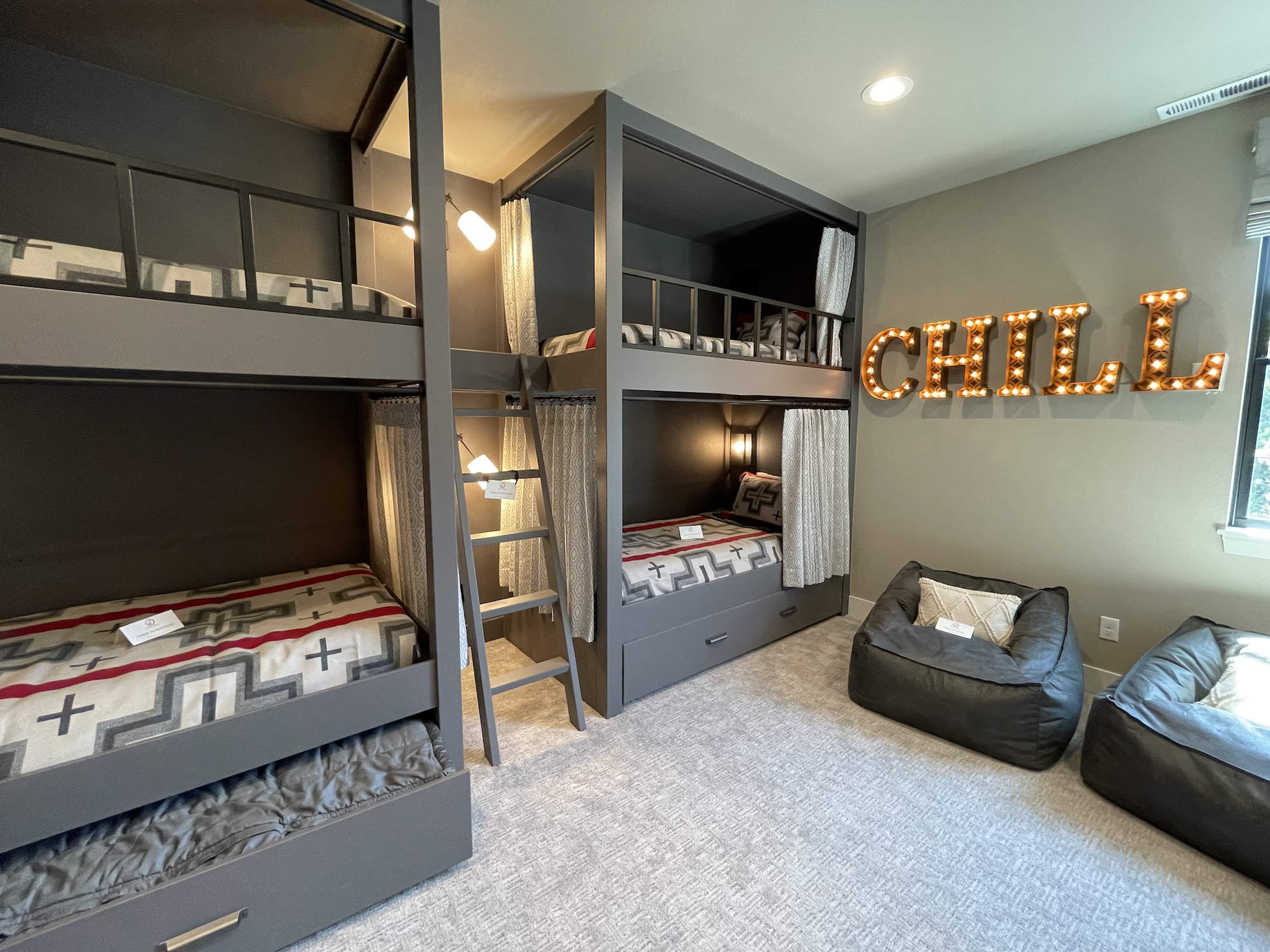
The double bunk beds topped with Pendleton blankets in Bedroom 3 were a hit, too.
The half bath was really cool; I love a dramatic “powder room”! The black leather-like wallpaper, reclaimed wood ceiling and wall, cool pendant light, moody color (Benjamin Moore “Cloud Cover”), dark quartz vanity, vibrant art, and metal sink all came together perfectly.
The interior design of this home is by Wendy O’Brien Interior Planning & Design. Beautiful work.
What… I Didn’t Understand
I mentioned it earlier so I’ll start with the stairs. Click the stairs picture above and take a closer look at those treads. The end piece doesn’t match the rest of the flooring. Believe me, I know it’s not easy to get this right, but I’d be a little annoyed if this was the result after spending (undisclosed but probably reaching over $3,000,000) a LOT of money on a new, custom home.

Swoons… because my brain hurts.
Since I just finished gushing over some of the bedrooms, let’s talk about Bedroom 4… Clearly it’s designed for someone that enjoys some mod-french flair… but that striped bath tile made me seriously dizzy. I wonder how they’ll feel about it in a year?
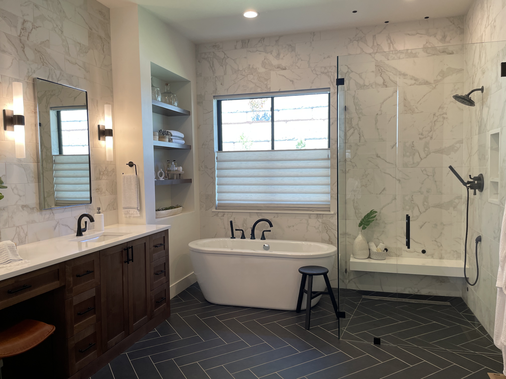
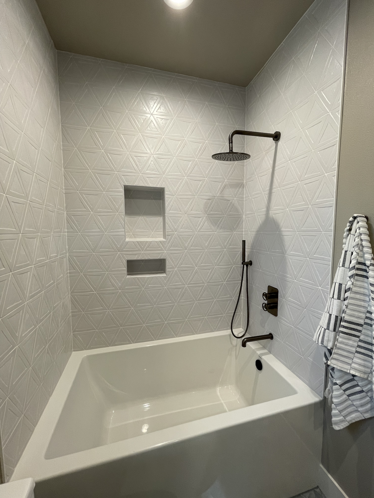
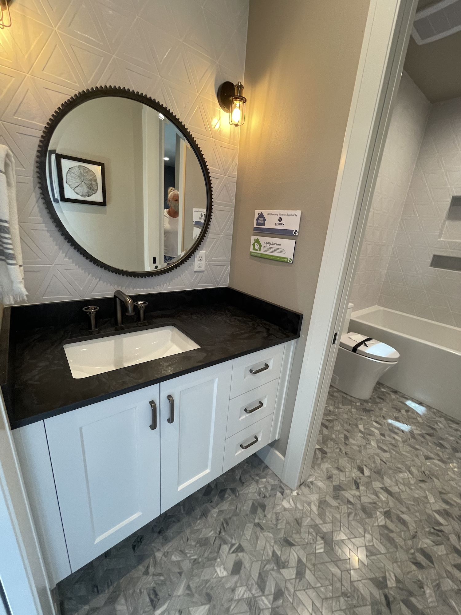
It seems like tile was prominent this year because I’m talking about it a lot… like what was going on in the primary bathroom? Bringing the tile up onto the ceiling isn’t exactly a new idea. It’s tough to make it work.

I dig the skylights and beams, tho.
Here they tried to make it look organic, stopping in sort of a flowing wave above the tub. It doesn’t work because even though these tiles are rounded on one side, they’re installed in straight rows, so there’s no way to make this flow look natural. The thickness of the tile also throws a shadow making it look forced. I’d be inclined to rip it off the ceiling.
The tiny balcony from the primary bedroom that looked down on the covered patio was an interesting touch. Weird, but interesting. There was another tiny balcony in the french-style bedroom that looked out above the garage. I guess these fit with the tuscan theme but since you can barely stand on them, they didn’t add much. (If you’re gonna build a balcony, make it a place I can sit!
View fullsize
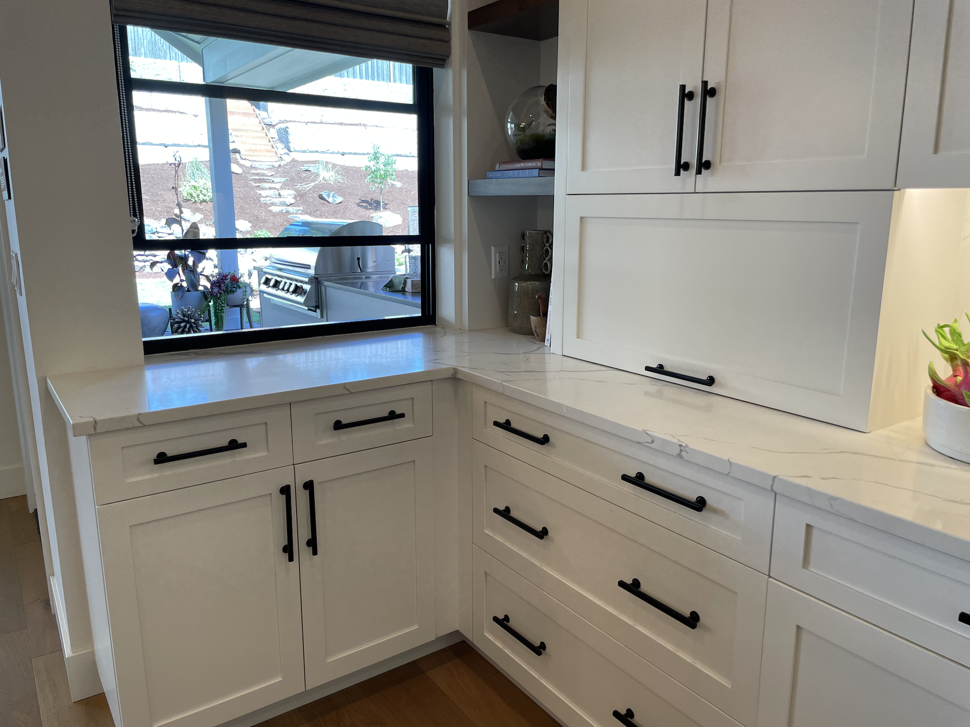
Moving onto the kitchen… it was okay. They used the absolute hottest tile of the moment, a square, glazed tile that I am seeing everywhere from luxury homes to flips to spec built new construction. I think it will play out pretty quickly but, for now, there’s a lot of love for it by designers.

Officially called “Tile of the Moment”
Otherwise, there’s nothing particularly noteworthy or objectionable about the kitchen, which is why I’m talking about it in this section.
For instance, they chose a medium wood tone for the island cabinetry and kept the rest white. This is an extraordinarily popular choice of home remodelers and builders everywhere: make the cabinetry in the island pop a bit and go with classic white elsewhere.
Nice farmhouse sink loved nearly universally and no one could possibly object to the pro-grade appliances, including a 60” Wolf range (unless you don’t like red knobs but you can switch those out). I DID object to the very obvious seam in the island quartz countertop.
All in all a great kitchen, just nothing innovative for my design brain to gush over. I’m hoping next year someone builds an ultra-mod house with something funky to ogle, appreciate, and/or complain about! (Maybe a house that isn’t either modern farmhouse style or influenced by modern farmhouse style… you know, just for a change?)
All together, this was a home with enough details to provide any home owner with great inspiration.

No objections to this other than cleaning the middle of this island might be tough for us shorties.
What Are YOUR House Dreams?
Phew, that was a lot of pics and info! What did you think? Was I overly critical? Not critical enough? Were you getting positive vibes from some of the things I disliked or maybe weren’t as enthused by some of the things I liked?
It’s what makes home design fun; it’s all in the eye of the beholder!
If you’re thinking about listing your home, contact me and I’ll provide you with an honest but compassionate opinion and help guide you towards making decisions that will result in the most profit. It’s why I am always working to keep up with the look and feel that a majority of buyers want along with the up and coming trends that will likely be in high demand soon.
If you’re thinking about purchasing a home, then let’s chat about the process and get started! I promise we’ll have a lot of fun looking at design hits and misses ;)